11

Based on this question, "Why do many sites leave half of each webpage empty?" and its comments and answers, I did some research, but I didn't find a complete answer.

For me it is obvious that it is a good decision to limit the width of the main container, but what is the recommended max-width for the main container for large screens, in 2017, when the screens become larger and larger? What variables should be considered in this decision?

Also, let's say a website has multiple columns in the main container, what is the max-width for the main column?

Update: I have now a related question. I recommended to one client to reduce the width of the main container on the homepage, but I can't convince him. It is a website with photos, like pexels.com. It is in this case important to limit the width if the elements are not one more important than other?

6
  • 4
    Possible duplicate of How wide should a webpage get? Commented Feb 9, 2017 at 7:13
  • @locationunknown My question is related to the main container, not to the body and I also asked what is the max-width for the main column? Commented Feb 9, 2017 at 7:19
  • @locationunknown Please, read carefully the questions. Commented Feb 9, 2017 at 7:23
  • @locationunknown Oh, if it would be like you say, all the question would be duplicate because are related to a field. I really think my question is different, it is just my opinion. Commented Feb 9, 2017 at 7:29
  • Have you considered responsive design? smashingmagazine.com/2011/01/… Commented Feb 9, 2017 at 9:57

5 Answers 5

7

Historically there was some research that indicated content that was too wide became hard to read and thus a standard of 960px was adopted.

However there's a strong emphasis on "reading" width there... for a web application I hate it when I'm artificially constrained to a small width like 960 when I'm on a nice wide 24"+ screen and I want to see more content at once.

If your content is not purely for reading (eg like a blog) I'd highly recommend supporting an option to not be constrained to a fixed width and allow a 100% width option.

6
+50

Depending on the kind of content and the way you present it you can show a certain amount of information.

For text there is a certain limit in the width of the container depending on the font size. So there you have a first constraint. However you could still fill up the screen with more blocks of information. There are certain breakpoints, we should adapt the layout to those and use one of them (instead of a random number) if the amount of information on a single screen is reaching a limit.

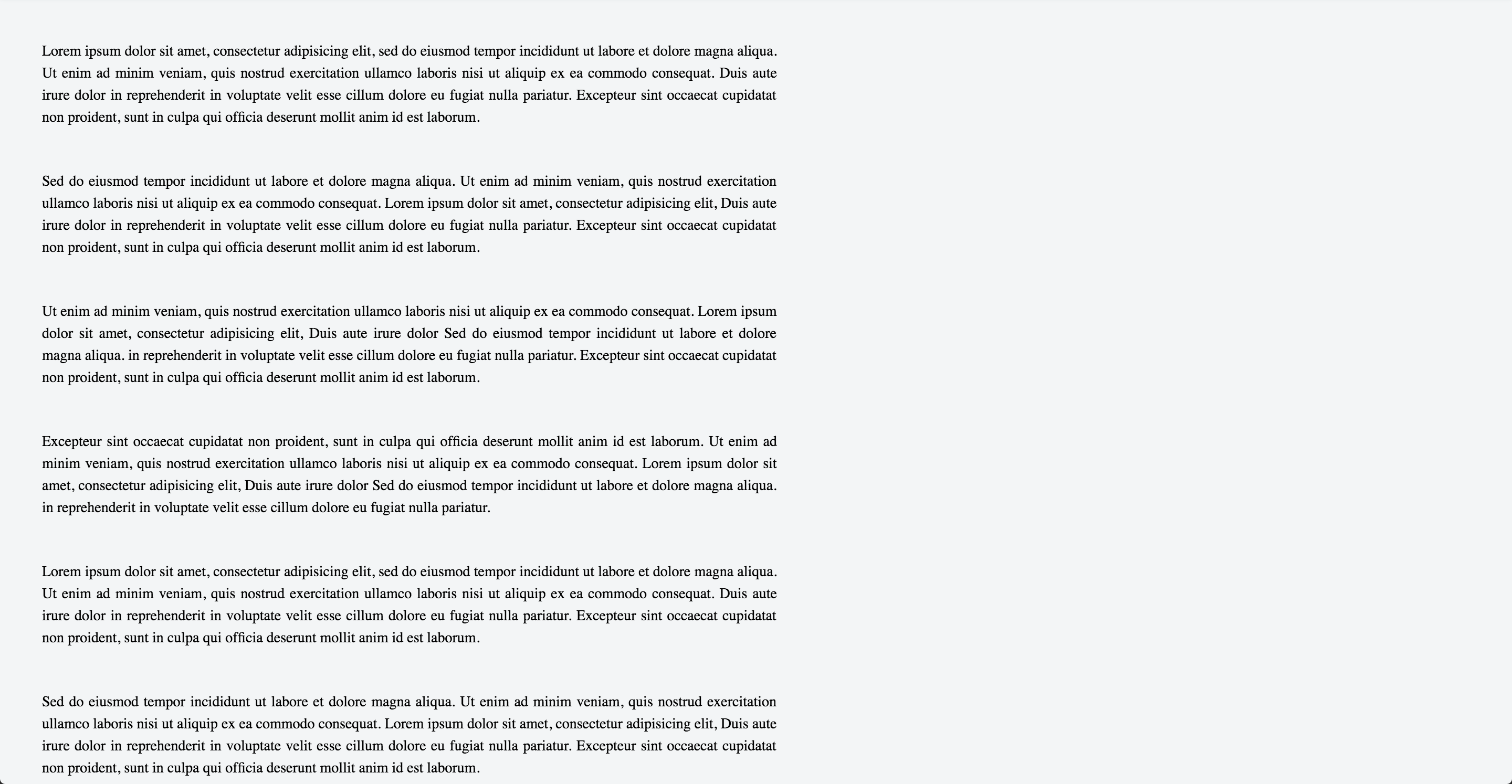
For example, (these images are meant to be seen full screen) in the case of text:

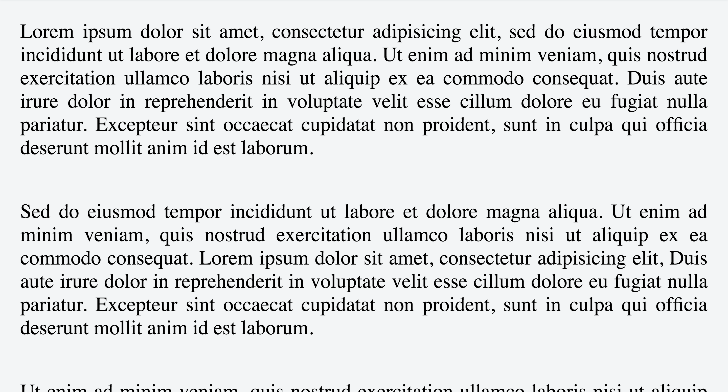
too much text information:

too much text

ok amount of text information:

ok amount big fontsize

also ok:

enter image description here

enter image description here

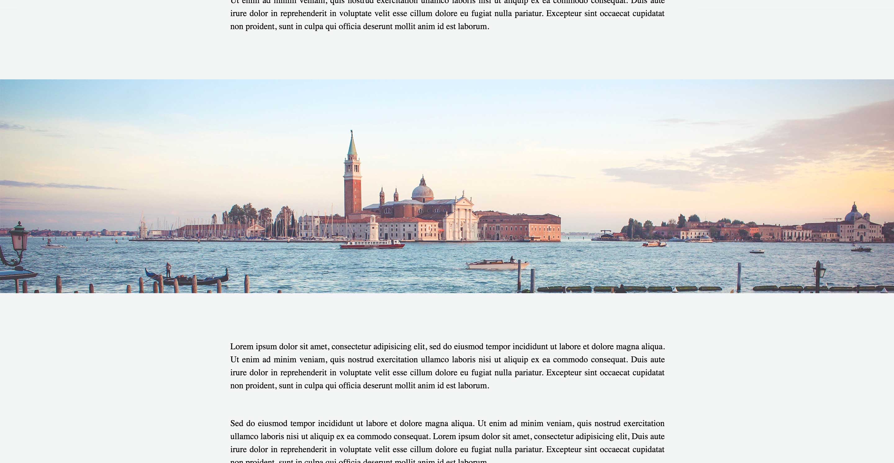
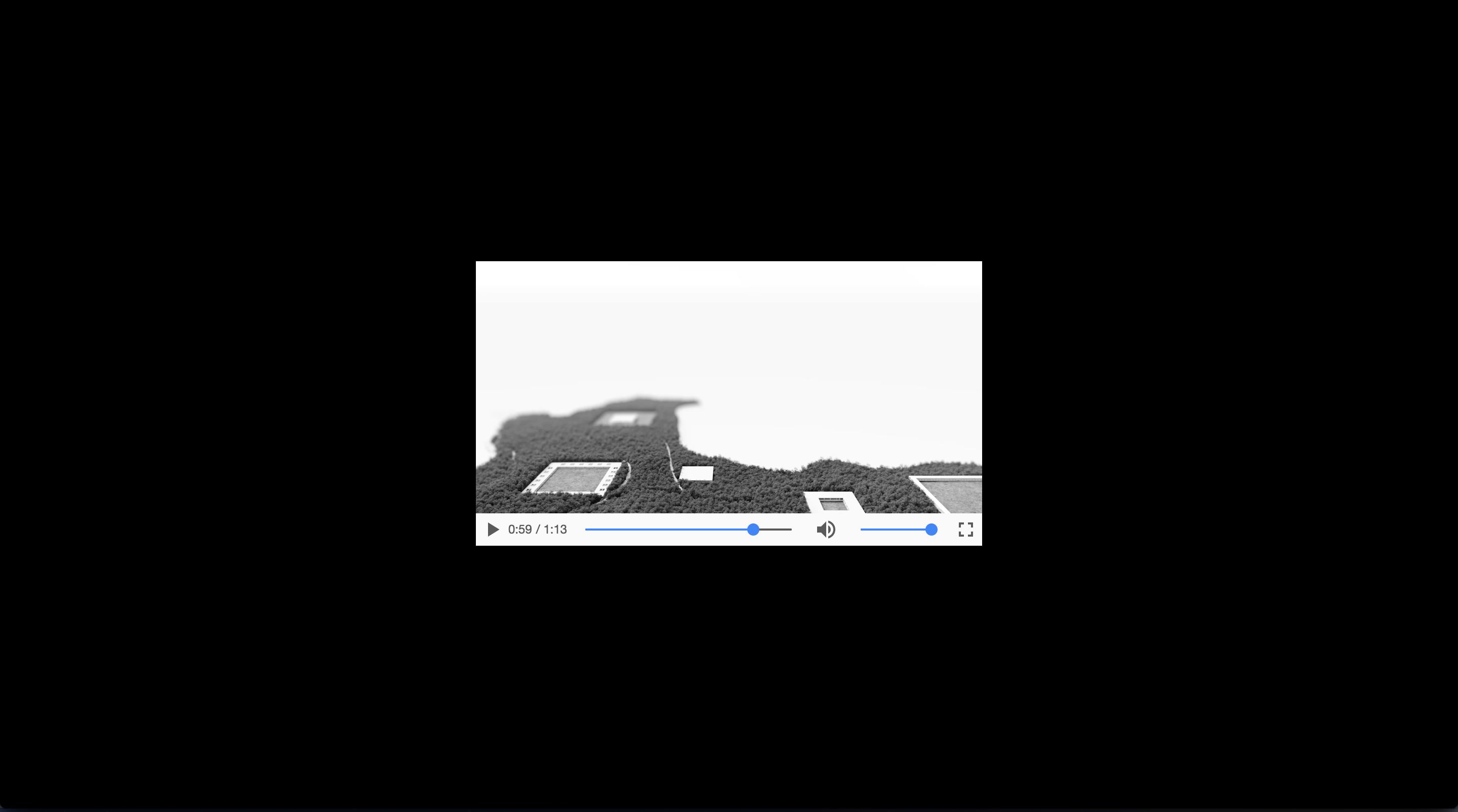
or in the case of images/video, the same amount of information:

enter image description here

enter image description here

1
  • You are welcome :) The point is, in case I was not clear, there is no rule to set a max-width. There are breakpoints that we should use if for example we decide that our content needs a maximum width close to one of those breakpoints, in this case it is a good idea to adapt to it.
    – Alvaro
    Commented Feb 9, 2017 at 11:19
4

The width of a line of type is called a measure. Some typographers consider 65 characters to be the perfect length for a measure, plus or minus 15. Anything shorter and your eyes bounce around too much, and anything longer and you get cognitive fatigue and risk losing your place when returning to the beginning of the next line. With this in mind, the pixel width of a column of copy will change based on the size of the copy, with smaller copy requiring a narrow column, and larger copy a wide one. While this won’t give you a definitive max-width on your wrapper div, it should be a good place to start in helping to make that determination.

0

The size of a monitor, doesn't change the width of the visual perception area, because the distance of the user to the monitor doesn't change.

You can figure out its width, just looking on the screen and analyzing the comfortable perception zone where you can see the content and don't need to move your eyes to the left-right.

It depends also on your content type and size. For large photos or presentations - larger, because the viewing distance may be larger and on this content you don't need to concentrate a lot. Videos - full screen, because in video the perception zone should be already configured.

Please take into account, that the men have narrower view field and please also take into account, that today's people in common have not so good eyes.

If you can do it adjustable, it would be best of all.

0

What variables should be considered in this decision?

  1. Do user testing. There's no better way than to get real feedback.

  2. And go with responsive design. Try different configurations and keep one where the customer can see the whole image.

Your Answer

By clicking “Post Your Answer”, you agree to our terms of service and acknowledge you have read our privacy policy.

Not the answer you're looking for? Browse other questions tagged or ask your own question.