2

With today large screen resolution (1920 screen width rules now), I need to decide between using the full width of the screen (liquid) versus fixed with (padding with white margin over 1366px for example).

Our main a web applications has tables, lists, complex forms and is designed to be used mainly on organisation Desktops.

While using all screen width can be great in terms of complex layouts such as master-detail, many charts and tables, I am aware that elements that are in the far left/right corners can be ignored easily. I see that many web apps goes for the full screen width (slack, Asana, Jira, Salesforce). Any ideas, thoughts or references regards such decision?

Thanks, Iris--

0

3 Answers 3

1

A lot depends on the overall structure of the application for example, use a hybrid is possible. I notice the trend that modern sites are more flexible

Full screen resolution:

Arguments:

  • greater control over the template
  • using %, em and rem scales more easily on more resolutions

Againsts:

  • display issues on custom resolutions (personally I have LG 2550x1080)
  • more visual errors may occur

It's good idea to define a grid regardless of your decision or some universal design pattern that will keep the page in a clear and consistent structure

1
  • 1
    Thanks. We might do just that, and use the basic grid.
    – Iris Green
    Commented Aug 15, 2019 at 8:33
1

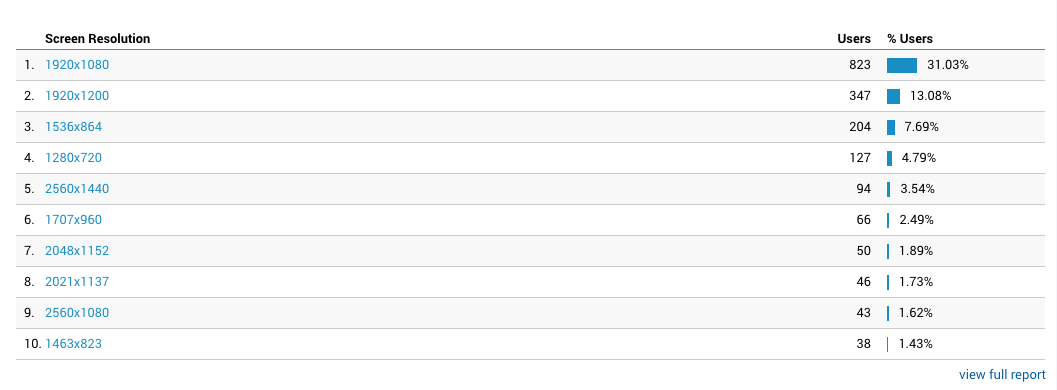
This is easy to target using your application/site analytics. If we consider the screen-resolution analytics in the image below, we can understand that if we keep the page-width between 1280px and 1920px, it will cater to all users and more than 50% visitors are using screens wider than 1440px. Considering this, we can ignore how the screen looks like on screens wider than 1920px, as long the page does not break down terribly.

enter image description here

7
  • This is never a correct answer and the question is asked ad nauseam all over the internet. One can never reliably or narrowly determine screen size so it is always better to build for the design and never the device.
    – Rob
    Commented Aug 13, 2019 at 13:47
  • @Rob So what is the correct answer? The question is looking for a rationale behind such decisions. Mind you, I am aware of the fact that it is not a good practice to take device dependent decisions.
    – Ren
    Commented Aug 13, 2019 at 15:14
  • The best answer I ever read was, "Start with a small screen. Then widen it out till it looks like [crap]. That is your break point."
    – Rob
    Commented Aug 13, 2019 at 15:17
  • And how would you determine your so called 'small screen'? Just assume anything? Either way, I do not take that as the correct answer to the question.
    – Ren
    Commented Aug 13, 2019 at 15:23
  • The smallest screen in wide usage with any kind of capability is 280px wide. The smallest modern device is 320px. Those are the only practical numbers one should use.
    – Rob
    Commented Aug 13, 2019 at 15:29
1

A lot depends on exactly how your site is designed (a bunch of wide tables might benefit from the extra width, but something like Google Forms may not).

Use as much screen space as possible until it no longer adds value to the user experience, then switch to fixed width and padding.

For power users, the benefit of that little bit of extra space could make all the difference.

1
  • Thanks! We are leaning more complex forms and reach lists and tables, so I guess the recommendation leans towers go wider (while keeping design responsive to smaller screens).
    – Iris Green
    Commented Aug 15, 2019 at 8:35

Not the answer you're looking for? Browse other questions tagged or ask your own question.