3

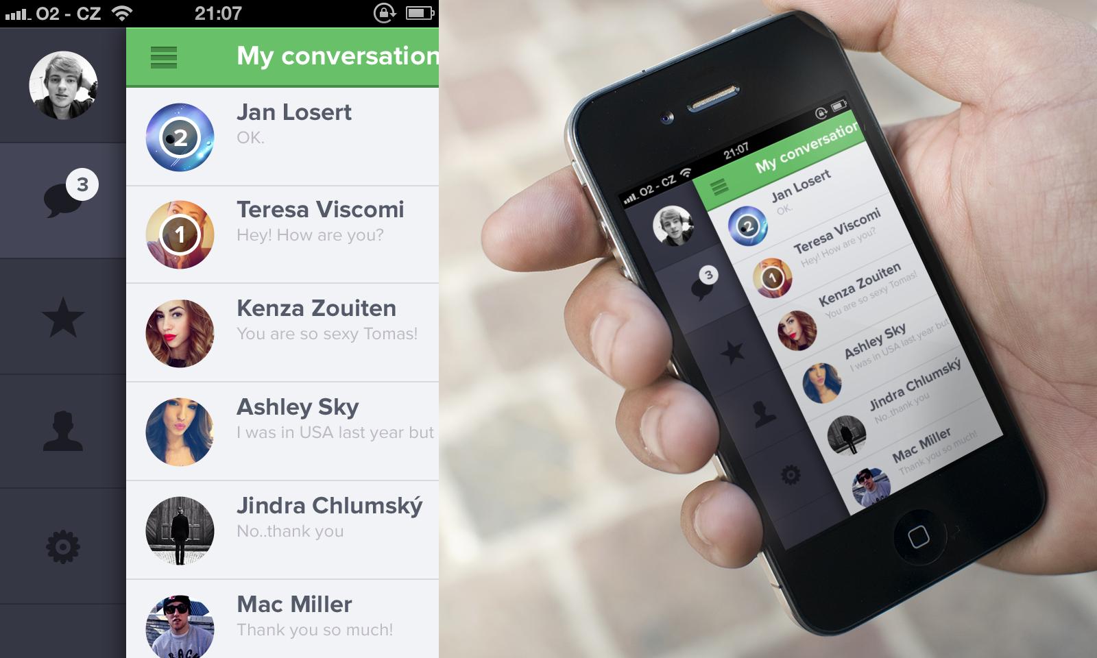
I'm interested in designing a mobile-friendly search results page where users can refine their results. I'm thinking about using a left-hand sidebar with the filtering options similar to this Dribbble project (pictured below) instead of hiding the options behind a hamburger icon.

Are there usability reasons for this type of navigation not being very common on mobile devices? I see similar menus all the time in desktop view. The sidebar with the icons would be expanded upon click to view the menu.

enter image description here

1
  • In the example image I find it confusing to recognize what is the sidebar and what the page, because the sidebar is darken out and the page is displaced.
    – Alvaro
    Commented Jan 27, 2017 at 14:17

3 Answers 3

3

Mobile screen real estate is precious. There just isn't very much of it.

The popularity of the "hamburger" menu is because it preserves as much of that real estate as possible for your content; all the navigation is tucked away into a single icon.

I'm not saying your sidebar idea could never work, but some issues you would want to test thoroughly are:

  • Permanent reduction of the content area's width, potentially making the content harder to read or just reducing how much content you can usefully display. (Even your screenshot looks pretty crowded already, with some not-terribly-long names displayed...)
  • Your navigation must be icon-only; there won't be room for labels. High risk of mystery-meat navigation.
  • Possible problems when switching to landscape mode -- which is likely, given that you're reducing the screen width on them. If you have more navigation icons than will fit within the height of the screen in landscape mode, you'd either have to let the navigation scroll along with the content, be a separate scrolling panel on its own (which would be super fiddly to use), or fall back to a hamburger menu or equivalent.
  • Easy for users to accidentally click a navigation link when they're trying to scroll the screen or otherwise interact with the content. This will affect some users more than others, depending on how they hold their device, so you'd want to test this with a variety of users.
2

The main problem I see is that icons can be difficult to associate with a meaning. This depends very much on the user context and the app context. That is why it is better to use icons to emphasize the text.

If an app relies only in icons you risk that the user doesn't recognize the icon and ends up having to click blindly to know what the icon is associated to.

In Material design this appears as a "Mini variant" of a Navigation drawer. Take the two images as an example, other than the picture meaning profile, it is difficult for me to know what do the icons refer to. If I would see only the text, as non-english native, I wouldn't know what does "Starred" refer to, but seeing the star icon I guess it means favorite or similar.

So my point is the order should be:

  1. Text
  2. Text + icon

0

There seem to be two questions in your post.

1. Why are hamburger icons so common?

  • they don't take up very much screen area
  • they are widely understood to mean "press here for menu"
  • they are, as @Rosiana said, a link to the global navigation (not reliant on the context of the current screen)

2. Why is a permanently visible sidebar not very common?

  • because it would take up a lot of screen space
  • if you have icons for the menu items, it would not necessarily be obvious what they mean
  • if you are in the context of a specific task (again as @Rosiana was saying), you don't want to be distracted with a link to a different task.

The nav bar or menu accessed via the hamburger icon should contain things that are not needed all that often, but that do need to be there (e.g. app settings).

Things that the user will need a lot should be available all the time (e.g. search, chat) but not take up huge amounts of screen space.

If a task has a workflow in it (e.g. find a person, open a chat with them), then the user should be able to do that workflow from buttons in the main part of the screen, rather than referring to the menu.

2
  • 1
    "they are widely understood to mean "press here for menu" - what evidence do you have in support of that? My personal observations is that elder people hardly recognize them.
    – drabsv
    Commented Aug 6 at 8:44
  • it does seem that a lot of apps do not use the hamburger. Here's an article with pros and cons which draws on some user testing uxplanet.org/… Commented Aug 28 at 14:28

Your Answer

By clicking “Post Your Answer”, you agree to our terms of service and acknowledge you have read our privacy policy.

Not the answer you're looking for? Browse other questions tagged or ask your own question.