I am new to Material design and had the same question. Since most of these answers appear a bit subjective, I'd like to offer an answer based upon my newness to the field underscore paradigm that Material design adopts.
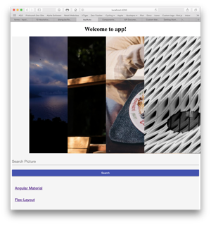
Where I struggle with this is that it violates expected norms for forms, the consistency heuristic, mentioned by Kristiyan. I've been working through a tutorial on using Material with Angular, and came up with the following page. My first response when viewing the result was "Where is the search field?". I thought the field border was a horizontal rule and did not recognize the place holder was where I needed to click.

Thus, at least while Material design is new, the cognitive load is greater for me because I have to think about where to click. Countering that would require modifying the placeholder to "Click here to search for a picture" or something. And while that works as a placeholder, it is awkward as a label.
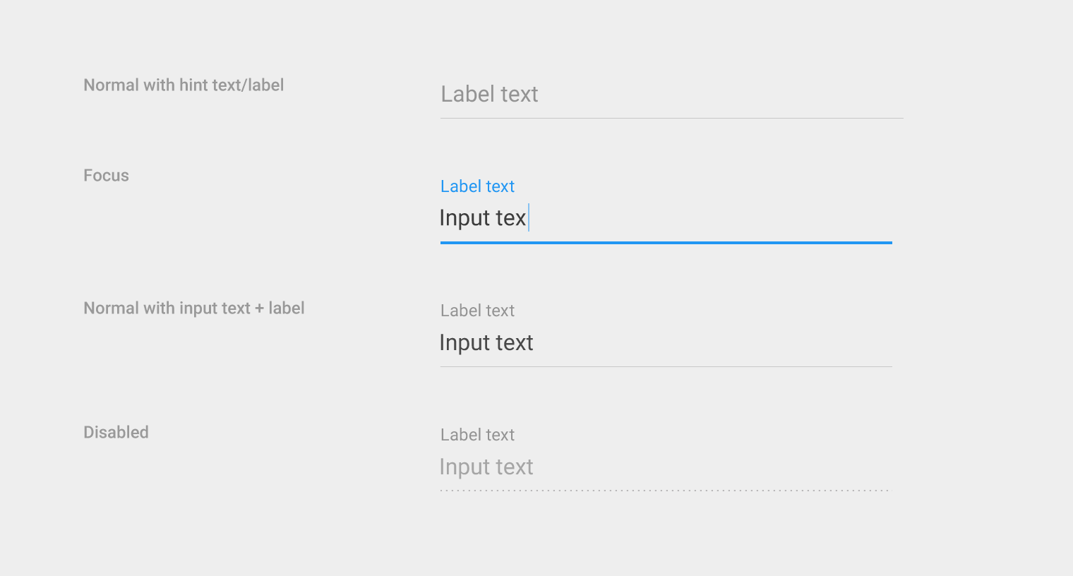
My answer then, is that having only a bottom border is currently detrimental to user experience. Thus when using Material design, we still need to determine a way to guide user input in the absence of a full border around fields. This could be done with color or shading, where the fields are lighter or darker than the page, or where a drop shadow accentuates the field dimensions.


