Edit (2022): Material Design has been a strong voice in application design for many years now, and many iOS users will have seen the FAB pattern. FABs are not a core experience to iOS and can still confuse users who don't regularly use your app.
TL;DR: I consider the Floating Action Button (FAB) to be the most polarizing element of Material Design, and generally wouldn't recommend a floating action button for use in an iOS application.
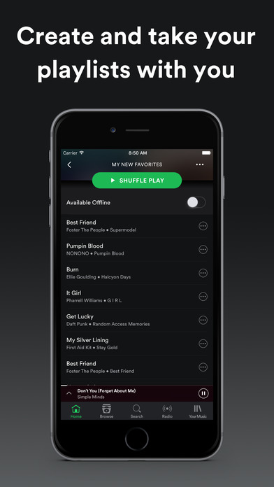
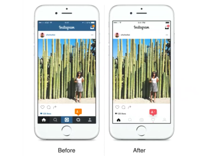
The principle is still sound: provide a strong call-to-action element (CTA) to guide your users. Apple tends to favor the top-right interaction, but I consider the play/shuffle button in Spotify to be a good example of a non-toolbar interaction (see below). It helps that it has high discoverability (easily understood wording rather than abstract icons). Other apps (Instagram, Tumblr) use the central icon of the Tab Bar to focus the user on a primary action (which might be relevant for your use).
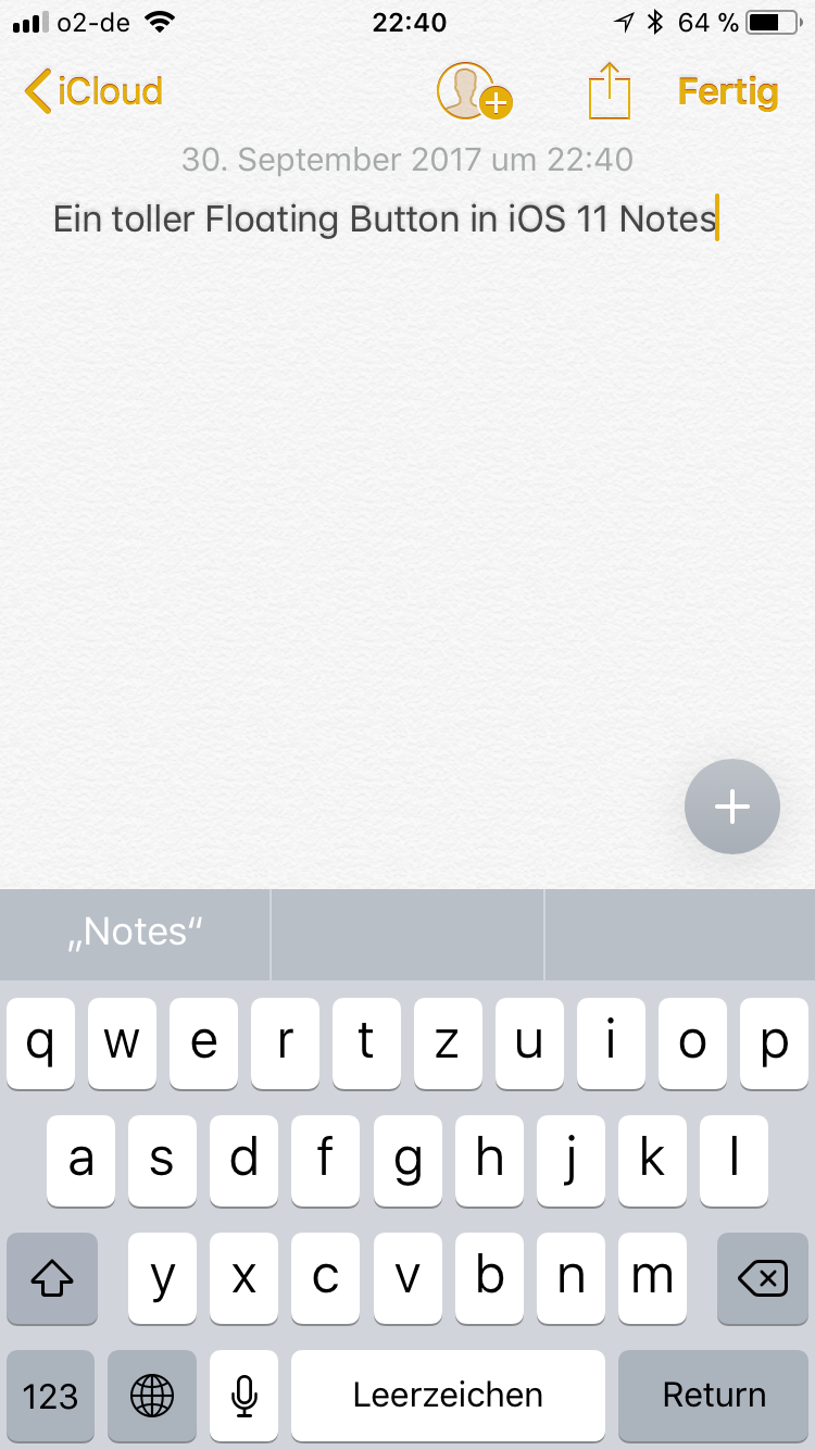
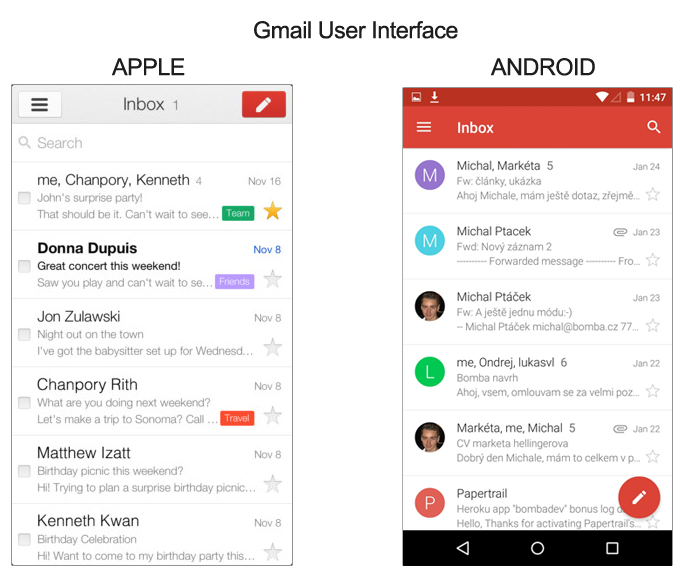
The FAB is probably the least generic component in the language and tends to make all implementations look like they were made by Google (which works great on Android). It's an abstract concept with low discoverability, which works fine for Android since it's part of the OS. You're taught to use it as part of the onboarding for the device.
If your target audience is iOS, where it isn't commonly understood, then you're increasing the complexity for new users. Ultimately there is nothing stopping you from using a FAB, but you should probably expect users to not know what it is, or how to use it on sight.

Strong shuffle CTA, with clear statement of what will happen when selected.

Example of how Instagram moved away from a strong CTA (probably to focus on the feed over posting...)

