4

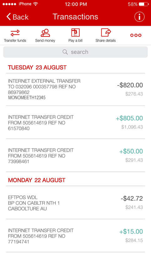
As most people know, red is a color used in many apps to display negative numbers, specially in financials. I also remember old calculators with paper rolls having that color by default for subtrahends.

Now, my problem is that we need to create an app where the request is to have this kind of treatment for negative numbers, and of course, red was suggested by the client itself.

But the client is an Asian bank, and its brand color is red. So I'm against using red because I know red is a good color for Asian people, not to mention is the client's brand color, so I can't use the brand color with negative connotations.

Considerations

  • Minus sign is a given, but we need more than that for easy scanning
  • So far, our best bet is to use black as default and a mid gray (#777777) for negative
  • While for an Asian bank, app is targeted mostly to Western users

Thus, my question is: is there any other color or treatment we can use to display these negative numbers?

2 Answers 2

2

Make it scannable

Finance is inherently a negative business. In finance, we assume that things will remain in the positive, so it's the negative trends that need to stand out.

The critical requirement is to facilitate the user's desire to quickly find negative values.

Even if red was a good cultural fit, it probably wouldn't work since the brand will be using that color elsewhere in the view. It's visual dominance is already compromised.

Black probably isn't right either, since most screens will be full of it (granted, in lesser density).

Orange may provide enough vibrancy (depending on the red in use), though it can be a challenge when it comes to balancing readable type vs muddy color. That said, it's probably the first color I'd test.

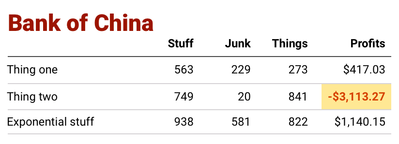
Another option, that opens the door a bit wider, is to use a background highlight rather than type color. Then something like yellow or an orange tint can be used with bold or darker type to compound the visual dominance.

Something along these lines:

Negative callout using orange type and yellow background

2
  • Very interesting, will play a bit with this
    – Devin
    Commented Aug 26, 2016 at 21:36
  • Another nice feature of this pattern: background color can be used to highlight goal achievement or any other metric. The trick is establishing a system that maintains appropriate visual hierarchy. Commented Aug 26, 2016 at 21:54
1

Interesting question.

The approach used in accounting is to indicate negative values by placing them within parentheses (or brackets) but without the minus sign, for example $(1,234.00) is a negative value while $1,234.00 is a positive value. So you could opt with that as an alternative and mostly acceptable and understood option.

To be honest, I'd be inclined to test both formats (the red v parentheses) with a couple of focus groups and see whether using the red is actually the issue you're concerned it will be. I say this because the client initially asked for the red and testing it may be useful in arguing your point or putting your mind at ease. Not to mention the fact that the app will target mostly Western users.

As for the 'highlight' suggestion by plainclothes, I do like this, but on the negative side (no pun intended) it would be an unexpected approach and could also cause a distraction when there are lots of negative values.

ADDENDUM

Another option may be to just leave the negative figures in normal black (e.g. -$1,234) and change the colour of the positive figures to something else and include the plus sign for them. Here is a quick mockup I've done using red for branding and green as the alternative colour for your positive figures:

enter image description here

I'm not suggesting that green would be the right colour - but this approach may be worth considering because you'd find a colour that complements the red branding and which is also neutral (no-one would assume green or blue or whatever denotes a +/- value, but they could assume that red denotes a negative value). And, also explicitly including the minus and plus signs for all values would reduce any confusion.

3
  • I think the OP's users are general bank customers. The parens are great for an accounting and finance audience, not so much for average users. Commented Aug 27, 2016 at 1:47
  • 1
    Hmmm, in that case I'd agree. Parentheses probably isn't the way to go, although I still think testing the red text is worth a go, as it's fairly well understood. Actually, red type and parentheses combined is also an option I've seen used (in fact I seem to recall this is a formatting option in MS Excel).
    – Monomeeth
    Commented Aug 27, 2016 at 1:54
  • For what it's worth I've edited my answer with a totally different approach. I think I'm more comfortable with this compared to my earlier suggestions.
    – Monomeeth
    Commented Aug 27, 2016 at 2:30

Your Answer

By clicking “Post Your Answer”, you agree to our terms of service and acknowledge you have read our privacy policy.

Not the answer you're looking for? Browse other questions tagged or ask your own question.