3

I am buiding a web app called Hero Panel (heropanel.com). It consists on a panel with different productivity tools. These tools work as separate apps, each have its on functionalities and they are also resizeable, so they are individually responsive.

Since the beginning it was a pain to implement dropdown menus for them, crunching it to take small space and finding balance between something that the user would easily deduct is a menu button vs. keeping it minimal.

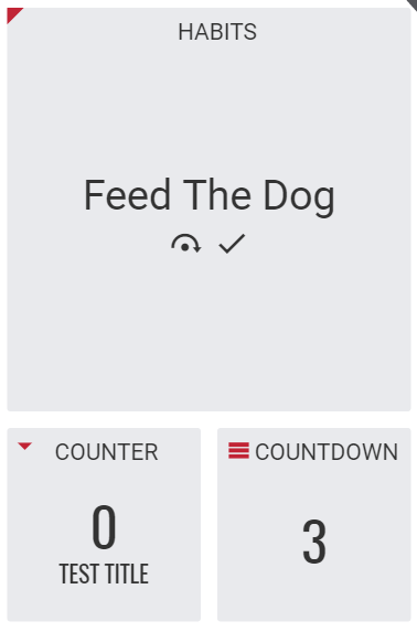
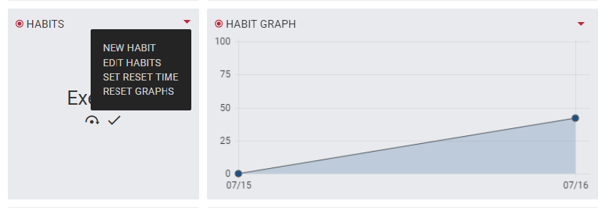
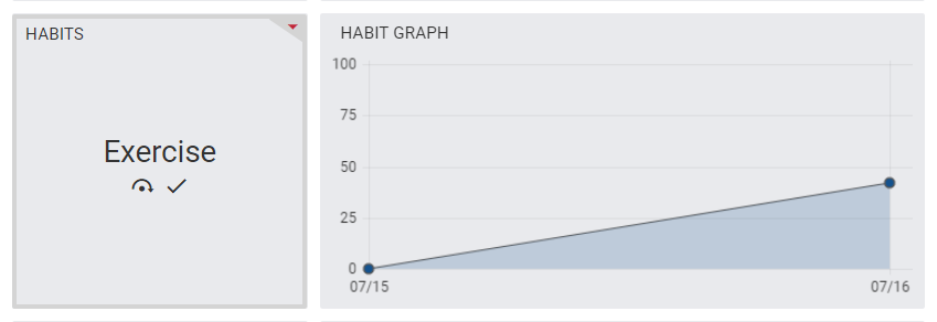
After a lot of tinkering, I came up with these ideas (each is in red, when hovered, a dropdown would appear:

enter image description here

enter image description here

Some of my thoughts on each one:

1) Triangle on border: Looks good, minimal, stays outside the margin, does not take space that would be taken by title on smaller sizes. Cons: seem very hard for users to find out it's a menu trigger (they would have to deduct and hover it)

2) Arrow down: Looks ok, quite small. Cons: perhaps a bit to small to notice? Stays inside the margin, taking up title space (for longer titles it sucks). Medium difficulty of finding out by inexperienced users

3) Hamburger menu. Aside from all the pro's and cons deeply discussed online about it, it is a globally recognizable "menu" icon. Users can easily find it. Cons: a bit too big, smaller size would render it almost unrecognizable

4) Settings menu. Cog is also a recognizable "settings" icon. Cons: Same problems as the hamburger menu, too big, inside the margin.

Considering all the pros and cons, I've looked too much into it and came to a point where I can't really make a decision.

Could you guys please tell me what you think about them, and which would you use or (maybe even better) a new solution that would work well.

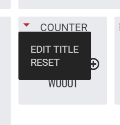
The following is the dropdown opened (very simple)

enter image description here

4
  • ps: if you want to test it in action, feel free to try at heropanel.com (it's currently in open beta)
    – sigmaxf
    Commented Jul 16, 2016 at 8:55
  • Why is the right angled arrow for Habit Graphs, Notes, etc...? Is that just a mark?
    – divy3993
    Commented Jul 16, 2016 at 9:15
  • Yes, everything that does not have a drop-down would have a right arrow.. I guess just to balance out colors on the screen
    – sigmaxf
    Commented Jul 16, 2016 at 12:43
  • Please don't do it. Do not open / expand items on hover. It sucks. The mouse hovering over an item does not necessarily mean the user is interested in that item. It only means that it passed over that item on it's way to wherever it was going. If the user is interested, he can simply click the icon instead. Please read more on my blog if you are not convinced: Why hover menus SUCK. Commented Aug 13, 2019 at 21:11

1 Answer 1

0

After going through your dashboard(created account), i liked it overall. But the arrows are little confusing.

You have used arrows for three different views.

  • For Drop-down
  • Calendar(Widget) Next & Prev
  • Right Arrow just for mark of tab/tile title.

It would be better if you can solve this. What i would prefer is as below:

enter image description here enter image description here

And the other look as below which will be displayed on hover action by user:

enter image description here

I didn't had right tools at that time, still tried to give my suggestions.

Hope it might help you!

1
  • Looks good, I like it!
    – sigmaxf
    Commented Jul 16, 2016 at 16:00

Your Answer

By clicking “Post Your Answer”, you agree to our terms of service and acknowledge you have read our privacy policy.

Not the answer you're looking for? Browse other questions tagged or ask your own question.