4

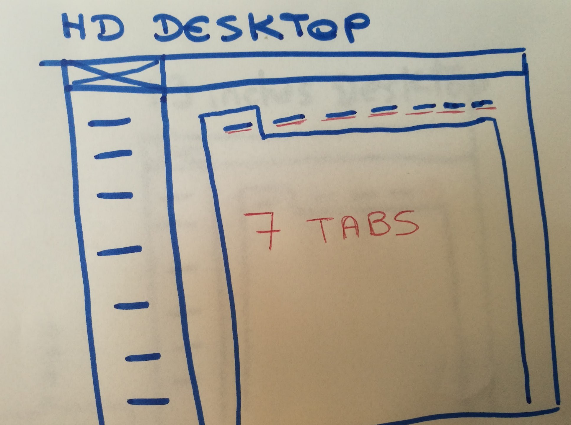
I'm actually working on an interface with a long tabs list menu (seven tabs. It's not so long in english, but in German version it begans to be complicated.

It works perfectly in HD desktop but in 13 inches this is a mess.

Here is a sketch of the interface elements : Header, vertical left navigation and the tabs-menu :

enter image description here

Have you any idea/advice of a good way to make this tabs responsive and efficient in any language?

THANKS A LOT

1
  • Have you considered placing tabs on two rows, in a way that tabs are not "merged" with the content pane but remain as standalone buttons above it?
    – drabsv
    Commented Feb 11, 2018 at 12:13

5 Answers 5

2

Congratulations - you have discovered one of the major challenges with Tabs :-)

One part of the challenge is based on how you construct the Tab (I am assuming this is HTML), e.g. if you use CSS to set the width of the tab you will have problems (it is better not to set a width and let the container adopt its width based on its text content).

If you are using jQuery you can see an example of responsive tabs and how respond to browser width here: http://www.jqueryscript.net/demo/Responsive-Scalable-Bootstrap-Tabs-Enhancement-Plugin-with-jQuery/

There are other types of grouping & organising UI metaphors, which might scale better, so you might want to consider an alternative design.

However, if you are sticking with tabs, there are ways to make them scale better but they might not be the optimal user experience.

1
  • Thanks for your answer! I've look at your link, it's an idea, but as you said, it's not an optimal UX. :/ Commented Jul 1, 2016 at 14:05
2

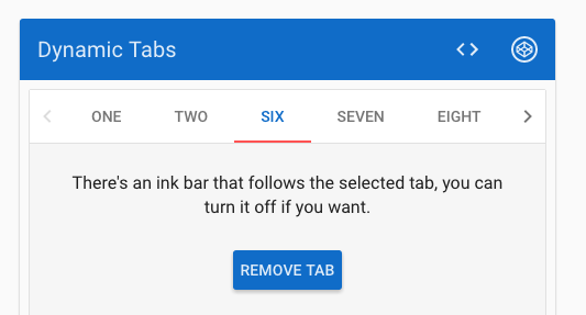
Thanks to a colleague at work I've finally found a solution :

enter image description here

The source link : https://material.angularjs.org/latest/demo/tabs

2

Lea, instead of low contrast for the first and last tab, you can hide arrows.

just my 2 cent, https://au.pinterest.com/pin/180284791312274083/ instead of showing complete tab, I hide half the first and last 'navigation tab' so that user can understand/curious there are more links. It is not a big issue, but just sharing an option. (*sorry for the link, i've old browser n not able to upload image)

1
1

Something that is commonly done is that if you want to use tabs, have it scale responsively down to a certain break point and then make the tabs become an accordion menu.

For example for mobile and tablet it would be an accordion menu and then above 768px it would break out and become an enlarged tab menu.

1
  • Yep, unfortunately I can't use this behavior here. Because it's a part of a back office CMS interface, wich already has a header and a navigation. So adding an hamburger menu would complexify to much the usability, and also, users need to see all the tabs labels. Commented Jul 1, 2016 at 14:59
0

I think This would be the best answer for you.

https://css-tricks.com/container-adapting-tabs-with-more-button/

1
  • 1
    You should add the main points of the linked website as an answer because the link may be broken in the future making this answer useless. Commented Jun 7, 2019 at 4:51

Your Answer

By clicking “Post Your Answer”, you agree to our terms of service and acknowledge you have read our privacy policy.

Not the answer you're looking for? Browse other questions tagged or ask your own question.