1

In a fast-paced environment (a desktop used by a store, to sell products), should I use a darker color as background for a Grid header, to differentiate the products and the header, or should I use the default WhiteSmoke [Header] + White [Itens]?

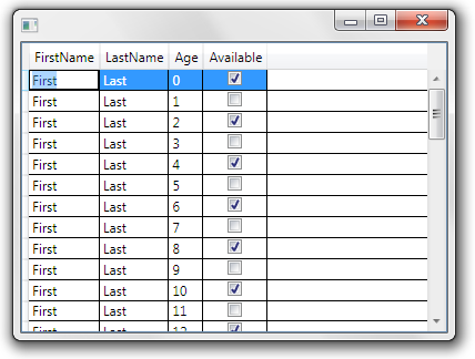
Basically, this: (the default style provided by WPF)

Default WhiteSmoke + White

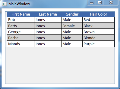
or this: (Not exactly the same color, size and font, but you get the idea)

Darker headers

Most of the cases, there will be more elements inside the same window, mostly text fields and buttons (all using a light shade).

1 Answer 1

1

In the first example ("white smoke"), the header row does not look very different from the rest of the table. On the other hand, this article about table design for good UX uses "white smoke" but with bold text.

In the second example, with the blue header row, the header row stands out much more. So I prefer the second one. This article from 2009 uses darker headers.

Most commentators agree that zebra stripes make tables much easier to read.

Also, I usually align the table header cell the same as the content that will be in its column (left for words, right for numbers) and so does this article about design tweaks.

Your Answer

By clicking “Post Your Answer”, you agree to our terms of service and acknowledge you have read our privacy policy.

Not the answer you're looking for? Browse other questions tagged or ask your own question.