2

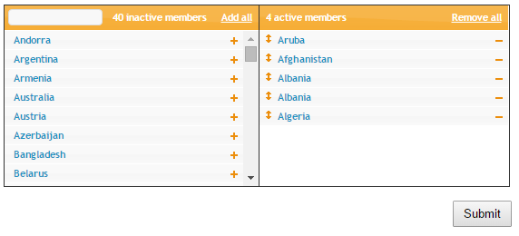
Given a web page with the classic "move items from a list on one side to the other", does it make more sense to have "active" on the left hand side of the screen? or the right?

While Submit Buttons on the Left or the Right? is similar in some respects, it addresses the placement of the submit button (which is on the left and is not at issue). This is wether "active" the active column should be on the left (and "inactive" on the right) or if "active" should be the right column. It is only expected that about 10% of the items in the 'inactive' set will be active at any one time.

If it makes any difference, this is for an internal website with an entirely American user base (not an international company, though the people using it are from a wide variety of cultures within the organization). There are no advertisements on the page, just this control that moves users from the inactive side to the active side.
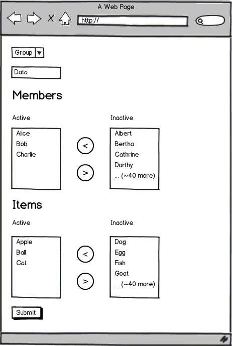
mockup

download bmml source – Wireframes created with Balsamiq Mockups

1
  • What is the purpose of the page? Is it to manage "Active" users or is it to "Activate" inactive users (post registration verification / activation as an example)?
    – Igorek
    Commented Nov 18, 2015 at 5:49

6 Answers 6

2

Put it on the right.

Most affordances have a progression from left to right.

As an American, we read left-to-right. In some sense, this means we have a natural progression. In this case, active on right would be correct.

Also consider that nearly all progression/sliders/scales have "off" on the far left and "on" on the far right. Computer volume scrollbars, page loading scrollbars, etc. All those have a progression from left to right as well.

Inactive --> Active is a fairly logical progression to map onto this sort of concept. Especially if your default state is "inactive" and you have to manually put everything in the "active" column.

Regardless of which you pick, I suggest making it perfectly clear on the UI. And even more importantly consistent in all your internal UIs.

0

It makes most sense to have the active list on the right. Consider that when a user first encounters this page, it is likely that the active list may be empty. However the inactive list would always have something in it. Of course I am assuming that a user might be 'adding' items of interest. If you feel the primary mental model would be 'removing' unwanted items then my answer might change.

So assuming there is a list for the user to read and select from. Then it makes sense to have the 'initial' list on the left. This supports a use case where the user must digest the list first in order to make an informed decision as to whether or not they should activate something.

0

Instead of 2 lists you can have just one with the active users and a separate page/menu where you can add to the active list. This lets you add more information for each user in the list.

That separate page for adding users could then have better sort, filter and search capabilities that a simple list would have. Which would be important if the number of users grows significantly.

To remove users you would add a checkbox for each user and a button with "remove selected".

0

Since Americans (mostly) read from left to right, the initial location of an item should be in the left column. So if people and items are initially inactive then the inactive columns should be on the left and some action would be needed to move them into the right column.

If things are initially in the active state then the left column should be the active column.

In other words: left column holds things in initial state.

0

enter image description hereA user-flow should be left to right inactive>Active>Submit in this case (moves users from the inactive side to the active side.). I would keep the user-flow consistent in the website.

2
  • Note the multiple left to right (or right to left) items along with additional other input fields. Please consider using the wireframe tool in the editor to help describe how you visualize all those fields to fit together.
    – user28531
    Commented Nov 18, 2015 at 2:11
  • I have added visuals. I hope that will help.
    – VB2001
    Commented Nov 18, 2015 at 2:53
0

Jakob Nielsen has researched this for the Nielsen Norman Group and discusses it in a post titled Horizontal Attention Leans Left.

His research confirms that not only do English users pay more attention to the left-handed content, but users internationally do as well. As someone has already mentioned, we read left-to-right, it feels like a natural progression, and most affordances already follow this pattern.

The question remains, however: does this mean your active content or your inactive content should start on the left. The answer is that whichever content upon which a user is acting should go on the left. If users are moving active items to inactive, the active column should go on the left. If users are moving inactive items to active, the inactive column should begin on the left. Either way the submit button should go on the far right.

This way the page gives a visual clue at what the action will be (an affordance, if you will). I am guessing that in your case users are moving items from inactive to active which would lead us to determine the optimal pattern for your interface would be Inactive>Active>Submit.

Your Answer

By clicking “Post Your Answer”, you agree to our terms of service and acknowledge you have read our privacy policy.