2

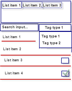
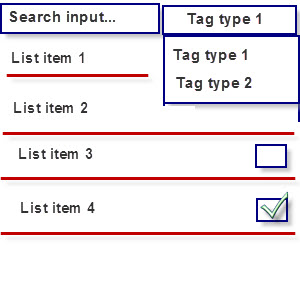
I have the current design of items selection like this:
enter image description here

A user can select multiple items from different tag types. The checkboxes allow multiple selections of items from the list. When Tag type 1 is selected from the spinner, one list is shown and a user can select several items from it. When switched to Tag type 2 - another list is shown and in the same way a user can select also several items from this list.

I need to show her the list of currently selected items and provide the ability to remove some. I have two ideas how to do that:

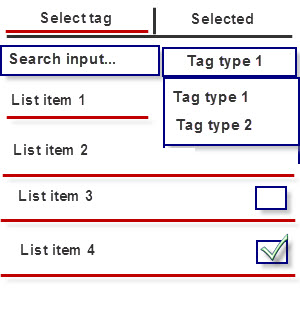
  1. Use tabs
  2. Use simple text field

Here is the first option:
enter image description here

Here is the second option:

enter image description here

Which is more suitable to my task? Maybe there's something that I haven't through of.

5
  • What are the checkboxes for? Assuming "List item x" is used for this as an example, how is that name being defined?
    – jazZRo
    Commented May 29, 2015 at 7:42
  • @jazZRo, the checkboxes allow multiple selections of items from the list. When Tag type 1 is selected from the spinner, one list is shown and a user can select several items from it. When switched to Tag type 2 - another list is shown and in the same way a user can select also several items from this list. Commented May 29, 2015 at 7:48
  • Thanks for the clarification. Maybe you can add it to the question because that is somewhat essential to know.
    – jazZRo
    Commented May 29, 2015 at 8:11
  • I think your interface is too complicated. Can you split the delete task to a per-list basis? I.e. the user can only delete items from the currently selected list. Or asking the other way around: Why do you think users would like to select items for deletion, then browse a different list while still retaining the previous' list's deleting selection?
    – kontur
    Commented May 30, 2015 at 11:42
  • I removed the android tag because it really isn't specific to that OS and updated the question with more relevant tags.
    – kontur
    Commented May 30, 2015 at 11:44

1 Answer 1

1

I think that you almost have figured out your answer.
From a usability perspective you have to show what the user can reach (tag names) but also provide feedback that he/she can select list items from others tag types.

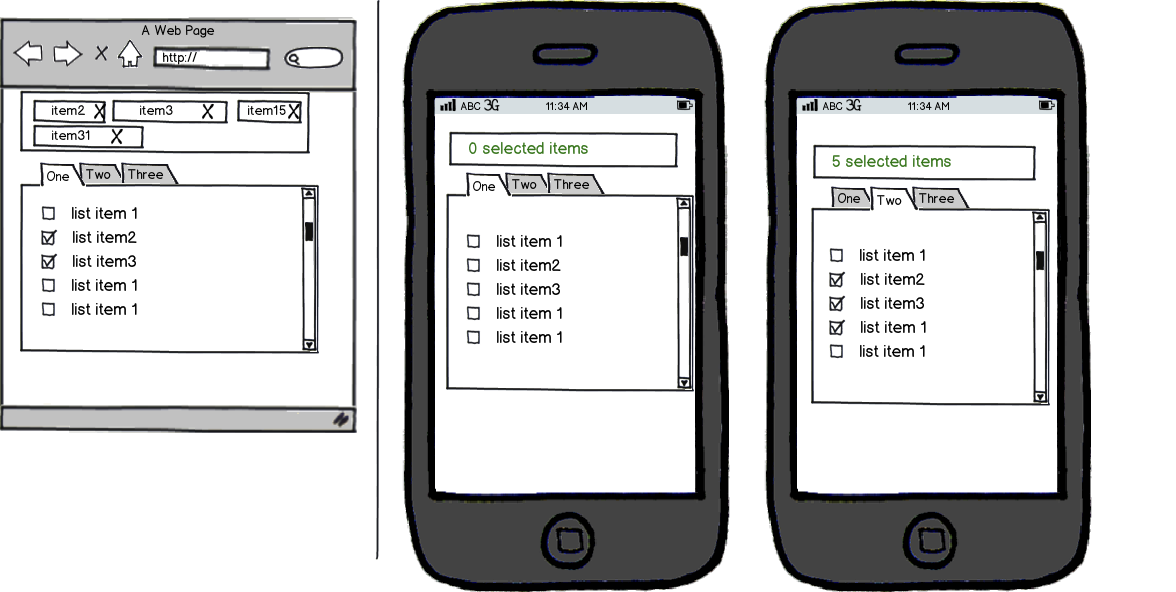
I think a combination of both would be great on large screens (a tabular table, and a space "selected items").
But on mobile we don't have so much space so you could use a selected items heading (the feedback) followed by tabs (the "what can I reach").

mockup

download bmml source – Wireframes created with Balsamiq Mockups

What is your opinion?

2
  • Thanks, I don't understand what's inside 0 selected items field on the right screen? Commented May 30, 2015 at 6:16
  • @Maximus I edited the above wireframe. If you can't see it, the first mobile has "0 selected items" and the second mobile has "5 selected items" (two from tab1 and three from tab2). With this text, we add an indicator that when the user switch tabs, his selections remain selected.
    – gpelelis
    Commented May 30, 2015 at 8:29

Your Answer

By clicking “Post Your Answer”, you agree to our terms of service and acknowledge you have read our privacy policy.

Not the answer you're looking for? Browse other questions tagged or ask your own question.