4

I'm part of a team designing a new website - I'm by no means the UX expert on the team but there are two clashes of 'philosophy' around how the user will access the content. It is primarily a resource website but we add new content each week.

On one hand one UX colleague says that we should encourage the user to click on one of the primary nav options (there are four) and then find the sub category they are looking for and a list of associated content on the next page after the homepage.

On the other hand, the other UX colleague thinks we should encourage the user to hover over one of the primary nav options and then select the sub category from a drop down menu, and maybe even the exact piece of content on the hover menu.

I think both ways are well intentioned - helping the user to get to the content as quickly as possible. But, I'm not sure which is best for the website. I am categorising and re-tagging some of the content soon so need some guidance.

Is one way better practice than the other?

2
  • 1
    Whenever I see the word hover, I think mobile. Commented Apr 19, 2015 at 18:05
  • For mobile you can not hover, therefore having a click will be better in long run.
    – Abektes
    Commented Apr 19, 2015 at 22:58

6 Answers 6

3

As you mentioned, both ways are valid and could work as long as each one is user-friendly. So, there is no right or wrong, but you want to know what works best. I guess that the answer can't be 'the first' or 'the second' so you have to test it. I would do a usability test in both versions to see which of the two versions is more usable.

However, I don't think that your goal should be "helping the user to get to the content as quickly as possible" but helping them to get to the content without requiring much thinking.

1

I'm currently in a similar situation. In my opinion it's actually not two alternative approaches, but more like adding an 'extra feature' to the main navigation – at least that's how the situation is in the project I'm currently involved in:

  1. main navigation + sub-categories on pages

  2. main navigation with sub-categories in hover + sub-categories on pages

So currently we're thinking of first going with 1) since that's also how the user knows the site from before the relaunch. Then we'll probably 'secretly' implement 2) for a group of registred test users and try to find out more about the pros and cons of that implementation.

With the team we have already been talking a lot about whether or not we should implement either of the approaches – but didn't come to any conclusion. Even 'responsiveness' and 'accessibility' can be achieved either way. So we'll first implement the pattern 1) that we know the users know already – and then eventually add the hover.

ps: one insight from another project: whether the sub-cotegory-hover is practical or not also heavily depends on how complex the sub-category list is. Some websites still feature long lists or huge layers that are impossible to use. So you should probabybly also take into consideration if the list of sub-categories is likely to grow over time, or not.

0

I think the second one is better, because it only uses 2 pages, while the first one uses 3, so the second one is faster.

2
  • 1
    Welcome to UX.SE. Your answers will be more useful if you would elaborate a little more. Speed is important but so is context. I can see scenarios where it would be useful to take the extra step but in so doing give the user more information in which to make a decision.
    – Mayo
    Commented Apr 19, 2015 at 5:03
  • How is the second necessarily faster? The number of clicks does not mean it is faster, on its own. Commented Apr 19, 2015 at 14:10
0

I think the UX challenge here is readability. From the description of your 2nd colleague's idea, it sounds like your content is small enough to fit in the hover. Without knowing what that content is, I can't comment on the appropriateness of placing content in navigation. My concerns with the 2nd option are: 1) as amount of content (and size of each piece of content?) grows, the main nav could become unweildy/unreadable; 2) finding content inside main nav doesn't follow any design patterns (that I know of) for navs; and 3) what happens when the type of content changes in the future, e.g., from text only to multimedia.

0

This is a great question, and it's very dependent on how complex the site is (categorically speaking) and your user-base and their needs. The real question that you'll want to be asking is not whether your colleagues feel one way or another is the correct path, but rather asking or looking at what your users are doing. Are they navigating to sub-categories directly and often? Or is it only a small portion of their behavior and they are predominantly using parent-categories? Does that user flow warrant having this behavior as a path? Data is your friend here and may determine what's best.

On the other hand, if you find that the data is fairly split it's a more tricky question as to what is the eventual path taken. You'll just need to explore the options then and see where things might be helpful in making a final determination.

0

Why not both?

onClick and onHover actions are not competing.

If there will be no difference between the subcategories you are showing in both approaches why not showing the dropdown menu and also add the "onClick" action to the primary navs options to redirect to a second page showing the categories?

I don't really see any drawbacks with this approach, the users will get where they want either way and won't get confused if the name of the categories are exactly the same.

I'd choose one or(exclusively) the other if there are:

  • Very few subcategories => On hover. It wouldn't worth a 2nd page unless in that page you show some extra information of those subcategories or "sub-sub-categories".
  • Too many subcategories => 2nd page showing them all on click. Although I may include a dropdown on hover if there are a group of around 4 most visited categories possibly ending with a "...see all categories" option which would redirect to the 2nd page (same action as clicking in the primary category on the nav menu).

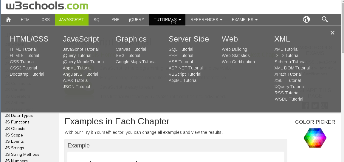
If you finally decide for using both or just the hover think about adding a arrow/triangle pointing down in the primary navs that have subgategories to show on hover. (example on image below)

The real dichotomy case:

Choosing what to do on click of the primary nav if there's no hover action.

In that case you would have to choose between:

  • Going to the 2nd page.
  • Displaying the subcategories under the primary nav. (arrow-poiting-down icon is a must here). This is the approach used by W3 Schools.

enter image description here

Your Answer

By clicking “Post Your Answer”, you agree to our terms of service and acknowledge you have read our privacy policy.

Not the answer you're looking for? Browse other questions tagged or ask your own question.