2

I'm making an internal-facing web-based interface for our corporate management platform. Users land on a homescreen with different applications available for them to then click on to use. (eg I can use Expenses and Scrum. Someone in purchasing can use Expenses, Purchasing, Accounts.)

For some users however there is only going to be one or two applications available for them to click on and use.

The early ideas I've had are very wasteful in their space, image one requires one extra click to get where the users needs to go which I dislike - it's also not come out in Balsamiq very well. Imagine the tabs occupying half the screen, other half is the info panel.

Image Two is a more traditional app store view, but again - it's far too sparse for such few apps.
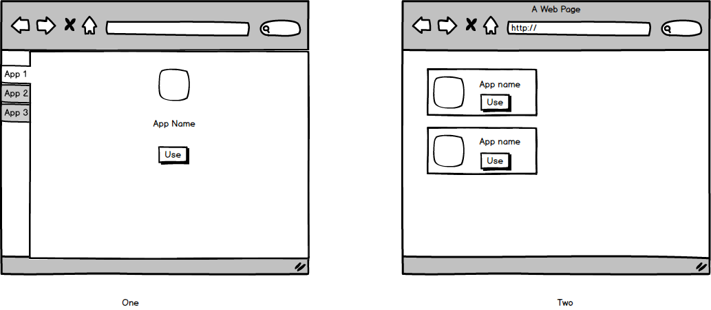
Early ideas

What sort of approach do you reckon I can take to display these app shortcuts to the user without making the shortcuts obstentiously big, or having 70% of the screen blank?

Thanks for any help.

1
  • 1
    There is not much you could do in case when there is only one or two app for user to use. So I could suggest that you make app selection screen more descriptive by adding app detail, developer, etc. Moreover, you could show user profile along with table of app for use.
    – nikhil84
    Commented Jan 30, 2015 at 12:30

1 Answer 1

2

You're running into a common problem with displaying content when there isn't yet a lot of content. However, it's less of a problem being a corporate site as you don't have as much risk of losing your customer.

If you approach the problem from a utility perspective, and ask yourself what will make the page / site more efficient for a user, I think you'll understand the problem differently. E.g. If I'm a user that needs to do X and you only show me two applications, both of which are relevant for me, then it's a better experience than showing me 20 applications where I only really need 2 of them.

Whitespace isn't a problem, it's one of the most under utilised design elements. Just structure your design around the fact that there will be whitespace in certain use cases. You can use the whitespace to emphasise the narrow number of options.

If however your primary concern is "does this look pretty?" or "does this look like the Apple or Android app stores?", then you're really concerned more with graphic design than with UX, and this then isn't the site to answer those questions.

3
  • Thanks for the insight, I only just got around to reading it properly. I can use this opportunity to include links to the most commonly used features of x app. I can then make each tile for an app larger, and pad it out with a bit more content. That's certainly going down the right route for making it easier for the user, do you agree?
    – gewh
    Commented Jan 30, 2015 at 19:10
  • Regarding the final paragraph, I am not trying to convince a user to click on either one of these apps, like iOS's or Android's do, they click on these apps because they have to. So I'm trying to make this so they spend as little time as possible using it.
    – gewh
    Commented Jan 30, 2015 at 19:18
  • 1
    @gewh I don't see why you need to change how you display an app if there are two or there are twenty. If there are fewer, there is just more whitespace, but that isn't necessarily a bad thing.
    – JohnGB
    Commented Jan 31, 2015 at 0:27

Your Answer

By clicking “Post Your Answer”, you agree to our terms of service and acknowledge you have read our privacy policy.

Not the answer you're looking for? Browse other questions tagged or ask your own question.