0

I'm working on an iOS app that lets users download and watch video content. In the playlist section I'm trying to find a way to clearly show what titles are being downloaded, and which ones have been fully downloaded.

Are there any existing solutions you like? Or any best practices you'd suggest I use?

Thanks!

-J

5 Answers 5

1

Summarizing the answers being provided, I think it is best practice to try and separate the actual item that you are trying to download and its status. That is, you would not use anything other than the text for the title, and you can choose from a number of different strategies to indicate its status:

  • Icon to show download status, possibly including animation if required
  • Progress bar to show status and progress (if it is discrete)
  • Text label (possibly a lozenge style) to differentiate from the title
0

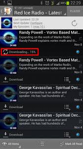
I like how BeyondPod does it when you download podcasts. Amazon music app shows downloaded files under 'Recently downloaded' section

enter image description here

0

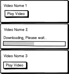
Not sure what your interface currently looks like but maybe something like this could work.

mockup

download bmml source – Wireframes created with Balsamiq Mockups

0

iOS 7 & 8 do this with the new clock circle progress widget. You can see this widget in the AppStore when you upgrade an app, or download one from the cloud. Each app to be upgraded has an "upgrade" button next to it, while each app in the cloud has a "cloud" icon button. You can also see it in the Music app, if you have songs in the cloud.

When you tap it, the button is replaced by a small blue rounded-corner square surrounded by a larger thin blue circle. This serves as both a progress indicator as well as a cancel button. While it is attempting to connect to the cloud server, a small gap rapidly travels clockwise around the thin blue circle. Once the connection has been established and the download has commenced, the gap is closed and the circle remains steady. As the download progresses, the blue circle slowly becomes thick in a clockwise direction, indicating progress, and the user knows the download is 100% complete when the circle is completely thick around all 360 degrees.

After the download is cataloged and ready for use, the AppStore replaces the icon with an "open" button, while the Music app replaces the icon with the song length. The AppStore also moves any upgraded apps from the "Upgrade" section to a new section titled "Updated".

You could apply this to your app. Place a cloud icon button next to the media title. When tapped, change to the downloading clock circle widget to indicate the progress of the connection and subsequent download. When complete, change it to a "play" button, or the media duration, or a thumbnail of the video, or whatever.

The interface was intuitive enough that I was able to understand what was happening without being informed of how it works. And as it should be recognizable to any iPhone owner, it would probably work well for you, too.

0

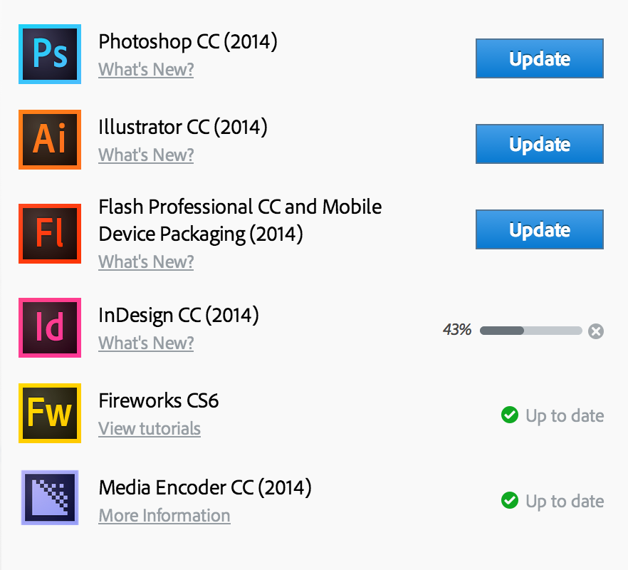
First of all, items that are being downloaded now should not be clickable/available for launch/viewing. This temporal unavailability should be signified by item's content (title, caption, image etc) and background greyed-out and the cursor that doesn't change when hovering this item. Second, there should be a progress bar displayed.

This is how Adobe is dealing with such a list in MacOS. Note the minimalistic layout that is really beneficial for mobile environment.

enter image description here

Your Answer

By clicking “Post Your Answer”, you agree to our terms of service and acknowledge you have read our privacy policy.

Not the answer you're looking for? Browse other questions tagged or ask your own question.