12

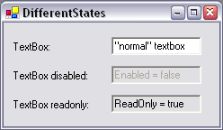
I currently develop some forms in a desktop application. There is the idea to use placeholder texts in some input fields (edits) as known from HTML forms or touch systems like smartphones. But comparing an edit with placeholder text it looks very similar to a disabled edit with text in it - both have gray text on white background. Only the border looks different - black in an editable field with placeholder text and gray in a disabled field.

Are the any conventions or rules for using placeholder text in desktop systems regarding the look of disabled edits?

2
  • 3
    Consider not disableing the inputs at all and instead presenting them as pure text. The user can't change their content anyway, so why presenting her an input, if it's actually not? Also idea for distinct placeholders and disabled (even when i'm against disabled): Put placeholder text in brackets and if possible with an example: "(i.e. Chicago)" Commented Aug 14, 2014 at 14:58
  • Is it an instruction or a default value
    – paparazzo
    Commented Aug 15, 2014 at 21:55

3 Answers 3

16

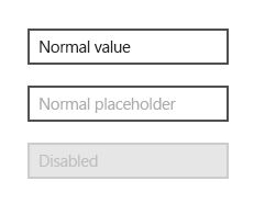
Generalising between platforms I would go with the following basic guidelines, they further emphasise a disabled field with a grey background.

Normal (with a value)

Black text, white background, black border.

Normal (with a placeholder)

Grey text, white background, black border.

Disabled

Grey text, slightly lighter grey bg, grey border.

E.g.

enter image description here

5
  • 9
    I would make the placeholder italic.
    – nwp
    Commented Aug 14, 2014 at 12:36
  • 2
    @nwp Isn't italics typically used to add emphasis?
    – Ben
    Commented Aug 14, 2014 at 15:28
  • @Ben I don't know, I am just a developer trying to learn some UX. This was on impulse. I may have been influenced by windows cue banner.
    – nwp
    Commented Aug 15, 2014 at 7:41
  • @Ben it's also used to indicate "meta" or "context" text in some forms of publications. For instance in theatre transcripts actors' movements and events on the stage are recorded in italics and actors' lines in normal fonts. Commented Aug 15, 2014 at 18:24
  • @Ben The italics would serve to further differentiate the placeholder text from a normal value so it would be easier for the user to distinguish it. Fewer possibilities for confusion is always a plus. Commented Nov 4, 2014 at 20:22
7

In most cases, forms are made of native elements and the look and feel is therefor (ideally) determined by the operating system. Mac OS has a different way of showing something is disabled if you compare it to windows. Here are two text fields of Windows XP and Mac OS X with native behavior:

different text boxes windows XP vs. different boxes mac os x

I would advice you not to change this behavior for several reasons:

  • People are used to their operating system and the visual language it uses. Changing this would add cognitive load.
  • Different versions Windows have different ways of presenting forms. Using the default libraries for your GUI guarantees proper working between the different versions. For example: if you change something for Windows XP, what should happen with Vista or Windows7? Same count for OS X Yosemite and earlier versions of Mac OS.
  • Not using the standard elements can make elements feel weird to the user. This can be caused by subtle differences in color, response time, rollOver behavior and a lot more.
  • If you decide to choose for custom input field, be aware that there must be a custom input field for every operating system you want your app to run if you want to maintain a uniform look 'n feel.
1
  • Ruddt, although I love how you emphasize the native look and feel of the OS's, I don't feel like your answer addresses the actual question, as to whether there are conventions or rules about using placeholder text in those UIs. Commented Aug 18, 2014 at 20:26
6

Some things I have seen done before in this scenario:

  • Make placeholder text green instead of grey (user input is in black)
  • Placeholder text is in italics (user input is in normal text)
  • Put angle brackets around text, eg. < your name here >. (This one is somewhat "technical", i.e. something a programmer is more likely to understand)

I would suggest that the key to making sure a user understands that the text is placeholder text is the content of the text itself.

You are normally using it to give instructions on what to type in the field.

For example, if you have a name field containing placeholder text, it is better that the text says Enter your name..., rather than just saying Name.

Your Answer

By clicking “Post Your Answer”, you agree to our terms of service and acknowledge you have read our privacy policy.

Not the answer you're looking for? Browse other questions tagged or ask your own question.