1

I am currently working on a system to manage debt, specifically account history. There are various statuses that an account can sit at and the product owner has requested an icon for each status, so that the user can determine the account status at a glance.

As users of this system will be spending many hours every day with the system I think this is a reasonable request, but I have one sticking point.

I cannot think of a tasteful icon to indicate that the account holder has died. Suggestions offered around the office have included a tombstone, a scythe, dove, and an inverted cross surrounded by a pentagram.

Any suggestions?

2

4 Answers 4

3

Sometimes in English, an asterisk is used to denote birth and a dagger (†) death. It's often used in genealogy with dates (e.g.*1918–†1993).

Wikipedia says this typographical symbol is not to be confused with a cross, but I could forgive the association. So that would be an aspect to consider if you decide to employ it.

Ultimately though I don't sliver the symbols meaning has enough currency to use on its own. You may want to include complementary information like a title-text to display "deceased" on hover.

Update I should probably be more emphatic about the implied Christian overtones, even if it typographically a dagger is different from a cross. This may be a convention whose time has come. Looking at Ancestry.com, they don't use symbols, just year of birth and death if deceased.

Could you maybe just have "Ann Smith (1918-1993)" with the dates next to the account holder's name? It implies the customer's demise and provides context, without either hitting you over the head with "This person is dead" or using an icon that may cause cultural issues.

1
  • I've seen that symbol so many times on the web or in papers and I always thought it was a cross. Commented Jul 10, 2014 at 10:56
3

This is indeed a tough one and very culturally diverse. So adding text would be a good way to be clear. I live in Istanbul, a cross-like icon would not be very well understood here. I would suggest a black icon to be used next to a tag: (ribbon) Deceased.

black ribbon

1

If it's an internal system you're designing for, I assume the user just needs to carry out a task/get a quick overview, so the icon perhaps doesn't need to be rich in emotional value, if that makes sense. Though it might seem boring/insensitive and not immediately intuitive, a simple 'D' for 'deceased' in a circle, with a neutral or no colour (and a hover-over spelling it out for them), could be an option.

0

I guess that any icon that would be specific to a certain religion should not be used, even though they might be clear.

I searched for 'funeral home logo' on google to get some inspiration and the most you see is a bird, a carriage or some form of wheat. All seem strange to me as an icon, unless you are tweeting somebody is dead.

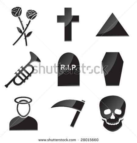
Personally I would go with a rose, as I cannot think of another meaning for the icon. But only if it's next to the label, not on it's own.

I guess the only clear icon on it's own would be a tombstone, but feels wrong to me.

Update: I like the top left one on this image

enter image description here

3
  • Things like tombstones make me very uneasy. I am considering giving each status an alias (a 2 letter abbreviation) and adding them to my icon set. Commented Jul 10, 2014 at 10:01
  • As the link posted by Benny clearly shows, most people think its a bad idea to have an icon. But if your product owner demands icons for all status, you might convince him that the absence of an icon (or blank icon) is just as clear for deceased. Commented Jul 10, 2014 at 10:04
  • 2
    (looks at roses) Oh cool! This application tells me when it's my customer's wedding anniversary. Let me send her and her spouse a note of appreciation. (later) Oh. ;) Commented Jul 10, 2014 at 11:22

Not the answer you're looking for? Browse other questions tagged or ask your own question.