25

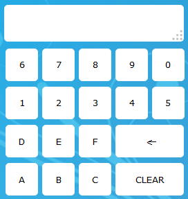
I am to design a web-based, on-screen keyboard for a touch interface. Users will only need to input 0-9 and the letters A-F. In addition to this, they need a backspace, and possibly a "clear" button. So, I have begun toying around by modifying this keyboard by Vasili.

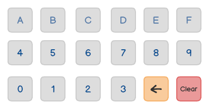
My first proposal was this:

Hexadecimal Keyboard Interface 1

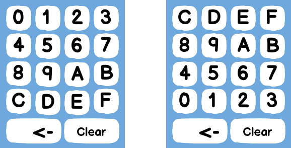
Which has an unnecessary dash and a space bar that is there more for tradition and coherence than anything else. So I decided it was not good enough. In removing the dash and the space bar, I would be left with 16 buttons, plus backspace. Now, 16 is pretty neat for ordering things, but 17 isn't. So, in adding a "clear" button, I thought of arranging the hex characters in a 4x4 pattern, and then having bigger "removal" buttons underneath:

Hexadecimal Keyboard Interface 2

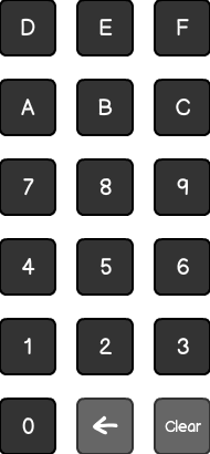
But this still doesn't feel right! In particular, because mixing letters and numbers seems confusing. So then I thought: What if I put numbers on 2 rows of 5, and then add removal buttons onto one letter row of 3 each? And this is probably the one I'm the most satisfied with:

eHexadecimal Keyboard Interface 3

But I should probably flip the order, right? Starting the top row with 1, 2, etc. and the third row with A, B, etc.

Anyone else have a better idea?

7
  • 11
    I realize the need to restrict the characters used, but are any of these really better than a full keyboard for most users? Will anyone type enough on these keyboards to gain any fluency?
    – JeffO
    Commented Jun 5, 2014 at 10:48
  • That's a valid point, I guess. Users will typically use the keyboard to type in booking numbers of ~10 characters. My thinking on restricting the size is of course to not clutter the UI. But I guess it might not feel much like cluttering to a user, as a keyboard is a very commonplace input device, so to speak. Commented Jun 5, 2014 at 10:55
  • Can I ask who your users are? Will they be using this keyboard often enough to get familiar with it? Commented Jun 5, 2014 at 13:18
  • @vincebowdren the platform will be used by a variety of vendors. But the typical use case is a person who is to retrieve a booking for some sort of event. So few users will use the keyboard more often than once every few weeks. Commented Jun 5, 2014 at 13:27
  • 8
    The order is 0,1,2,3,4,5,6,7,8,9,0,A,B,C,D,E,F. Your second example is all over the place. The third one would be OK if flipped to 12345/67890/ABC/DEF as you suggest. But I like renaud's answer better. Commented Jun 5, 2014 at 16:26

11 Answers 11

63

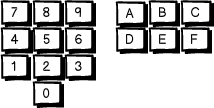
Why don't simply improve the standard numerical keyboard by adding the missing characters ?

mockup

download bmml source – Wireframes created with Balsamiq Mockups

11
  • 8
    Yes. Definitely keep the digits 0 to 9 in the "right" (calculator-style) order with zero at the bottom. Commented Jun 5, 2014 at 13:59
  • 1
    I'd keep the 0, backspace and clear on the bottom, numbers in the same order, but then swap the letters. ABC on the first line, DEF on the second line. Commonly I've seen letters top to bottom, numbers bottom to top.
    – Jem
    Commented Jun 5, 2014 at 15:38
  • 34
    @JackMcE No,no,no! This one gets my upvote because in addition to retaining the normal layout for the numbers, it is one of the few that has a consistent order for all 16 digits! Start at 0, then left to right, bottom to top. All the others are making my eyes hurt! Commented Jun 5, 2014 at 16:18
  • 2
    +1 There's something to be said for extending a familiar design (a calculator or numeric keypad) layout, rather than inventing something totally new. Note that if it was more important to extend a telephone keypad (1-2-3 on top, with 0 in not in numerical order), it's not clear how you would want to lay out 0 and A-F. The "tallness" of the layout is a bit of a concern, but I think the basic familiarity outweighs that.
    – Phil Perry
    Commented Jun 5, 2014 at 18:44
  • 3
    A is the next "digit" after 9 so in numeric keypad order it should be in the row right above nine, as Renaud has put it. Do not put ` A B C ` in a row with ` D E F ` below it. +1
    – Stephen P
    Commented Jun 5, 2014 at 19:17
28

You say the keyboard is for hexadecimal input. And that's the reason why your second try doesn't feel right! As @steveverrill also noticed in the comments, the numeric order ABCDEF1234567890 is wrong. So if you want to go with a 4x4 layout, you should choose one of these:

mockup

download bmml source – Wireframes created with Balsamiq Mockups

9
  • The first one. Definitely. Commented Jun 6, 2014 at 3:23
  • @steveverrill: Yeah, probably. Because it's easier to detect the arrangement pattern? I wasn't sure why in the "standard numerical layout" the smaller digits were on the bottom.
    – Bergi
    Commented Jun 6, 2014 at 3:25
  • Either Renaud's extended keypad (if the users are expecting calculator-style input) or your first one (if they aren't).
    – Mark
    Commented Jun 6, 2014 at 6:34
  • @Bergi smaller digits are more likely to occur in many empirical data sets (Benford's Law), an effect that is only increased by rounding. Putting the smaller digits closer to the bottom of a calculator might be a way to reduce hand travel. This is supported by the fact that on most calculator layouts the common operators trend towards the bottom (= usually being right at the bottom-right). Commented Jun 8, 2014 at 16:56
  • I think the second one is easier to get used to, mainly because that is the layout that a regular keyboard numpad uses.
    – Seth
    Commented Jun 9, 2014 at 2:59
18

So, as I was writing a couple of pretty long comments on the other answer, I felt inclined to present it as an answer as well. Following are a couple of considerations not made by the other major designs and mockups implementing these considerations:

Mobile virtual keyboards shapes

Notice the shape keyboards take on mobile devices on the mockups drawn below:

mockup

download bmml source – Wireframes created with Balsamiq Mockups

Any designs have to work in the restrictions of virtual keyboards. Now in this specific case the top whitespace may be a bit smaller, but still, the basic limitation still applies which rules out extremely tall designs for example.

Rotation lock

Getting to the second point, mobile web apps can not limit the orientation. One could possibly do the following (as showing different content based on rotation is easy)
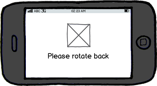
mockup

download bmml source

But I hardly believe anybody here would consider that proper UX design. In other words, we actually need two keyboard layouts: a portrait one and a landscape one.

Normal users vs Programmers/Mathematicians

So, programmers will know about what hexadecimal codes are, normal users on the other hand will not. This is absolutely crucial, because it means the 'numbers' A to F should not be treated as numbers, but rather as letters. And letters are traditionally ordered alphabetically. Any design treating A-F as a continuation after 9 will only look good in the eyes of people aware of it's mathematical meaning, and from the question I understand that the users in this case are normal users entering a code that just happens to be hexadecimal.

Portrait mockup

So, implementing those ideas gives something along the lines of (please note, this is just a possible implementation, some of the other implementations are just as valid, the main point of this post is the theory):

mockup

download bmml source

I made two designs as I was torn between putting the letters and [ok] button to the left or right. The phone is held primarily in the right hand, so entering with one hand the numbers will be used more often than the [ok] button, but [submit] and [enter] like buttons tend to be to the right on desktop systems. Now I do believe that breaking this on mobile is within reason, but I am not sure it's worth the second look it will take.

Landscape mockup

As with the above design the backspace and ok button could be mirrored to the other side, but at least it gets the concept across:
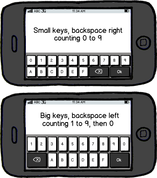
mockup

download bmml source

Additionally I was torn between whether to start or end with the zero. Once again on traditional keyboards the zero comes at the end similar to the mockups, but when presented without the rest of the keyboard a strong argument could be made to count from 0 to 9.
3
  • > mobile apps can not limit the orientation Actually, it's certainly possible (on Android, Windows Phone and iPhones) for apps to simply disable rotation, or even specify a different orientation from the default. This means that you can design your layout for any single orientation without worrying about others if you don't want to. "Please rotate back" is a terrible solution unless you have no other options.
    – Bob
    Commented Jun 9, 2014 at 15:01
  • @Bob: We are talking about mobile web apps here, not sure why in the wide world you're trying to make a point by referring to the documentation for native apps... Commented Jun 9, 2014 at 16:26
  • Yea, sorry, forgot it was about webapps (was thrown off by your mention of mobile apps). You are correct there.
    – Bob
    Commented Jun 9, 2014 at 23:07
16

Based on Renaud's idea of extending the standard numeric keypad, but wide instead of tall. Also illustrating that it's OK (even beneficial) to leave space between groups of keys.

+--------------------------------------------------+
|                                                  |
+--------------------------------------------------+

+-------+-------+-------+  +-------+-------+-------+
|   7   |   8   |   9   |  |   A   |   B   |   C   |
+-------+-------+-------+  +-------+-------+-------+
|   4   |   5   |   6   |  |   D   |   E   |   F   |
+-------+-------+-------+  +-------+-------+-------+
|   1   |   2   |   3   |                        
+-------+-------+-------+  +-------+-------+-------+
        |       0       |  | DEL.  | CLEAR | ENTER |
        +-------+-------+  +-------+-------+-------+
3
  • This get's my vote because it keeps both the the numbers and letters in a familiar pattern, it keeps them in numerical order (sort of, if you go up the left column then down the right column), and it's horizontal.
    – mcrumley
    Commented Jun 5, 2014 at 20:11
  • (No vote) but I don't like seperation because I worry someone might think that they could type 10 on the keyboad for 10, (ie that the ABCDEF are optional). (as we know 0x10 is 16) Could you improve your answers by either justerfying this risk, or by saying it won't happen because X (eg only experts would be in this mode) Commented Jun 6, 2014 at 1:50
  • 1
    @Oxinabox the OP's application is entering booking codes, which just happen to be hexadecimal numbers (many users won't even notice they are hexadecimal.) So I don't see the problem. Note that on the Windows calculator (see Halfwarr's answer) the letters and numbers have a different appearance, which I think helps, not hinders. Commented Jun 6, 2014 at 13:46
11

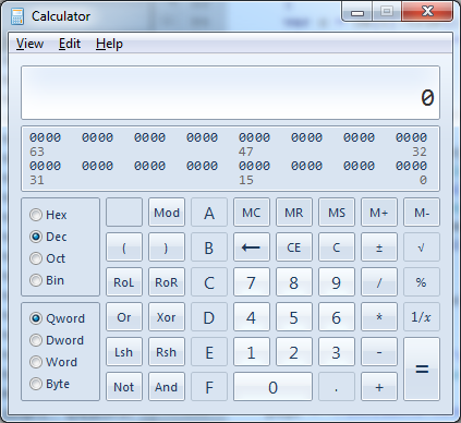
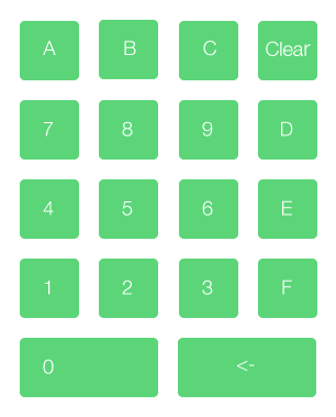
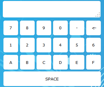
Personally I like how the Windows Calculator does it:

enter image description here

I understand this does have extra keys that you do not need, but I do like having the letters in alphabetical order to the left of the keys. This also does not change the expected behavior for a keypad.

1
  • The idea here seems to have been to extend the standard calculator (rightmost five columns) by adding 3 columns to the left. I like the fact that the numbers are in the "normal" arrangement. Then again I may like this because I'm already used to using it. Commented Jun 5, 2014 at 16:30
9

I noticed myself having to actualy search where were the numbers on your last two design.

I would definitely choose a design where the numbers are ordered and not mixed with letters.

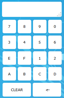
Here is my attempt:

Hexadecimal keyboard mockup design

Here is another one, inspired by the default Windows calculator.

+-----------------------------------------------+
|                                               |
+-------+-------+-------+-------+-------+-------+
|   A   |   D   |   6   |   7   |   8   |   9   |
+-------+-------+-------+-------+-------+-------+
|   B   |   E   |   2   |   3   |   4   |   5   |
+-------+-------+-------+-------+-------+-------+
|   C   |   F   |   0   |   1   | DEL.  | CLEAR |
+-------+-------+-------+-------+-------+-------+

I recommend distinguishing visually the letters from the numbers with this design (different background or font color), like the Windows one. But still, I find the first one more readable.

Edit: Added a picture made with balsamiq re-using @Renaud file

3
  • 2
    Your first one is the second best here (the best one being Renaud's) It has a couple of advantages: it's wide instead of tall, and it has all the letters in order. Colouring the numbers differently from the letters and del/clear would be a further enhancement. I don't like the second one at all. Commented Jun 5, 2014 at 16:37
  • @Renaud's design has the advantage of keeping the same digit order as the numpad, that's nice ! But i really find the keyboard too tall. Plus, as JackMcE noticed, some people prefer a different order for letters. I really like the first one I made: easier to implement in a UI thanks to its horizontal look and keeps the number/letters organized.
    – refreshfr
    Commented Jun 5, 2014 at 19:38
  • Could the two downvoters explain why they think my answer is wrong? Please be constructive so I can improve!
    – refreshfr
    Commented Jun 9, 2014 at 20:55
8

For what kind of screen is the interface? You say touch, but that can mean a multitude of things. For example, on a smartphone, a square-ish keyboard may be acceptable, but on a tablet you want the width of the keyboard more than the height.

For a wide keyboard, I like steveverrill's idea (not enough points to upvote...), but I would tweak it a little bit like this:

+-------+-------+-------+  +-------+-------+
|   7   |   8   |   9   |  |   A   |   B   |
+-------+-------+-------+  +-------+-------+
|   4   |   5   |   6   |  |   C   |   D   |
+-------+-------+-------+  +-------+-------+
|   1   |   2   |   3   |  |   E   |   F   |                      
+-------+-------+-------+  +-------+-------+
| DEL.  |   0   |CLEAR  |  | Possibly Enter|
+-------+-------+-------+  +-------+-------+
1
  • Have an upvote for some more reputation ;-) I do think an enter key is a great advantage, for the reason I mentioned in my comment on the question. Commented Jun 6, 2014 at 10:10
5

Warning: Unsubstantiated non-expert opinion ahead.

You say hexadecimal keyboard in your question, but your users are not actually doing calculations with these numbers, or even really thinking of them as numbers at all: they’re booking references, merely alphanumeric codes. They just happen to be alphanumeric codes which use only the first six letters of the alphabet.

The idea of expanding a numeric keypad to include the hexadecimal digits, as suggested by Renaud, would probably be excellent for people actually working with hexadecimal calculations, but for people merely typing in letters and numbers, I would keep the letters and the digits distinct. The wide layout suggested by steveverrill seems the best for your use case: the numbers are in the standard layout of a numeric keypad, with which everyone is familiar, and the letters are separate and easy to find (there are only six of them, after all).

If you need a tall one, perhaps put the letters above the numbers, in a layout like Renaud’s, but separate the two with a gap, and perhaps a change of colour.

3

I have two points to note about your layouts:

I. People are used to the existing decimal numpad layout for numbers, and I would not miss the opportunity to give the users the satisfaction of feeling familiar with this:

mockup

download bmml source – Wireframes created with Balsamiq Mockups

II. Trying to force the extra characters in is not necessarily the best solution. I would try to group them in a way that makes them quick to use on their own.

Keeping with the "standard" of the numpad, two rows of three seems like the obvious choice for me. Also for some reason I want them to the right of the numpad, sort of giving them equal importance with the familiar numpad taking a little presidence.

The result is then:

mockup

download bmml source

3

A few constraints arise that direct our design:

  • We want the number keys to be in the same order as we're all used to them being in.
  • The keys should be located as close to each other as possible so that fingers travel the shortest distance when using the keypad.
  • The 'clear' and 'backspace' keys should be located away from each other so that the user traverses a different qualitative direction to access that particular functionality.
  • The 'clear' and 'backspace' keys should be located at outermost points (corners) to minimize accidental pressings.

With these constraints I've mocked-up a design comp that should fulfill your needs.

Hex Keyboard Mock-Up

I also think that a valid design could be moving the 'Clear' button to the top left so the top row reads "Clear, A, B, C". Depends on which you like.

2
  • I don't have enough reputation to comment on the main post yet so I'll comment here. @ChristoferOlafson: There are a couple questions I have about the design intended that would help us decide which (if any) of the current designs are appropriate: --- Interestingly, no one has reproduced the fact that you have a 'read-out' at the top of your hex calc mock-up. Is that a necessary aspect? --- Are there further refinements of the interaction regarding the 'touch' requirement? Should the Webapp work on all touch 'modes'? (ie. Phone portrait/landscape, tablet portrait/landscape.) or a subset?
    – reor
    Commented Jun 10, 2014 at 21:57
  • --- I suppose the larger question that would help greatly is: What is the application context in which the hex calculator is intended to be used? How much other information must be easily visible while the calculator is active?
    – reor
    Commented Jun 10, 2014 at 21:58
0

Would it be possible to make the keys look like this... 1, 2, 3, 4, 5, 6, 7, 8, 9, A/10, B/11, C/12, D/13, E/14, F/15, 0/16 I use hexadecimal dice, and this would be helpful in my app.

2
  • 1
    Can you do a mockup so we can see what you're suggesting?
    – JonW
    Commented Oct 8, 2015 at 13:40
  • These are alphanumeric booking references: no calculations are being done, and in the minds of the users, they aren't numbers at all. As such, any association between F and 16 is purely in the mind of the programmer: there is no need to show this to the user. It would only confuse them.
    – TRiG
    Commented Oct 13, 2015 at 9:06

Your Answer

By clicking “Post Your Answer”, you agree to our terms of service and acknowledge you have read our privacy policy.

Not the answer you're looking for? Browse other questions tagged or ask your own question.