4

In our application the user can add entries (like materials) and add names for multiple (between 2 and 20) languages.

For example:

  • Wire (en)
  • Draht (de)
  • Fil (fr)

In our case english is always the base language and should always be visible when entering a translation, also when no translation is found the english name will be used in other parts of the application.

What is the user friendliest way to enter something like this?

I've thought about a grid, but this would probably not be the best solution when there are more languages.
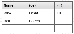
Translation Grid

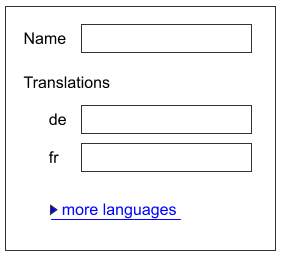
Also two other alternatives I came up with:
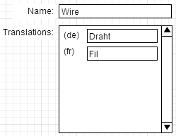
Translation List

Translation ComboBox

Which is they way to go? I'm also very thankful for every other suggestion to solve this!

4
  • Is there a predefined number of languages that user must translate in ?
    – Nash Vail
    Commented Jun 2, 2014 at 14:52
  • The user is only required to enter an english translation (and he probably will enter his mother tongue if it's available), also the translations will most likely be entered by different users later.
    – Staeff
    Commented Jun 2, 2014 at 14:59
  • Who is the user? Developer, translator, manager? What is the process that company follows, from creation of string to completing all translations? Your UI seems wrong for me because each user is almost always comfortable only with 2 languages (English and user's native language). Therefore once user selected in his profile those to languages, show him only the languages he know. Commented Jun 3, 2014 at 19:14
  • Also, have a look at Getlocalization.com project. Their UI is far from perfect, but you can grab some ideas. Like the idea, that creating strings and translating is something, that would be done in a different time by different people. Commented Jun 3, 2014 at 19:18

2 Answers 2

1

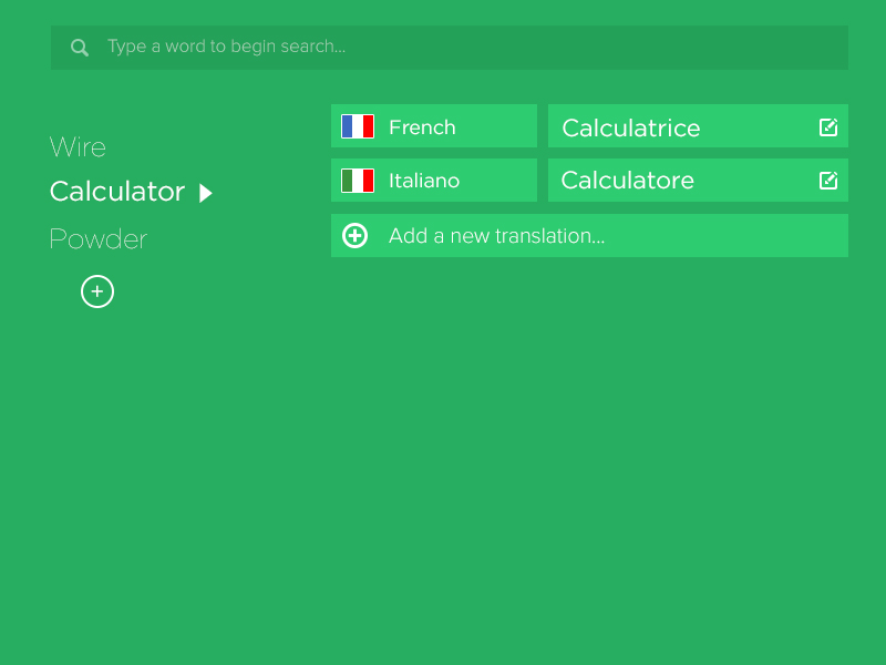
At first the application should start by asking the preferred language or more possibly their mother tongue (base language). Once entered the application should allow the user to add new words and translations and also suggest edits to already available translations if they discover an error . I have cobbed up a simple interface in photoshop .

Language translation interface

Whole interface is separated in two vertical columns after the search field, which are vertically scrollable. Users can look for already entered words . Clicking the edit icon will allow user to make suggestions if they discover errors. Hope I make sense.

0

As the translation task has separate task space (window), I'd not recommend using dropdown control, as

  • it requires more efforts for entering translations -- not so efficient
  • it has quite limited real estate, so scrolling is needed -- not so usable
  • it doesn't consider a person's knowledge of limited set of languages -- not so smart

.

I think of more smart interaction:

  • first time you display all the available languages. User enters translations for some language
  • next time system learns the user and proposes him limited set of languages. Still user has control to choose other languages
    enter image description here

This approach eliminates information overload and makes it clear and simple to add translations for known languages.

Other improvement could be using machine translation services. So users mostly validate machine translation, or correct it, only if needed. This requires less efforts for the task.

Your Answer

By clicking “Post Your Answer”, you agree to our terms of service and acknowledge you have read our privacy policy.

Not the answer you're looking for? Browse other questions tagged or ask your own question.