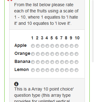
I'm working on a survey web site, which I already have a responsive design. Survey questions are sometimes array type, that options are columns, and questions are rows.

As you can see in the image above, the questions radio buttons have very small spacing in between them. There will be a small number of questions (rows), so I think users will be able to find which radio button belongs to which column, but it's still difficult to use IMO.
It seems I can get some screen real estate by removing the padding and margin around the question (green lines), which are 15px each.
- Will it make difficult for users to use the site in a mobile ? If the radio button appeared too close to the physical edge of the mobile screen, will it make difficult to use the site? Is there any thoughts you might have to suggest (use at least X pixels/percentage) as a margin to the screen edge for example ?
I know I could go for a rating widget or select lists in this case. I'm just trying to offer as much as question types possible to the client instead of limiting the options. He's good with the ideas so he might not use such 10-option arrays at all, but I'm still looking for some thoughts on the margin with the screen.
