2

I am designing a form which requires the user to set a long list of parameters and a value. Each entry in the form can have any number of parameters, though some do have typical values.

In the past I would do this by creating two text boxes next to each other with a + sign that allows them to a new line. However, this feels to me like there should be a better way to do this. A more user friendly way.

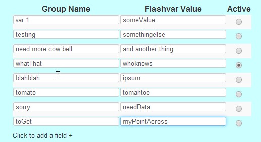
Here is an example of what I would normally do. But I really don't like it. enter image description here

Edit: Here are the issues I have with the current design:

  1. It takes up too much space, both horizontally and vertically. (vertical is more of an issue for me than horizontal)
  2. It's a bit of a pain to use as a user. You have to type, then switch to the mouse. And it's not as clear as it could be, as to what exactly you are working on.
  3. I find it to be quite ugly.
  4. It doesn't lend itself to be used multiple times of a page. (Back to point 1 I guess)
  5. It feels "clunky"
3
  • 1
    What don't you like about the design? That is, what are your users doing, or not doing, that you find concerning? What is the point of pain you want to alleviate? Can you be more specific than be "more user friendly"? Chances are you can articulate your own answer once you know your question. Commented Feb 3, 2014 at 16:24
  • I'm not posting this as a response because it doesn't address your exact question. If you are designing this interface for people who read left-to-right I'd recommend moving your "Active" column to the far-left. This allows you to find the active thing and smoothly read from left-to-right what its parameters are. ...or more clearly delineate the "active" thing through row highlighting.
    – John S
    Commented Feb 3, 2014 at 17:53
  • @MichaelZuschlag I have edited the question. You make a good point, but I still can't come up with the answer on my own :)
    – avi
    Commented Feb 4, 2014 at 9:35

3 Answers 3

5

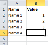
It seems a spreadsheet-like interface provides good experience for the task. Virtually infinite number of rows – no efforts on line adding, easy navigation, etc.
enter image description here

You could mimic some spreadsheet behavior, including:

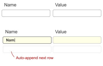
  • new row auto-appending, as you need a lot of rows and pressing Add row constantly isn't user-friendly
  • easy navigation between rows and cols with keyboard, as your task is heavily keyboard-dependant
  • current row and cell highlighting

enter image description here

This features allow to create more efficient interaction for the current context.

2
  • Mindblowing answers are always the most obvious in hindsight. Thanks!
    – avi
    Commented Feb 4, 2014 at 6:36
  • Originally I saw this answer on my mobile device and only saw the excel window. That was what I thought was mindblowing. I think I'm going to use something like this: mleibman.github.io/SlickGrid/examples/example3-editing.html
    – avi
    Commented Feb 4, 2014 at 15:31
1

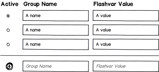
The last item could be a placeholder inputs to quickly add a field. I don't know if the example you gave is the final design but I'd suggest to make it easier to read and more accessible by making the inputs larger.

mockup

download bmml source – Wireframes created with Balsamiq Mockups

1

It sounds like you’re primarily concerned with real estate (minimizing the space required) and user efficiency (reducing effort), with aesthetics being a secondary concern. As far as I can tell, your design is already pretty close to optimal on all these, and any improvement is mostly trimming and sanding.

Real Estate

Your design uses just about as little real estate as possible. Assuming you expand the region as user adds parameters to the list, all the space you use is filled with data the user provided –nothing goes to waste. Yes, if you have multiple lists each with many items, then in makes for a long form, but what else can you do? You have a lot of data; if you want to show it all on the same page, it’ll be a long form.

About the only way to make it more space efficient is if you can move “Click to add a field +” so it doesn’t take a whole line by itself. However, you probably want to have it at the bottom of the list because that’s where users are likely to be looking when they’re about to add a parameter, so maybe it’s not worth moving it. Here’s some more “sanding”:

  • You can shrink the font of the column headers. Their position and boldness are already adequate for indicating the visual hierarchy. That may address some of the aesthetic concerns too.

  • If the list tends to be long (like you have in your example), you can try a “compact presentation” of the text boxes. This may also address some aesthetic concerns (the BUBOF (Big Ugly Block of Fields) effect).

  • If the list tends to be long, you can put the list in its own adjustable and scrollable pane and/or expander so the user can control how much space is used, regardless of the number of parameters on the list. That would only make sense if users edit the form on occasion, rather than enter all the data once and almost never return.

Efficiency

The primary source of inefficiency in your design is the keyboard-to-mouse transitions. That also contributes the most to the “clunky” feel. The easiest solution is to give the Add function an accelerator key. The Insert key is a good choice. The main challenge is communicating the availability of the accelerator key. If you have trained or experienced computer users, it may be sufficient to put “(Ins)” in or beside the caption for your Add button. However, your user may need a more explicit instruction, such as “(You can use the Insert key)” beside the button.

The primary alternative to your design is to auto-add a blank row to the bottom of the list, as described in What’s best when inserting into a table view, and add button or a blank line? on Stack Overflow, and also in other answers to this question. Instead of the Add button you have the blank row at the bottom of the list, so it doesn’t take any more real estate. The auto-add design is better for entering multiple parameters from scratch, while the add button design is better for editing an existing list (see my answer to the Stack Overflow post for details).

An additional consideration is the average length of the list and number of fields per row. Hitting the Tab key to go to the blank row in the auto-add design is a bit easier than hitting Insert or a Ctrl-whatever accelerator to add a blank line in the add button design. The more parameters to add, the bigger the advantage of Tab over the Insert key. However, the add-button design takes only a single Tab-press to leave the list for the next field on the form, while the auto-add design requires users to tab through all the fields in the blank line before leaving the list. The more fields on each row, the worse it gets.

You can also reduce the clunky feel by using terser prompts and captions. For example, reading “Click here to add a field” takes time. Try a button labeled simply “Add.” Being a button tells users it performs a content-editing action on the page (versus navigation), and being at the bottom of the list tells users that it’s for adding a parameter.

Aesthetics

I understand your design illustration is just a quick sketch not meant to be critiqued, but it nonetheless illustrates some things than detract from appearance, which may be helpful in your aesthetic “sanding.” Ugliness comes from irregular, harsh, unbalanced shapes. The more fields you have, the more subdued and regular the graphic design needs to be to counteract the harshness of all those controls packed together. I’ve already mention compact presentation and small column headers. You can also:

  • Flatten the design –avoid radio buttons and 3-D drop shadows for focus.

  • Use a simpler “grid” –left-align the column headers so they line up with the text box contents.

  • Vertically center the fields within their respective zebra stripes.

  • Extend the white zebra stripe to the edges, so they don’t look like boxes on the cyan background.

  • Use more subtle (paler, less saturation) zebra stripes. Don’t use zebra stripes at all if the list is almost always five or fewer parameters.
4
  • Thank you. This is very useful. However, I am curious. Why do you think the basic design is correct, rather than using an editable table, such as this: mleibman.github.io/SlickGrid/examples/example3-editing.html ? I found this link because of your answer FYI :)
    – avi
    Commented Feb 4, 2014 at 15:32
  • An editable table is fine, as long as the user can simply tab to a field and directly edit it (sometimes SlickGrid does that for me, sometimes I have to double click -I haven't figured out why). A block of text boxes with compact presentation can have the equivalent UX as an editable table. The design choice becomes a question of ease of implementation and maintenance -the users won't know or care about the difference. Commented Feb 4, 2014 at 17:17
  • If you look in the link of the example, there are two buttons, auto-edit ON or auto-edit OFF. That is why sometimes tab allows you to edit, and sometimes it doesn't. Also, the link you provided for compact presentation, didn't provide an example of looking like a grid/table/spreadsheet.
    – avi
    Commented Feb 4, 2014 at 17:42
  • 1
    Re: Grid-like compact presentation: The Subject-Verb table in the linked article is sort of like a grid. You can make it look exactly like a grid by putting full borders around the field controls and overlapping the borders of adjacent controls. However, now you need another way to discriminate read-only and editable fields (I don't know if Slick Grid does that -it should). Compact presentation is experimental -there's no one standard way to do it. I'm interested in variations and, especially, usability tests comparing them. Commented Feb 4, 2014 at 18:14

Your Answer

By clicking “Post Your Answer”, you agree to our terms of service and acknowledge you have read our privacy policy.

Not the answer you're looking for? Browse other questions tagged or ask your own question.