Reddit case study
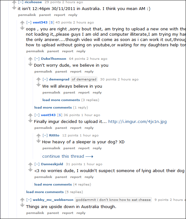
Let's look at a typical threaded commenting system, such as Reddit. It has the following problems:
- It's hard to tell what's the parent of a comment when the tree is very deep.
- If the tree is fully expanded, sometimes the parent comment can be off the screen.
- There's no indication of which comments are new.

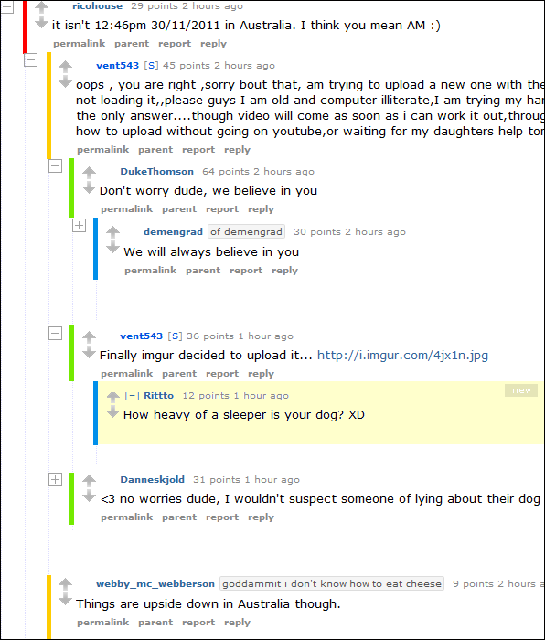
Now let's look at my suggested design for addressing all three problems:

Finding parent comment
The faint gray vertical lines on Reddit are not enough for matching a child comment with its parent comment. The eye has to do a lot of work scanning up and down the lines. I suggest, in addition to the faint lines, we color code each level of comment with a different color. We use the colors of the rainbow (ROYGBIV), where red is the first level and violet is the maximum allowed level. Now it's easy to find your parent comment because we have another visual cue in addition to the spacial cue. For example, to find the parent of a blue comment, we scan upwards to the nearest green comment.
Parent comment is off the screen
When the conversations become long, the parent comment may be off the screen. This can be solved with + / - buttons. You can contract more and more branches until the parent becomes visible. I chose to redesign Reddit's + / - button because I found it weird that they put them next to the poster's name. The button is supposed to act on the branch, not perform an action on a user. Also, their button is not really a button. It's just text in an anchor tag. It looks lame and doesn't look as clickable as a graphical button.
New comments
You can highlight new comments with a yellow background and a "new" label. What you highlight as new depends on your policy. I would probably only highlight comments that are 1 or 2 hours old.


