17

The check out or payment process in an application is critical and has to perform smoothly to make the inexperienced users feel that they fill in forms correct. I’ve seen numerous of examples where user pick up a credit card and try to read the form and what goes where. Experienced user doesn’t have this problem since they’ve done this a lot and find the credit card number, valid date, name and CVC code. But to help inexperienced users I could implement a skeuomorphic GUI-design to overcome that problem and make them visually understand what goes where. I’m afraid that experienced user might not trust a payment process looking too close to the real world. This sums up to what are the pros and cons of skeuomorphic design in payment transactions?

A usual payment form looks like this:
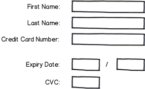
mockup

download bmml source – Wireframes created with Balsamiq Mockups

The skeuomorphic equivalent form would look something like this:
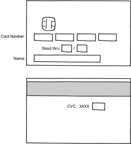
mockup

download bmml source

8
  • Your idea is very interesting. If your site is designed in a way that looks trust worthy, I can't see users having an issue with your skeuomorphic designed inputs. As always, testing is the only real way to find out.
    – Rich
    Commented Jan 23, 2013 at 11:06
  • 3
    I'd first try and determine if it's actually a problem. It may very well be, but my hunch is that in 2013, shopping online isn't a new concept.
    – DA01
    Commented Jan 23, 2013 at 16:35
  • 1
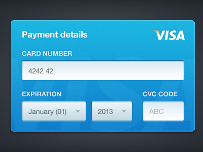
    There's an awesome pattern on dribbble for this - definitely worth checking out: dribbble.com/shots/570629-Card-Payments
    – NotSimon
    Commented Jan 23, 2013 at 18:20
  • 1
    +1 very interesting question Benny. Since most credit/debit card brands can be detected by their 1st two digits you could instantly update the image with the card brand logo. Commented Jan 29, 2013 at 21:11
  • 1
    Just for the record, there's an open source implementation of the proposed form by Ken Keiter called Skeuocard. It even handles the differing placement of the CVC on AmEx cards, etc.
    – Kit Grose
    Commented Apr 16, 2014 at 23:51

4 Answers 4

7

Interesting design, I haven't seen this before. I think credit card forms are so common that most people have few problems with them, but if you have the extra space for a form like this, I don't see why you shouldn't use this.

One thing though, I would stick with a single text input field for card number, rather than a segmented group of four. The segmented field may look easier, but introduces extra complexity during input or when making corrections (users will either have to manually advance to the next input field or fight whatever automatic behaviour you introduce when they make a mistake). With JavaScript and CSS you can easily style a single text input field so that it displays its contents segmented in blocks of four.

1
  • Thanks for the input on not dividing card number into four different fields! You have a very valid point there! Commented Jan 23, 2013 at 11:50
4

I think the pros greatly outweigh the cons (if any). Using a credit card is both visually and user friendly. I see it gaining a lot of traction in the design community, check out this link that shows a design of what you are talking about on dribbble.com:

http://dribbble.com/shots/660725-Credit-Card-Form

5
  • 1
    This isn't an answer to the question, you've only posted a link elsewhere. (what if this link goes down?) Can you summarize what that link is, why it answers the question and just keep the link as an additional citation.
    – JonW
    Commented Jan 23, 2013 at 17:07
  • That's also fairly inaccurate given that a CVC code is located on the back of the card. It certainly looks pretty, but I'm not sure what value it's adding to the process.
    – DA01
    Commented Jan 24, 2013 at 20:01
  • 1
    I think that while the design is not a perfect simulation of the real life model, it helps to streamline this normally tedious process. Making something like this enjoyable to look at may make it more pleasant overall. Kind of like how elevators now have mirrors Commented Jan 24, 2013 at 20:45
  • @Redandwhite you are assuming I find looking at myself enjoyable. ;)
    – DA01
    Commented Jan 25, 2013 at 2:31
  • Although the design looks good, card designs can differ, not just in the position of data on the card but the wording used, and which side of the card data appears on. In some use cases it would cause more confusion than it would help.
    – Kayo
    Commented Jan 25, 2013 at 10:07
2

If the layout on most cards is consistent (I think it is but haven't done any research) then I could see this been particularly useful to users who aren't familiar with the process. If designed and implemented in the right way I dont see it having an adverse effect on users perception of the security of the site.

One potential negative would be that the "real world" layout is not as easy to scan as it lacks alignment and proximity.

If practical I would go for a standard form with an illustration of the card layout to compliment it as this seems a happy medium that suits both expert and novice users.

2
  • 1
    That was my reservation - that the design in the mockups relies on all credit cards that could ever be used all following the same layout.
    – JonW
    Commented Jan 23, 2013 at 17:15
  • But can't this be solved by the localization, such as the language setting of the browser? If different countries have different credit card layout - that would be one way to solve it. Commented Jan 24, 2013 at 19:31
2

I agree that this is an interesting concept. From a practical point of view, rather than visual design, user experience etc., remember that not all cards follow the format above. Amex for one does not have the usual 4 x 4 long number format, plus its CVC number is 4 digits long and on the front of the card. So you probably need to prompt for card type before showing the appropriate design for entering the details.

Also, most cards have more information on the front then you have detailed in your design, such as start date, issue number etc. If the layout on your design matches that on the user's card but for different fields, this could cause the wrong details to be added, e.g. start date instead of valid until date. This might be more likely with inexperienced users who will over-rely on the visual layout of your design, when these are the people you are striving to help.

I would suggest that you have a link to a more traditional web layout for those users that do not feel a benefit from your new design. (Other details such as billing address will still need to be entered in a standard forma as these are not on the physical card.)

The last thing to point out is that I'm based in the UK so what I've said above about Amex and other card details might not be true else where. Which raises the question about international and localised considerations...

Anyway, good luck and fair play for trying something new!

Your Answer

By clicking “Post Your Answer”, you agree to our terms of service and acknowledge you have read our privacy policy.

Not the answer you're looking for? Browse other questions tagged or ask your own question.