8

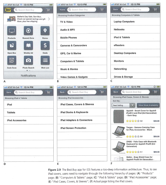
I’m reading Jakobs Nielsens new mobile usability book. There is an example of a mobile site that suffers from an overly deep hierarchy (5 levels in total) In the example users need to navigate through the following hierarchy of pages:

 (A) Products 
  + (B) Computer & Tablets 
     + (C) iPad & tablets 
        + (D) Ipad Accessories 
           + (E) iPad Cases, Covers & Sleeves 
              + (F) Actual page listing the iPad covers.

Jakob doesn’t offer any solutions. I thought this would be an interesting discussion.

Mobile device navigation structure

How to solve overly deep hierarchy navigation on mobile device?

5
  • So your question is -- "What is a better alternative navigational design" ? Commented Nov 7, 2012 at 17:40
  • yes it is. I'd be interested to hear your thoughts. Commented Nov 7, 2012 at 17:49
  • Why is it a problem what is wrong with the current capability ?
    – Mortalus
    Commented Nov 7, 2012 at 19:00
  • This type of question doesn't really carry any right or wrong answer. Perhaps the only obvious solution is to be a little less broad with the options in the hierarchy. For instance "Computers & Tablets" in step 2 could be broken out separately in the same menu, avoiding the need for step three. whilst the current structure may be a little long winded, it does allow the user to accurately refine their search products. Commented Nov 7, 2012 at 19:22
  • @DanielMeade Of course there is a "right answer" to this question. And I have to say I disagree with you to have the navigation less broad. I think the other way around is better: broad and shallow. Commented Nov 8, 2012 at 8:07

3 Answers 3

4

There are several problems with mobile devices compared to lap tops’. The screen is smaller making it harder to show “all you need” to the user at the same time. Also, navigation is trickier and more often than on lap tops’ users navigate wrong unintentionally – with the effect that user need to use the back button and go forward again. This makes the process of navigation on mobile devices a delicate problem.

First you need to realize that users expect a mobile view of a web site which is made for the mobile devices limitations. That means that you can omit things that doesn’t fit a mobile device or content that is not appropriate for a mobile view. The more you can leave out, the better. All of this comes at a cost, of course. Having an online store makes it hard to omit stuff you want to sell – but on the other hand, you have the data ready to see which items are really being sold, view and/or searched for on mobile devices through web analytics. That way you can more easily chose which item to omit and which to rank higher.

Also, mobile users expect a link to the full site through their web browser. A site they’re probably familiar with and know where on the site to find login, navigation and add to cart-button.

Next you could turn the entire sites’ structure from being narrow and deep to broad and shallow. That way users may have to scroll more through navigation, but that’s much easier than clicking through a deep hierarchy.
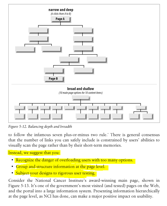
broad and shallow

2
  • I agree with your comments. A broad and shallow structure would work better. If I were to redesign it I’d look at the stats to ascertain what the majority of users select on the first screen. I’m guessing the vast majority select products and very few click on options such as Open Box (needs to be more descriptive), Weekly Ad(?) and Photo search (should that be part of Products?) Commented Nov 8, 2012 at 10:15
  • @MarkChristopherson Unless you're selling photos, they shouldn't be placed in Products. The Open Box is kind of funny. Is it an instruction how to open the box? as in unboxing? Weekly Ad needs to have a new label, such as Weekly Offer or something more attractive. Commented Nov 8, 2012 at 10:22
1

Way too busy, and the data being displayed is very redundant, worse yet not even organized. Why would I ever think that by clicking on "ipad" I can get to device covers. The solution is reorganization, the design itself is acceptable but of course imperfect. The main page for example places no emphasis or indicators to what the typical user might use the app for. For example I'd make an item for device accessories (sleeves etc). I would also replace the search at the top with a live filter allowing you to mitigate the problems associated with extra long lists.

1
  • I see your point about the device covers. A reverse card sort would help here. I like your live filter suggestion Commented Nov 8, 2012 at 10:15
1

What I believe that Jakobs was trying to say is that there is not such a soultion. I didn't read the book, but I've been taking a look to some of his articles. A quote from him:

Your desktop information architecture (IA) should always feature a simple navigation space that avoids an overly deep hierarchy. But for mobile, the limited space makes it even more important to prevent user disorientation; you should thus limit the navigation options, because you can't show full contextual information on every screen.

What I can figure out from this is that the point is not how to show a deep hierarchy, but to avoid such a hierarchy. The user navigation on a monile site must simpler then ever, what you should focus on is to reduce the detail you want to provide and offer a simplified navigation experience. Redesign your categories in a way that the user can go down as few levels as possible.

It's since before the smartphone era that researchers advocate for an flat hierarchy when it comes to mobile ux, as happens, for instance, in Usability For Mobile Commerce Across Multiple Form Factors. The paper of course is very old, but few of the points discussed there are evegreen.

Your Answer

By clicking “Post Your Answer”, you agree to our terms of service and acknowledge you have read our privacy policy.

Not the answer you're looking for? Browse other questions tagged or ask your own question.