1

I am researching into the methods of how various eCommerce websites notify their users when they have added items to their shopping basket/cart.

From what I have seen (I am still researching) so far nearly all of them just update the 'number' of items and/or add up the total item values e.g.

http://www.debenhams.com/

But on the John Lewis website, (http://www.johnlewis.com/) they notify the user with the same method but also change the background colour of the 'shopping bag' section from white to a shade of green.

Does anyone agree with this method of notifying the user or know of other websites that are implementing a better way to notfiy the user?

1
  • I think it's going to be VERY difficult to get a definite answer as to the BEST method, but I'd love to be proved wrong! Commented Nov 6, 2012 at 17:17

3 Answers 3

2

The most popular approach is the one that you described, when only the numbers change next to the basket. I totally agree that its not very informative. Check out ASOS.COM I think they redesigned a shopping basket not long ago and I love the way they are displaying the information. 1st when the user clicks "add to basket" the item and price is displayed next to the basket, then it fade away. When user hovers over the basket it displays the items in the basket, so the user doesn't have to go to checkout are or view basket to see what's inside.

1

I disagree that the most popular approach is the one described in the question.
A few months ago, I surveyed 30 large ecommerce sites pulled from the top of this list.
http://www.internetretailer.com/top500/list/
I found 3 interaction patterns for the 'add to cart' action:

  • Clicking on Add to Cart (or its equivalent) added the item to the cart and replaced the product's page with the cart page.
  • Clicking on Add to Cart displayed a small version of the cart, temporarily, on the product's page. The small version of the cart usually appeared in the upper right corner of the page.
  • Clicking on Add to Cart displayed a text message (e.g., 'You bought this!') somewhere in the page.

Although all of the sites contained a shopping cart icon in the page header and the icon contained a number indicating the number of items in the cart, I did not see the interaction described in the question. Based on the Newtonian principle of human-computer interaction - 'every user action should have a noticeable and understandable system reaction' - the interaction described in the question seems the least likely to work well.

Although you did not ask about checkout, I expect your has a set of checkout pages. Here is a survey of 100 ecommerce site checkout sequences.
http://baymard.com/checkout-usability/benchmark

2
  • When you surveyed those sites, do you have the actual results? If not the actual survey can you indicate (such as with percentages) how popular each of the three options indicated above were?
    – JonW
    Commented Nov 6, 2012 at 15:05
  • I cannot provide the actual results because the survey and the results belong to my employer. The proportions were, roughly, .5, .4, .1 in the order shown in the list above. Commented Nov 7, 2012 at 13:43
1

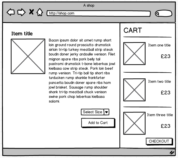
Although not all that common, I like the approach of displaying a list of the items placed in the shopping cart, together with the item thumbnail and a running total. This gives a clear indication of what has been placed there, although admittedly this would depend on the amount of real estate you have available / are prepared to give up in order to accommodate the system.

Here's a very rough mockup, but it should help give you an idea.

enter image description here

Of course, with this method you also have the option of including "Drag to Shopping Cart" functionality. Something I have seen work quite well.

Your Answer

By clicking “Post Your Answer”, you agree to our terms of service and acknowledge you have read our privacy policy.

Not the answer you're looking for? Browse other questions tagged or ask your own question.