I'm trying to design a simple website that will show movie showtimes in a few cities. It's going to be a french website but I translated the important content in the screenshots and the website to let you help me.
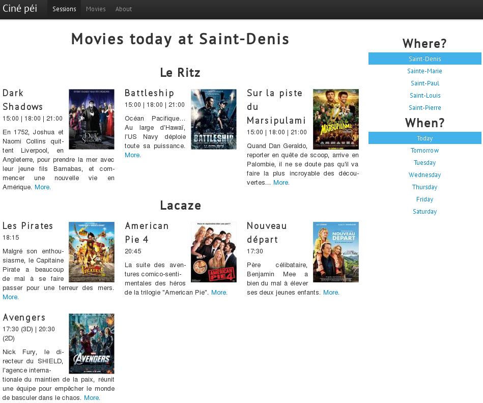
I'm using Bootstrap 2 which is a grid-based CSS framework that allows to "easily" use the same HTML for the mobile and desktop version of a website. This is what I have come up with so far:

As you can see, there's a menu on the right which allows to change the movies displayed on the left. I believe it's an easy way to change the city and the day. Inspiration comes from Google Movies.
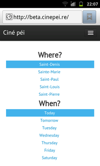
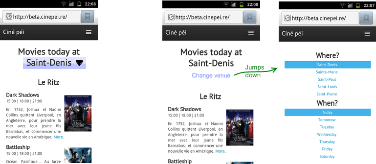
However, problems arise when the website is viewed on a phone. If the menu is kept at the right, it will show at the bottom of the mobile version, and users will need to scroll down to discover the menu. If it's on the left, it will show up on top, and nothing says they should scroll down to see actual movie showtimes. Resizing the window is enough to test the "mobile version", but here are the relevant screenshots on my actual phone (a Galaxy S) with the default Android 2.3 browser:


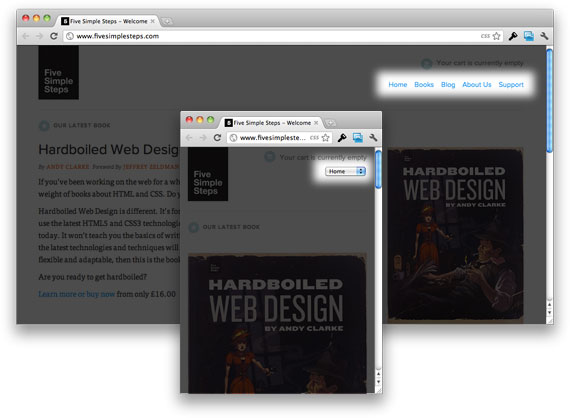
This question on menu placement mentions that menus should be on top and that users expect it, but I don't think it applies to menus bigger than the screen. Am I wrong?
Anyway, my question is: Is one of my options the best solution? If not, is there a better alternative I didn't think about?


