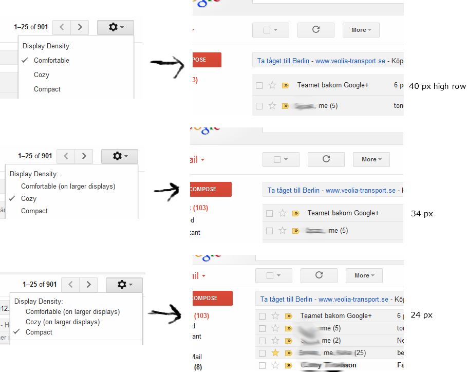
When Google blogged about the changes with respect to responsive design and the display density the title of the article was Changing information density in Gmail’s new look
Information density seems about the best description to me.
Here's a section from the article above
We also thought quite a bit about the density of the information on
the screen in the new design. Gmail’s old design packs a huge amount
of information into a small space. While this is perfect for some,
many people appreciate a more airy design with more whitespace between
lines and elements on the page. This is especially true on larger
monitors.
We wanted Gmail to be more attractive and easier to read by default,
so if you’re on a larger monitor you will see that the items in your
inbox are spaced farther apart than they were in the old design. We
believe that this results in a better overall experience, but it does
take some getting used to. In our internal testing we found that most
of us adjusted to the new spacing after about a week and found the old
spacing cramped and uncomfortable when they looked back at the old
design.
Others, however, found the original spacing to be ideal and wanted to
see as much information as possible without scrolling, even on a large
monitor. We added a density setting to the gear menu in the toolbar to
make sure that everybody can find a setting that works for them:
Comfortable, Cozy, or Compact.

