0

Background

I am designing a mockup for a surveillance camera interface where users can set up various trigger profiles.

The setup process can be complex and often requires many steps, along with contextual information on best practices and do's and don'ts.

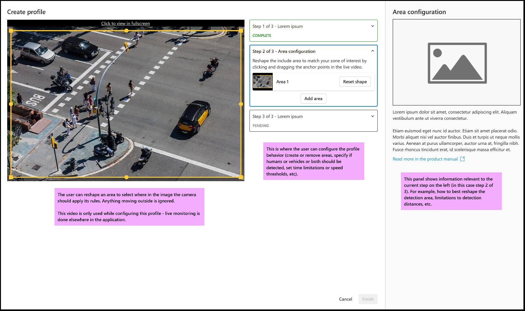
The screenshot below shows a contextual drawer that opens when the user clicks "Create profile", functioning similarly to a setup wizard.

enter image description here

The challenging bits

Information Pane: The information pane on the right is crucial for guiding users through each step. We've faced issues with users not understanding certain components or having unrealistic expectations of the application's capabilities. Therefore, this pane needs to remain open and visible at all times.

Primary Interaction Placement: Currently, the primary interaction area is in the middle of the screen. I have concerns about this potentially being a poor design choice compared to placing the controls on the side.

Step navigation: I am also concerned about the navigation through the setup steps. It is important that users can easily recognize, click, and expand each step in the process, but I am not sure if the current design makes this clear enough.

Question

How can I improve this design considering the constraints mentioned above? Are there any best practices or alternative layouts that could address the challenges I mentioned?

2
  • The question is very broad. Almost reads as a redesign request. Maybe you have to focus on one aspect at a time and ask multiple smaller questions (in multiple posts). You are more likely to get a useful answer that way.
    – jazZRo
    Commented May 27 at 10:22
  • @jazZRo, you're not wrong, I suppose I could move the step navigation question to its own post. But the layout concern (the 3 columns) still stands and I suppose that has to be seen as a whole.
    – Chris
    Commented May 27 at 13:38

1 Answer 1

1

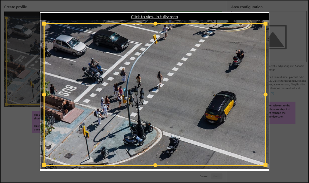
Limited Space: This shouldn't be a problem so long as your video doesn't have weird aspect ratios. But if the videos have interesting aspect ratios, then the "Click to view in fullscreen" should the default behaviour when a user clicks on the video. fullscreen video

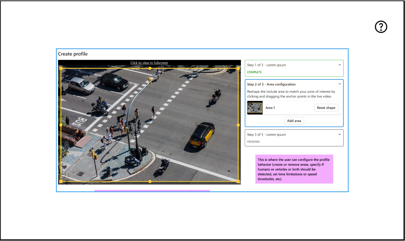
Primary Interaction Placement: This is fine where it is. Technically speaking, it's on the right of the "main" area. Though, if it does bother you, you can hide it under a help button. redesign with flow buttons

But this might defeat the initial goal of realigning expectations and main goals.

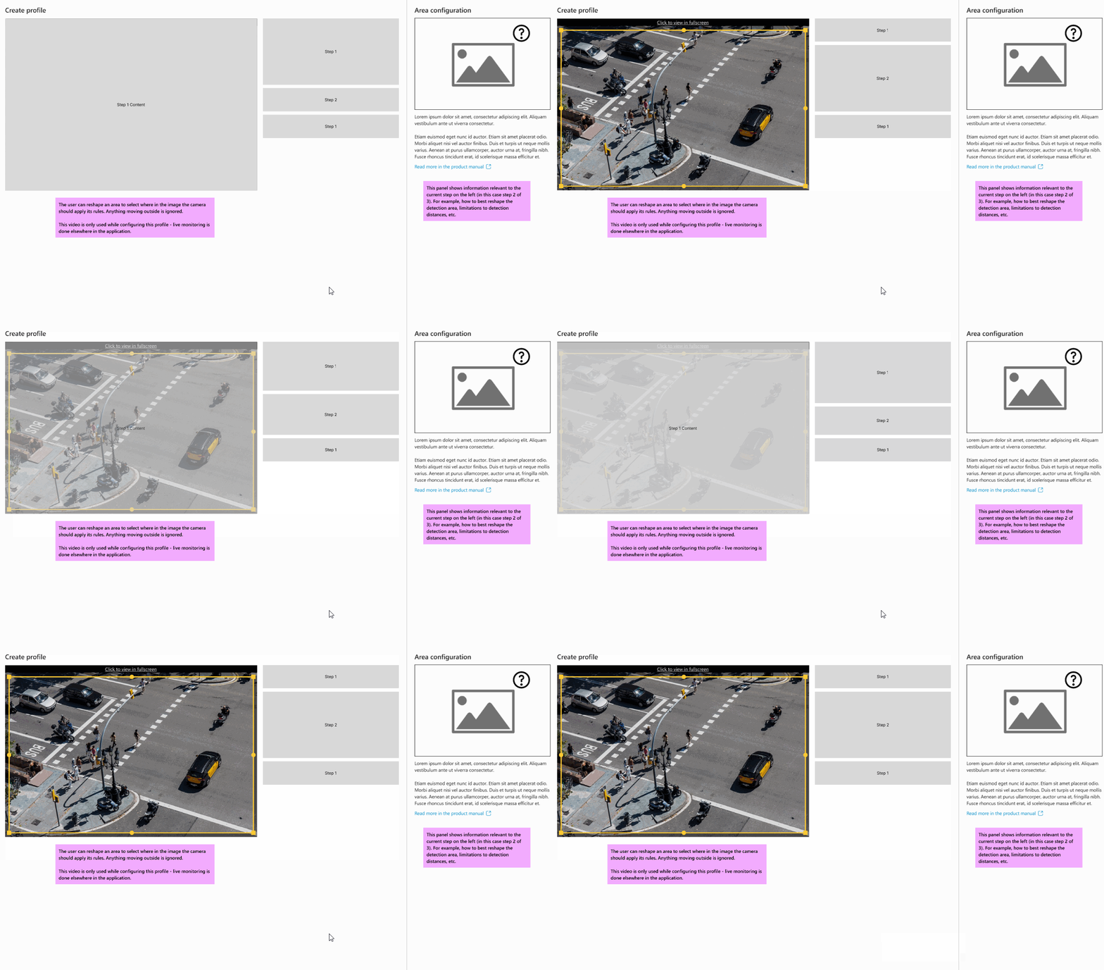
Step navigation: If you keep the previous section's layout but feel paranoid still, you can add motion/animations to the steps area as you move to the next step to visually emphasize it.

emphasised action area

This way it's really hard for the user to miss, you could also time the animation so that the steps area finishes it's animation last, this way the user is fully fixated on that area.

3
  • Thanks. Do you think people will initially have problems understanding how to proceed from step 1 to step 2?
    – Chris
    Commented May 27 at 14:14
  • 1
    @Chris I think so, the finish button is all the way at the bottom. I actually forgot to mention that. You'll want to put the next within the step "container" Commented May 27 at 15:17
  • 1
    Just to clarify, I'm saying that the next/finish button should be placed within the step "container". Not at the bottom Commented May 27 at 15:28

Your Answer

By clicking “Post Your Answer”, you agree to our terms of service and acknowledge you have read our privacy policy.

Not the answer you're looking for? Browse other questions tagged or ask your own question.