0

I have a challenge: I'm working on a project and I used icon buttons. Someone said icon buttons are not accessible because they don't have labels.

ARIA and some HTML techniques can achieve accessibility compliance: https://www.sarasoueidan.com/blog/accessible-icon-buttons/

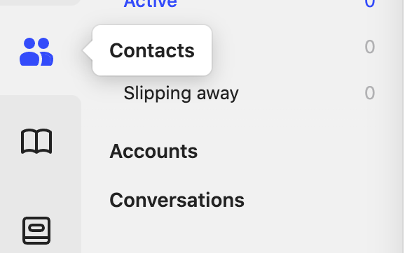
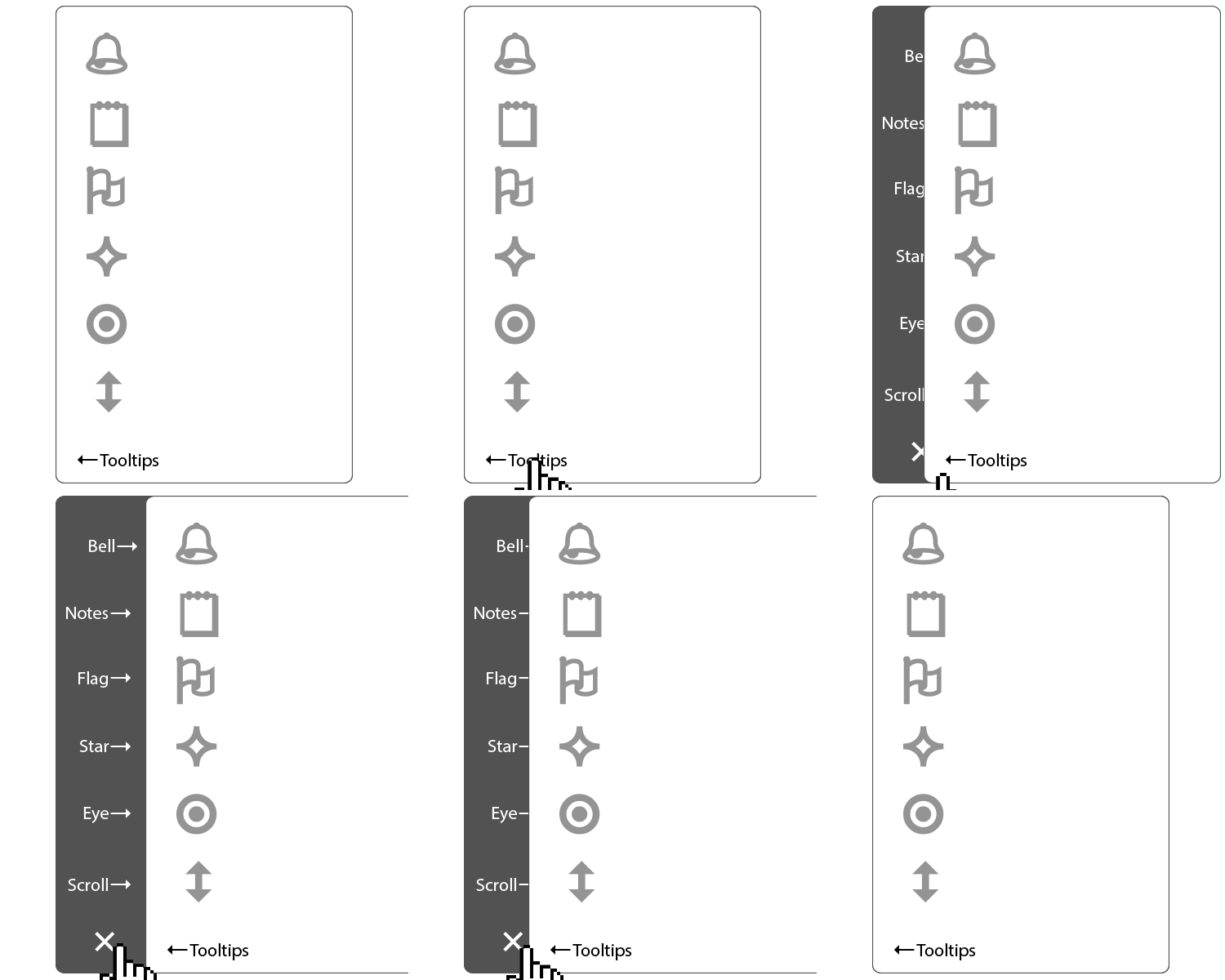
To improve usability I've tried adding tooltips like intercom:

![Intercom Tooltips

However, I was told that all icons need labels and that tooltips will not work on mobile as they don't have a hover state. Following this logic, icon buttons should not exist at all.

I'm confused with this premise because it is widely used by many companies with solid accessibility teams and user researchers. Technically if the html is taken care of, then you really don't even need the tooltips.

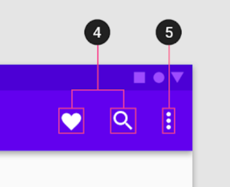
For example: Google's Material action items

Google Material Action Items

https://material.io/components/app-bars-top#anatomy

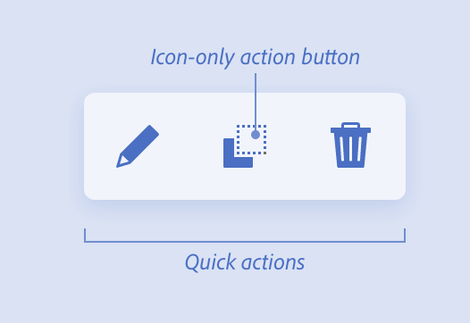
Adobe Spectrum Quick Actions

Adobe Spectrum Quick Actions

https://spectrum.adobe.com/page/quick-actions/

I understand that it is desirable to have labels. But, thinking about growing complex single-page applications with lots of modes like Figma and Miro that need to work both on mobile and small laptops, having labels, in my opinion, will decrease usability for people with cognitive disabilities (busy UI).

Thoughts?

3 Answers 3

2

As long as icons are recognizable. the user's understanding of an icon is based on previous learnings or experiences. Icons without labels might not help your UX but they might not break it.

So on this note, you should be on the safe side when using notorious icons like: print, settings, edit, play, share, save etc. but if you want to communicate a new idea through a icon it might cause confusion among users.

This has not stopped big companies using icon as they also rely on learnability.

1

For icon buttons, WCAG does not specifically say (*) you need labels. I think the guideline you're thinking of is WCAG 3.3.2 Labels or Instructions. "User input", as referenced in that guideline, is specifically when typing stuff into a field. All the examples in the "Understanding" section talk about input fields.

(*) The interpretation of WCAG guidelines can be subjective. My interpretation is purely my opinion and someone else might say "user input" includes buttons and such, but I resolve that further below.

That doesn't mean you shouldn't have labels, or at least have an option to display labels as in @Danielillo's example.

Also note that a "label" doesn't have to be text. "Label" is a link in the WCAG guideline and points to a definition that says "text or other component". For example, you can have a search field with a magnifying glass icon next to it. The icon serves as the "label" of the field (provided it has alternative text associated with it).

So with your icon buttons, the icons themselves serve as the "label". Now, if the user doesn't know what the symbol means, that's more of a UX problem rather than an accessibility problem.

4
  • Totally agree with you, but I was told every icon needs a text label. Commented Apr 26, 2022 at 0:35
  • 1
    I showed you the link to the WCAG requirement. You can read it yourself. While it’s a good UX idea, it’s not required. Commented Apr 26, 2022 at 5:08
  • To add that there is no need for labels on icons but 1.1.1 Non-text Content requires that icon has a name, which can be for example alt text and can be visually hidden. Where as label has to visible all the time. Commented Apr 27, 2022 at 5:41
  • @locationunknown, not to nit-pick but terminology can make a difference. 1.1.1 requires a "text alternative that serves the equivalent purpose". That's not necessarily a name (meaning accessible name). And as I mentioned earlier, yes, a label must be visible but it doesn't have to be text. The icon itself can be the label. Commented Apr 27, 2022 at 19:52
0

... tooltips will not work on mobile as they don't have a hover state.

Solution: Desktop version with tooltips and mobile version without tooltips

...thinking about growing complex single-page applications with lots of modes like Figma and Miro that need to work both on mobile and small laptops, having labels, in my opinion, will decrease usability

Solution: Desktop version with labels and mobile version without labels

...it is widely used by many companies with solid accessibility...

Recommendation: I don't know the scope of your project, but in general terms, it's not very useful to compare personal projects with companies with a wide international impact. These companies have enough power in the population at a perceptual level to even be able to develop their own iconographic language without affecting the functionality of their applications at all or altering their credibility as a company. If tomorrow Google pulls out an icon of an intestine saying that it means downloading files, the world will accept and even applaud such a decision. Investigating the way of working of large multinationals serves to collect ideas in general terms, both at the execution and functional level, but they are not referents to follow blindly.


Answering the question

  • If your project only has three icons, I don't think there is a major problem, with only three elements it's very easy to inform the user the meaning of each one and for the user to interpret them and know how to use them. If in a project I need icons to define states and I determine that a circle is a complete state, a square state in process, and a triangle is incomplete, with a simple info or merely letting the user understand the use via trial and error, it is enough. They will only be wrong three times, once for each icon. Six times to finish understanding, and nine times to definitely know the meaning of each icon.
  • If these icons must be well defined and identifiable, a marked contrast is sufficient (shape, color, shape/background, style, position, size...). Option B is more understandable than A and less than C.

enter image description here

  • If the application is full of icons and labels or tooltips are not an option, mobile screens offer hundreds of possibilities, just look at the variety of mobile games that exist.

enter image description here

Your Answer

By clicking “Post Your Answer”, you agree to our terms of service and acknowledge you have read our privacy policy.

Not the answer you're looking for? Browse other questions tagged or ask your own question.