1

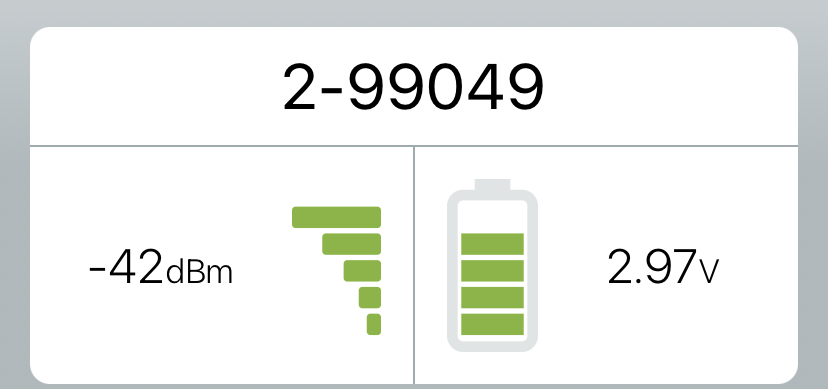
Here's a portion of a display from an iOS app that allows users to connect to a Wireless Valve Control device.

UPDATE: My question is regarding the -42 dBM and 2.97V labels.

enter image description here

As a code implementor, whether to show a number, an analog graphic, or both, has always been kind of "what seems to work best".

When space gets small, icon only is often nice. Icons only here might work, but the numbers add a bit of increased fidelity to the reading and help communicate what the icon is actually describing.

Is there a more rigorous/disciplined approach to when one should include the numeric value of a status value? Other than "that looks best/is nice to have"?

6
  • 2
    what's the larger context here? Is this part of a busy dashboard? Is it front and center? Also, is this number just an identifier? Because you also mention a status value. Is that part of the number? Any deeper context might help the community...
    – Mike M
    Commented Jun 9, 2021 at 23:57
  • Front and center on a mobile phone. Not a very busy screen. This panel and a couple of others with a similar amount of white space. Commented Jun 10, 2021 at 2:47
  • 1
    If that's all you're showing, I'd say the numbers are good. I would rather have clarity and knowledge over simplicity as a user, given that my attention is not in danger of being overwhelmed here. In a narrow status bar it would be different. Commented Jun 10, 2021 at 3:10
  • 2
    If your users are people that will understand the difference between dBm and voltage then can't see why you shouldn't show it to them, adds more context and precision. If it's for anyone in the general public, maybe not show? Commented Jun 10, 2021 at 8:10
  • Just make sure to show the relevant numbers and that users understand them. Also be sure it doesn't harm the user's workflow: If a quick glance is important in situations where time matters and precision is not needed, the numbers might only distract.
    – jazZRo
    Commented Jun 10, 2021 at 8:34

1 Answer 1

1

Probably the two key deciding factors for me would be (other than the physical space available to display the information, which affects readability):

  • use case for the information
  • level of accuracy required

You will find that if it is just something that allows the user to take a quick glance and perhaps to do something quickly, then the graphical representation is usually sufficient (e.g. do I need to recharge batter or not?). But if it is to get an idea of how long the battery will last for then instead of the amount of charge left in the battery you might even want the number of running time left (at current usage rate).

The level of accuracy relates to the use case, because a user might be required to enter in detailed information for a particular task and therefore the degree of accuracy becomes a factor. If you only need a qualitative input (e.g. safe or not safe) which does not rely on having a specific cut-off value then there is also no need to put in numeric values with that degree of accuracy.

Most often there will be a combination of use cases and level of accuracy required for those use cases. So you generally need to cater for the most common or critical tasks.

Your Answer

By clicking “Post Your Answer”, you agree to our terms of service and acknowledge you have read our privacy policy.

Not the answer you're looking for? Browse other questions tagged or ask your own question.