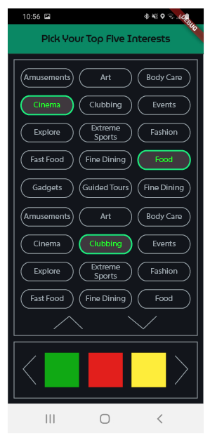
I agree with you that options 2 and 3 are not the best. But I see some drawbacks in the option one that knowing them can help you find a workaround:
- The icons are very small, it's difficult to perceive them
- The text is too small and cannot be seen clearly
- The icons are too close together to select
- The already selected icon is not seen as such (Clubbing)
I think that in this case some of the components or the text legibility or the clarity of the icons should be prioritized, as it is now is a middle way that doesn't reach an optimal solution.
An alternative, starting from the premise of an easy visual perception, is to offer the possibility of a double selection prioritizing the text: the upper part allows the user to see/select any options in text with a vertical scroll and the lower part the larger icons with a horizontal scroll. Both are selectable, but the top field clearly shows the ones already selected:
Example: Di.fm

