3

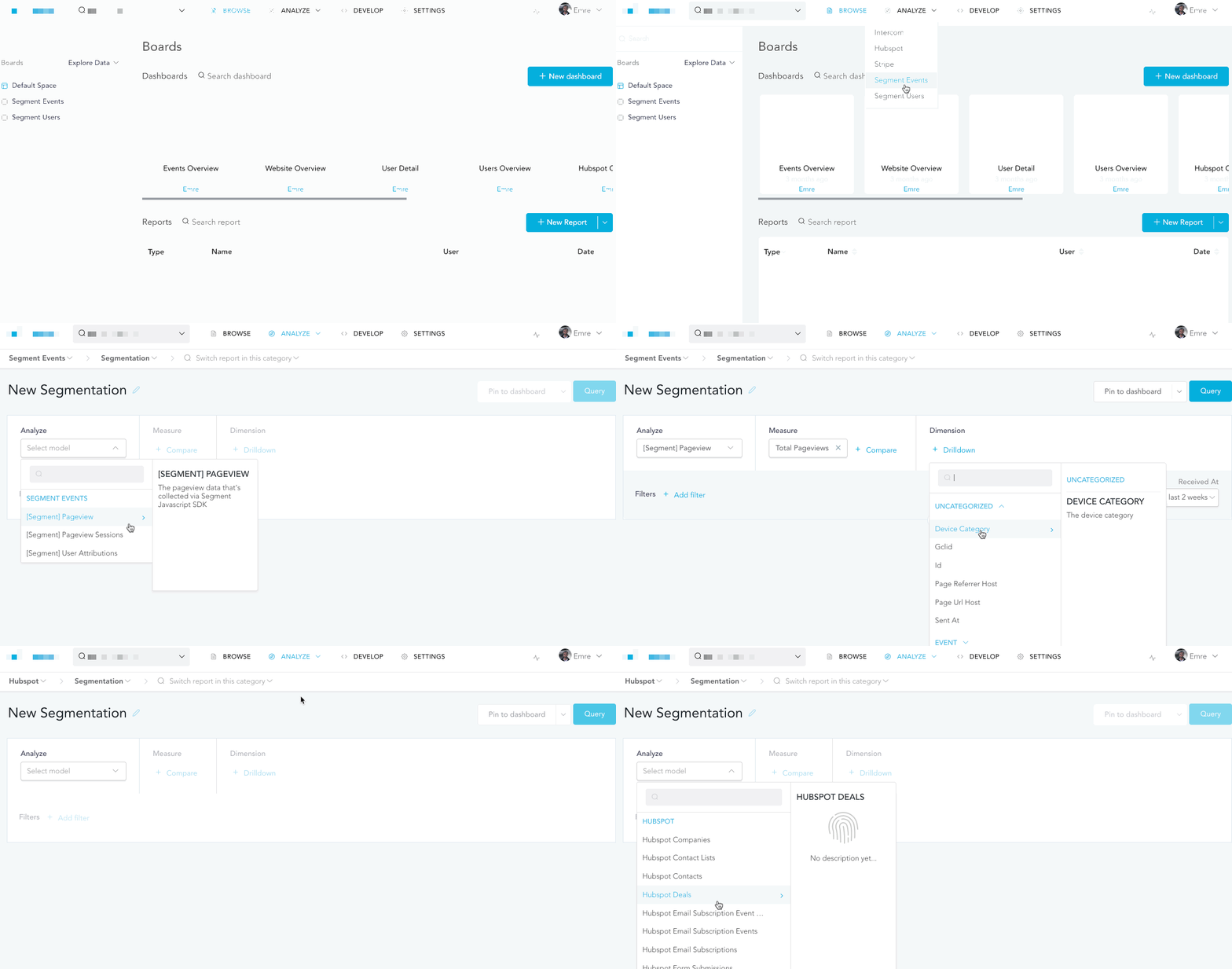
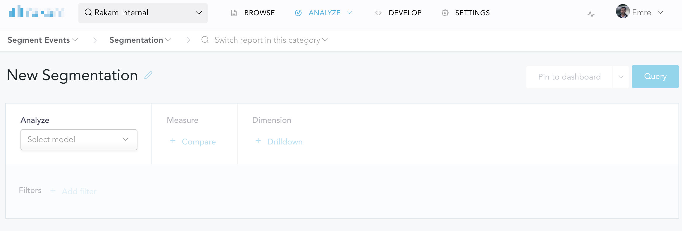
We have a page that lets our users analyze their data. In order to analyze the data, they need to select the data-set via a dropdown first and without selecting the data-set, the page is almost useless. Here is how it looks like:

empty page

We're planning to open the dropdown automatically when the user opens the page, here is how it will look like if we implement it:

enter image description here

The idea is that we open the dropdown automatically on behalf of the user in order to be able to guide them in a better way. Otherwise, 30% of the users leave this page without selecting the model. On the other hand, dropdowns are usually user-controlled components so we're not sure if it's a good practice.

1
  • 2
    It could feel like a bug when a dropdown is open on page load. Maybe if it would draw more attention to it people will understand that it is intentionally already open. Like a thick colored border around the dropdown menu that disappears when the menu gets hovered for example.
    – jazZRo
    Commented May 19, 2020 at 10:45

2 Answers 2

1

The UI components like dropdowns are not charaterized to open/show up automatically without an interaction input from the user. That would take away the users trust which in turn makes user feel the wierd behaviour leading to an idea of 'it might be bug'. So, here are the some of the ways to do it.

What you need here is a Signifier (feedback or direction for the user to select from frop down next).

  1. Show a stepper/progress indicator on what steps to be done next, indicating start and end points. This will address your problem of 30% users going away without selecting the model.
  2. Give the CTA(i.e buttons/dropdowns etc) at the steps. Usual behavior of a user is to see the CTA as soon as they enter or land on any step.

These will solve your problem for sure.

2

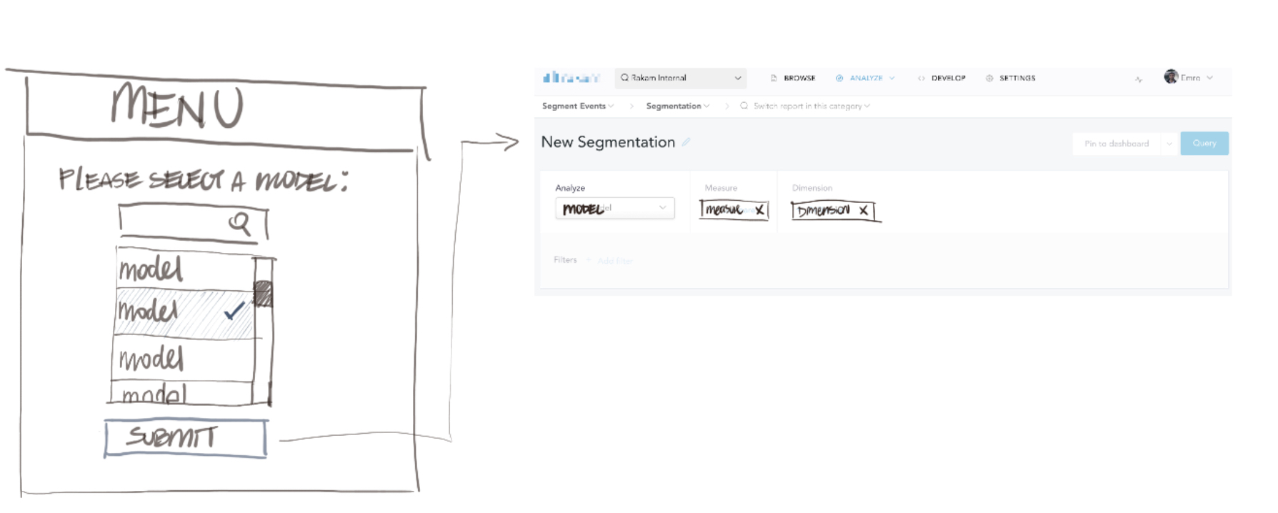
Since you are asking the user to do one thing before anything else in the page becomes usable, why not hide everything else that might cause them confusion?

For example, simply state “Please Select A Model:” and list out all the options including the search bar. Once the user selects an option and clicks “Submit”, you can show the rest of the interface.

enter image description here

Another option is to simply call attention with another color to the open dropdown.

enter image description here

2
  • A tooltip, as you've shown, might be helpful to first-time visitors, especially if it's in a heavy/dark contrast color to call attention. I would caution against using red, as it's often used in error states.
    – Izquierdo
    Commented Jun 3, 2020 at 18:09
  • Agreed about the color, was not recommending red.
    – Nicolas
    Commented Jun 3, 2020 at 19:08

Your Answer

By clicking “Post Your Answer”, you agree to our terms of service and acknowledge you have read our privacy policy.

Not the answer you're looking for? Browse other questions tagged or ask your own question.