2

I don't like modal popups, because they force you to close them before you resume normal input -- and because they tend to dominate the screen.

When I made Valence, I had a dilemma: where do I put the information on atomic valency? How do I show the player the valence of a particular element which they hover over?

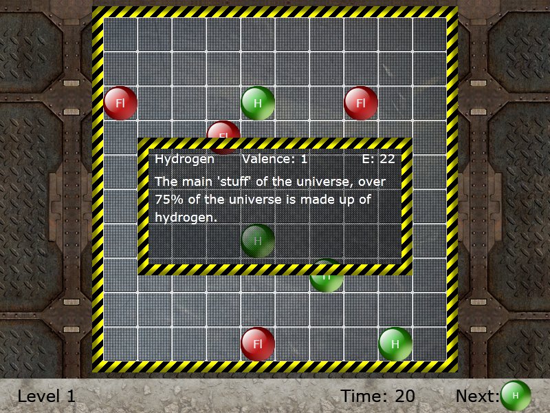
I put a (badly placed, I admit) popup in the center of the screen that shows the info of any atom you hover over:
enter image description here

Ideally, this should have been closer to the atom you hovered over, but I wanted it to be guaranteed readable all the time.

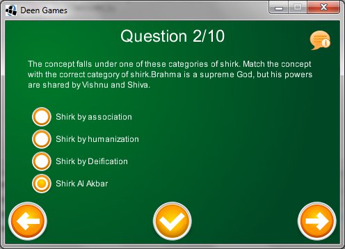
In my current game, I'm faced with a similar dillema; it's a quiz-based question, and the screen is already full of information (current question, answers, and next/previous/done icons).
enter image description here

Having said that I can't fit in the additional question information (extra info/tips for the current question), is there a mobile-friendly alternative to using a "hover over me for more information" control? There's no concept of "mouse is over X" in mobile devices, so I'm out of luck.

You can see the info icon in the top-right; clicking? on it would reveal an information panel (which would cover some of the question/answers information) with some additional information. This is not strictly necessary, but may be useful to some users.

But is it a good idea? Are there maybe alternate approaches? As I mentioned earlier, modal dialogues may work, but I don't like the forced aspect.

1
  • Some solutions are long click to show info (hard to discover, usually requires you tell your users about it), a little icon to tap for more info (often an i or ? in a blue bubble a la windows) or in your case you could highlight words in the question (if that's what you're explaining) and you tap to show more info.
    – Zelda
    Commented Oct 17, 2011 at 13:25

2 Answers 2

2

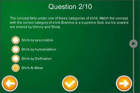
You can have a sliding panel - it's often used in mobile to present additional info. Something like this:

enter image description here

3
  • Why is there an arrow pointing left? Also, it doesn't convey "more information" like the info icon I have above; substituting that for the arrow would make it non-obvious what this thing is sticking out of the RHS of my app, no?
    – ashes999
    Commented Oct 17, 2011 at 16:24
  • It could use a bit more design, yes :). I'd replace the arrow with a question mark, which should do the trick. BTW, the icon you have above immediately says "chat". The fact that it has a little "i" hidden under the bubble just makes it a strange chat. Commented Oct 17, 2011 at 16:43
  • @VitalyMijirtsky yes, I know. Having said that the question is a question, this icon will suffice for the time being.
    – ashes999
    Commented Oct 17, 2011 at 16:51
1

I am working on a iPhone app currently, that has a 15 steps (yes i know..) assessment in it that users need to fill out. Each page is one question. I also needed that "info" on question that you are mentioning.

What i've done is a folded paper corner in the bottom right corner, that reveals just one letter "i" that stands for additional information. Tapping on that place, folds the paper upward and gives user an information on that question. (something like google maps on iphone does when you click that fold paper icon)

I must admit, its more aggressive than your popups even, but since it has that little animation and since the design supports it (its designed as a clipboard with papers since its an assessment) its interesting and not that annoying; and its not like they will pick the answers while reading the information.

Make sure that your questions are understandable to most of the people without reading the additional info, so they only need it once or twice along the way. If its impossible, than you need to change something ux-wise.

5
  • Any chance of seeing a video of this?
    – ashes999
    Commented Oct 17, 2011 at 12:55
  • i have still frames - design, it's still not coded. I cannot publicly disclose it yet, so shoot me an email [email protected] Commented Oct 17, 2011 at 13:28
  • okay, no worries then, my imagination will probably suffice :)
    – ashes999
    Commented Oct 17, 2011 at 13:36
  • btw, i know this is offtopic, and i know that there was a thread concerning this, but you never mentioned why you need that done button? Commented Oct 17, 2011 at 14:29
  • it's like a quiz. You can flip through any of, say, ten questions, pick whatever answer you want, and at the end, signal that you're done.
    – ashes999
    Commented Oct 17, 2011 at 16:25

Your Answer

By clicking “Post Your Answer”, you agree to our terms of service and acknowledge you have read our privacy policy.

Not the answer you're looking for? Browse other questions tagged or ask your own question.