6

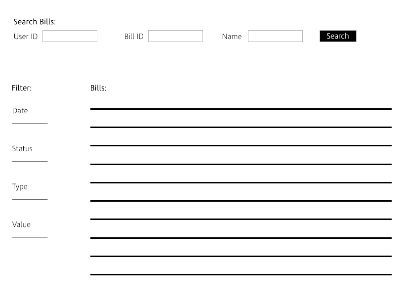
I have a table full of content, and there are multiple values users can search the content, example: User ID, Bill ID, Name.. And there are also filters, example: date, status, type, value...

I think the way they are in the image attached is confusing. How can i combine search values and filters?

Please let me know your suggestions. Thank you

enter image description here

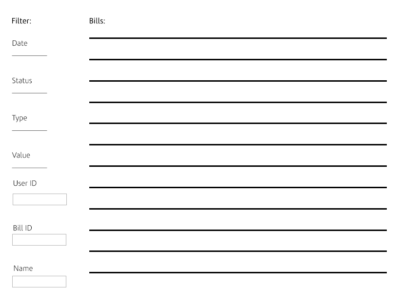
Maybe I should add the search inputs with the filters in the side? like this: enter image description here
1 Answer 1

4

From your examples, I see a few things:

  1. Users need feedback on when searches are active
  2. Users need feedback on which searches are active
  3. Users need to combine their searches with their filters, without being confused.

The important UX consideration here is to make sure users are aware of the system status - i.e. what filtering is being applied. So the aim is to provide lots of feedback.

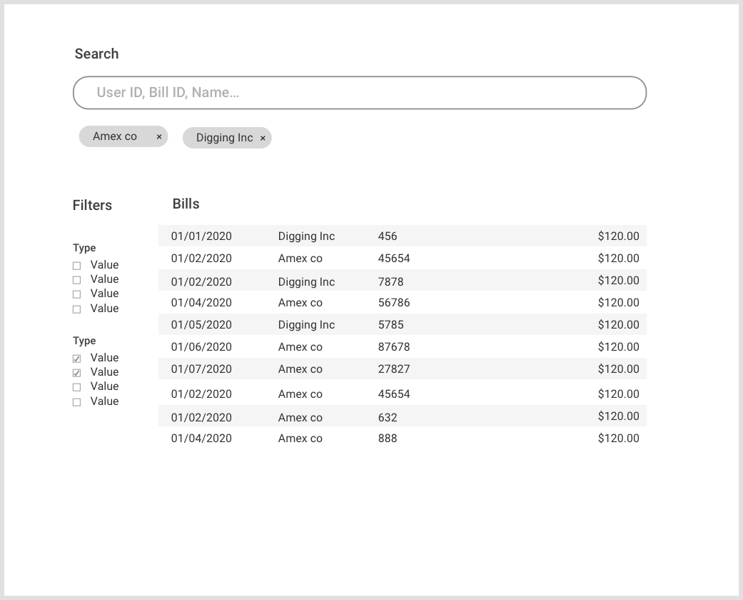
With that in mind, I've mocked up a quick wireframe. The 'active search' indicators are best placed under the search bar, so the user can see their search being applied.

enter image description here

4
  • Thank you so much for taking the time to answer, i really appreciate it. When the user opens the page, He will see all the bills. And then he can search for a specific one and filter the bills. So the bills will be there without the search. But if the user wants to find a specific bill id for example, he will search for it. I don't think combining the multiple search inputs is clear, especially that it can be more than 3 according to the user.(it is a dashboard)
    – nyjom
    Commented Feb 28, 2019 at 7:27
  • Just have one search box; let the software have the problem of figuring out what the user's input is. Even if you have a bill Id of 001 and a user Id of 001 just show them both of the user searches 001; the user will be able to pick the right one. If you really feel it's critical that the user specify, have a drop down to avoid visual clutter of 20 text boxes. Alternatively if you're showing 20 columns, put a filter icon on each column. This method works less well when the user can search for data not shown in the grid
    – Caius Jard
    Commented Feb 28, 2019 at 7:55
  • You could also consider showing a drop down under the search box when the user types e.g. 001, have the drop down show options: "search everywhere for '001'", "search for user id '001'", "search for billid 001"... if the user chooses one of those, modify the search box to contain userid=001 or similar to show the user the syntax for doing a userid search if they want to type it rather than pick from list. Like google does; if you want to search only in a specific site, put "site:x.com" in - I was taught this by google's advanced search page-I set options there and then observed the search box
    – Caius Jard
    Commented Feb 28, 2019 at 8:02
  • @nyjom "I don't think combining the multiple search inputs is clear" Why? Personally I suspect it's a lot less error-prone and intuitive than multiple inputs. Perhaps this is something you could move to user testing, or even a simple paper test.
    – S. G. A.
    Commented Feb 28, 2019 at 20:52

Your Answer

By clicking “Post Your Answer”, you agree to our terms of service and acknowledge you have read our privacy policy.

Not the answer you're looking for? Browse other questions tagged or ask your own question.