4

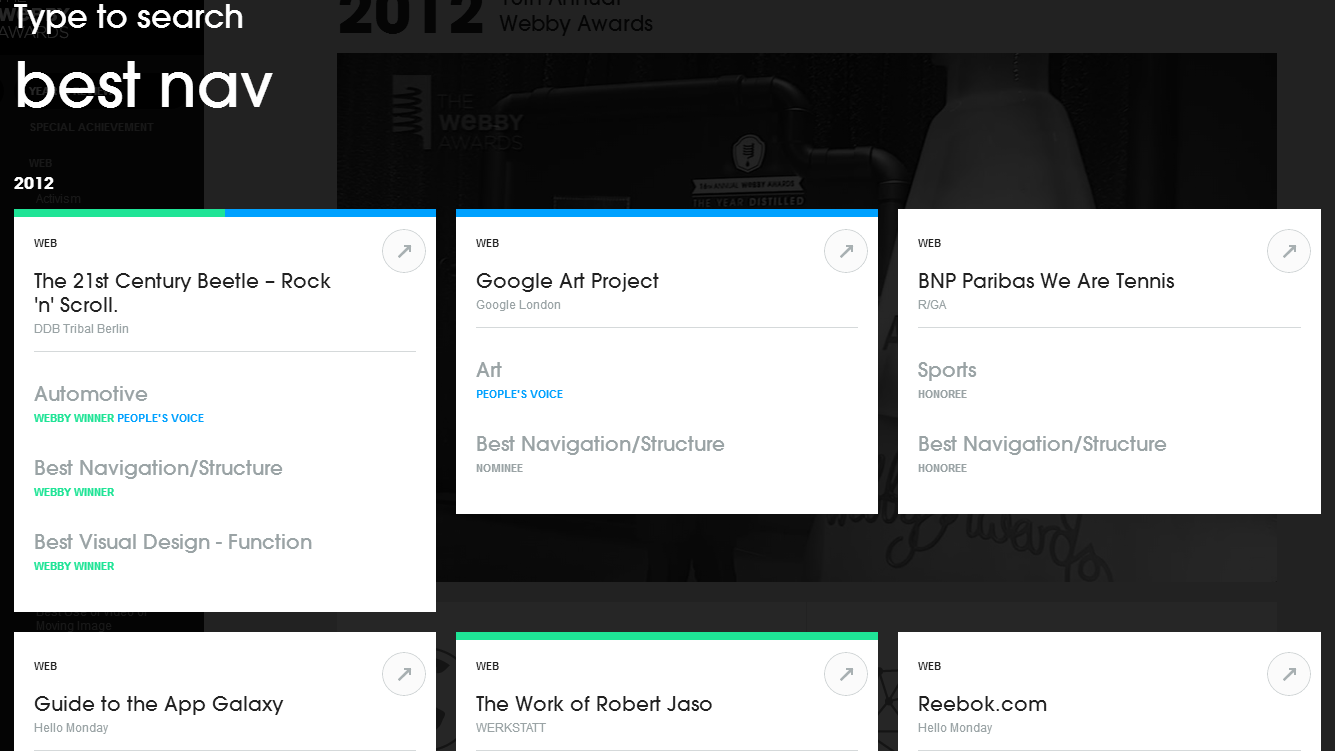
I've noticed a few sites utilizing a full viewport search overlay in which when a search function is called, via a magnifying glass or link, the previous view is overlaid with a semi-transparent overlay and a search box appears. The attached screenshots represent what I'm referring to.

Example sites: • http://www.myspace.comhttp://winners.webbyawards.com/2012

In many cases I can see why this is beneficial but what are What are the negative and positive issues when utilizing a search pattern in this manner? I'd like to discuss User Experience implications of course but are there technological issues as well?

For example, when utilizing a lightbox or modal for content - sending a user directly to that lightbox/modal can be difficult - with or without a url with a hash.MySpace SearchWebby's Search

3 Answers 3

2

Some pros and cons of this approach:

Pros:

  • You gain a significant amount of real estate for the search task.
  • It is clear to the user that you are presenting a nontraditional interface. This might allow you to present a novel interface, as in the webbyawards site: enter image description here
  • Arguably you might be able to more easily return to the interface you were previously using if search results didn't pan out.

Cons:

  • It isn't clear that presenting search results this way is actually better for users, who are accustomed to traditional web searches looking like Google searches.
  • As you mentioned, it is difficult to share the results of the search with anybody else via URL.
  • The technical complexity of this type of interface is considerably higher than a traditional search control.
1

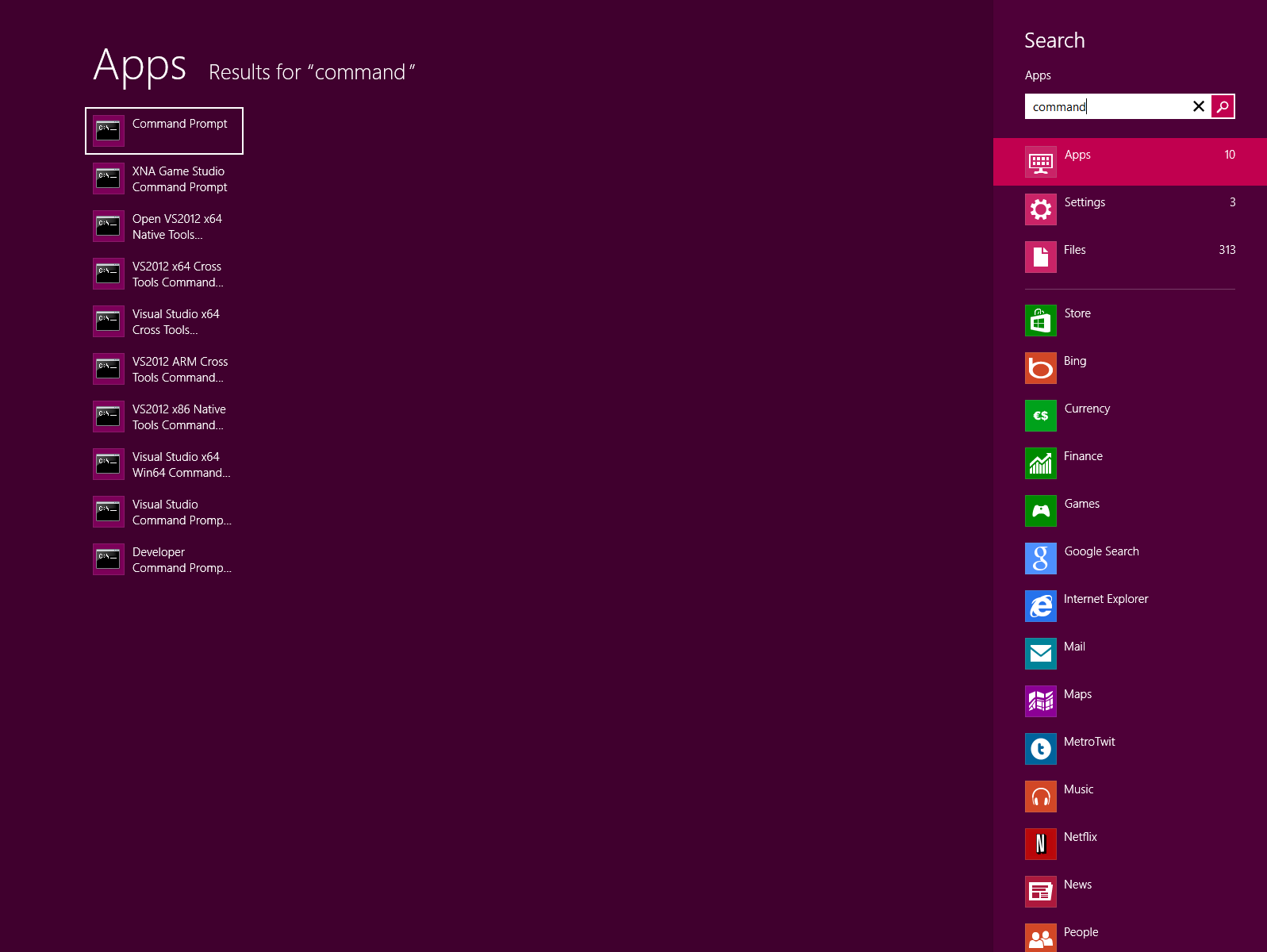
My guess is that this new pattern comes from peeking at Windwos 8, which behaves exactly the same way. You hit the windows home button on your keyboard and start to type.

enter image description here

When you do you see immediate results emerging on the screen, like this:

enter image description here

Pro

You get the entire viewport as a search area, and have the ability to focus on this specific task (searching). You avoid distraction from surrounding tabs, advertisements and notifications.

Con

You lose context of where you are in the app (besides search). What where you doing? might be what you're asking yourself. Also, it takes a lot of effort to overcome this new way of navigating. More importantly - how do I stop searching and get out of here? All of this adds to frustration - which is bad for business.

If you're bald - implement it now, but my recommendation would be to wait until more sites start to use it (and users start to know how to operate it).

0

It is good and novel in many ways, but just to add to another concern: it will be frustrating if what you want to search is from a piece of the original view, in this interface you can't refer back to what originally inspired you to search.

Your Answer

By clicking “Post Your Answer”, you agree to our terms of service and acknowledge you have read our privacy policy.

Not the answer you're looking for? Browse other questions tagged or ask your own question.