0

Let's say I'm trying to accomplish a task on a mobile app, in order to do so I need to choose one out of 2 options, for example, confirm via e-mail or text message.

Each choice leads the user to a different "path"

What's the best interface solution to present this choice to the user?

1
  • Why not just use 2 buttons?
    – yitzih
    Commented Sep 13, 2018 at 19:08

3 Answers 3

2

It depends on what happens on selection of that element.


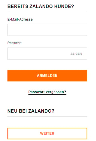
1. If it is a link to a new view/site, simply using two different buttons is usually clear:
enter image description here

This is an online shop giving the user the possibility to either log in into their account or to create a new one. You can see that the buttons are styled differently for primary and secondary actions.


2. If it is a "toggle" that adjusts what is currently shown on the screen, you can use something like iOS' "segmented controls":

enter image description here

Here you can see how choosing one option immediately affects the content shown on screen.

0

The easiest way to use the buttons with the required functions. Note that the buttons can be of different design and color. So you can make a brighter button and use it more often. It will draw attention to your goal.

0

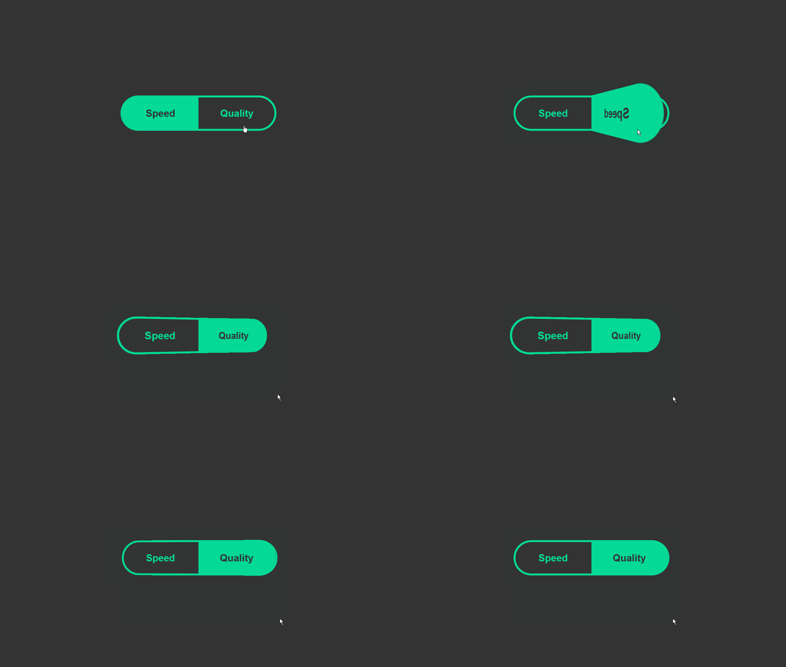
toggle example
I would use something like this. Not necessaraly with this animation, but big enough so it can be toggled; left one option, right other.

Your Answer

By clicking “Post Your Answer”, you agree to our terms of service and acknowledge you have read our privacy policy.

Not the answer you're looking for? Browse other questions tagged or ask your own question.