3

I'm creating a UI that allows a client to review the individual (and global, but that is for another time) results of a survey once it has been completed by another user. The question types are pretty standard, and can be boiled down to multiple choice and free text.

My first approach would be to show the form to the client the way it was presented to the user, just with the answers filled in. However, this could confuse the client by filling the screen with the visual cues used to tell a user that the form is interactive. Also, specifically with multiple choice, the other answers that the user did not choose could be seen as visual noise if the client already knows (or doesn't care) what the other options were.

Am I wrong in trying to display a filled in form differently from when it was filled out (or created, for that matter)?

edit for more context: In this platform, the individual responses are just as important as the global data and trends. The client viewing the response needs to have the ability to review the input, respond to the user who submitted it, and move on to the next submitted form.

edit with possible solution: At this point, I think that I am going to just show the user's input and question, with a button to show the other options.

**What is the answer?**
_B) this is the answer_

On button press:

**What is the answer?**
A) not the answer  _B) this is the answer_  C) maybe the answer

My thinking here is that the client reviewing all the submitted answers most likely won't care what the other options were because a) they created the survey themselves, or b) when viewing other responses, they will be reminded what the other options were.

2 Answers 2

1

If you are showing the result, I Would expect you would be summarizing the user input, and not just serving it as it is.

If you have a good chunk of survey results on hand, then you can show the user's answer and how that compares to what the consensus so far is. Think an exit poll survey.

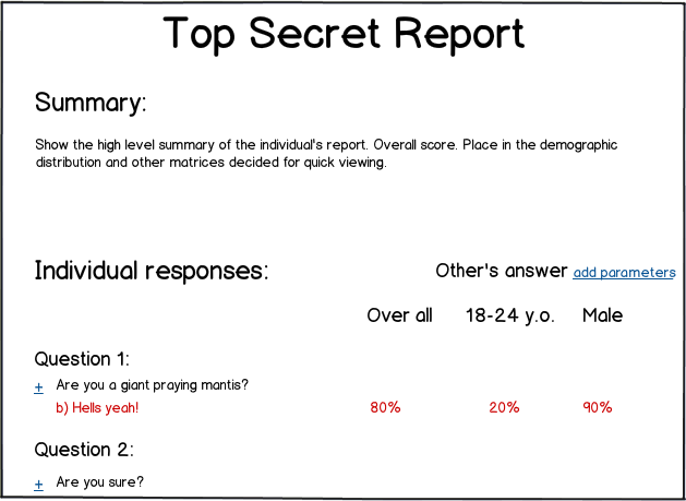
That being said, depending on the contents of the survey, you might want to emphasize certain aspects. Like if you are scoring the survey then, you should begin the result with the score (and maybe sub-category scores). You can do comparisons based on the demographics or similar parameters.


I would imagine something like an infographic. Show the overall summary and bullet points up top and then the inner workings and additional details in the body.

It can be a good experience if you nail down the parameters which will be most interesting to the user. Also, the heading and the background working of the parameters should be clear: If you show 'Male' and '18-24 y.o.' parameters, then does it mean that you are talking about males which are 18-24 or male of all ages and 18-24 y.o. male and females?

Ofcourse, you should replace the numbers with graphs (bonus for interactive graphs) everywhere where possible.

mockup

download bmml source – Wireframes created with Balsamiq Mockups

5
  • That makes a lot of sense, but there is still a strong use case for showing the full survey. Individual responses are important in this platform. I thought about displaying the selected answer without the other options like this: What is the answer? '<br>' This is the answer. Commented Jun 27, 2013 at 14:12
  • @oatmealsnap The full survey is a details on demand function. The entire point of a survey is to get an overview of the population on the subject matter. The results should aid in this discovery. If however, during the discovery, you find some particular individual/group odd, then you view their full report (answers) to see if you can fish out the oddity.
    – rk.
    Commented Jun 27, 2013 at 14:16
  • I think I can get behind that. Reviewing the individual responses will be important in this platform, but any way to make that process easier and quicker will be helpful. I think it will work to display just the user's input up front, and show the other options on a button press. There will definitely be a 'global view' which can highlight the outliers, but there needs to be a good individual view, as well. Commented Jun 27, 2013 at 14:31
  • @oatmealsnap You need to provide more details on the domain of the survey and in what form the individual responses need to be consumed by the user. Since, with the current level of information you will be getting super generic answers like the ones right now.
    – rk.
    Commented Jun 27, 2013 at 14:35
  • I added a bit more context to my question. Hope that helps. Commented Jun 27, 2013 at 14:58
1

What benefits does your client have observing 1000 user survey? It's a dummy work. As @rk said, there should be some useful summaries for each survey. I add, the summary could include some meta information, i.e. daytime of survey passing, time was taken for filling survey, some outliers in answers and so on.

The idea is as both client and user are different kind of users it is better to display information aligned to their tasks.

1
  • Totally agree, but it makes within the platform for the client to be able to view an individual user's response. There will definitely be a summary of all responses, but it is important I cover this use case. Commented Jun 27, 2013 at 14:09

Your Answer

By clicking “Post Your Answer”, you agree to our terms of service and acknowledge you have read our privacy policy.

Not the answer you're looking for? Browse other questions tagged or ask your own question.