19

I always have the same question when I am working on a new project and I have to start thinking about responsive design.

What do you think about reducing the font-size of the website content from 16px (Desktop) to 12px in the Mobile version?

I think it is not a very good move in order to have a good UX. When I come to my colleague at work (he is UX designer as well) with a problem about how the content looks on mobile, he always told me to reduce the font size. I am keen on keeping the same size with maybe a little font size reduction for titles.

What do you think?

5 Answers 5

9

Sounds like your coworker is using Material Design guidelines; they recommend not going smaller than 12sp (scalable pixels) for mobile. Whether this is a good practise to follow depends on two factors: the font you use and the device that the website will be viewed on. Different fonts have different characteristics when it comes to readability, while each device has a different pixel density.

Ideally, font size should be responsive and scalable, but I recommend not using sizes smaller than 16 px for body text. Depending on the font, many users will start to have to put in more effort to read at the 12-14 px size mark. Sure they can still read it, but it's not exactly good accessibility.

By default, the browser will display each font at 16px (CSS pixels). This is a good default for most cases, but may need to be adjusted for a specific font - i.e. the default size can be set lower or higher to accommodate for the different properties of the font. Then, once the default size is set, larger and smaller fonts should be defined relative to the default size using pixels. These can then be used to adjust size of the text for primary, secondary, and other type of content on the page.

This link here contains some good insights regarding font size best practises.

2
5

Yes, it is a good idea to decrease the font size on mobile compared to on desktop.

Generally, you sit further away from the screen when you're viewing a larger desktop / laptop than you do when viewing on a mobile. An 18pt character will take up more space in your vision if it's closer to you than if it's further away.

From this great article about responsive typography on IA.net

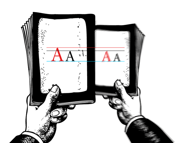
The further away you hold the text, the smaller it becomes visually. You need to make the text size bigger the further away the text is read, to compensate for a larger reading distance. How big is, again, a science in itself. If you are inexperienced, a useful trick is to hold a well-printed book at a comfortable reading distance while looking at your website to compare.

enter image description here

1
  • What about for older/elder users, whose eyes may have presbyopia (farsightedness)?
    – 5260452
    Commented Apr 10, 2020 at 18:19
2

What is the physical size of a single pixel?

On a 15 inch 1366×768 px laptop screen, a single pixel should be about 0,2341 mm wide.

On a 5 inch 1280×720 px phone screen, a single pixel should be about 0,0864 mm wide. But here comes that Supporting Multiple Screens article on Android Developers website that says that device independent pixel size on Android can be calculated from the following equation:

px = dp * (dpi / 160)

On the mentioned mobile screen, a device independent pixel is approximately 1,8358 times bigger than the physical one: 0,1586 mm. That’s about 68% of the laptop’s (desktop’s) pixel size — on mobile, your pixels are already smaller.

To answer your question: I think you shouldn’t make base font size on mobile different than it is on desktop, because the browser (or the OS) already takes care of it. However, depending on your overall design and the content, you may find it useful to make headers a bit smaller on mobile because of narrower screen.

1

For body text don't go from 16 to 12 for web to mobile but I would suggest you to stand at least for 14px for mobile(for body text).

You can keep the primary text or body text at 16-14px
secondary at 14px-12px(like tab menus)
and tertiary text at 12px-11px(like tooltip)

You can read more here.

1

Definitely use smaller font size for mobiles, especially for headings. Lets assume, there is a heading in bold font with 42px with 5-8 words, Desktop can accommodate this in a line considering width to be 1280px, if we use same 42px font size for heading in a mobile, it will occupy the entire screen (At times users have to scroll a bit in mobile to view the heading), For body content like many others said use font size not less than 16px.

Your Answer

By clicking “Post Your Answer”, you agree to our terms of service and acknowledge you have read our privacy policy.