3

I often see that monospaced text is smaller than regular text in the same context. Here are some examples:

  • Crafting Interpreters has the main font 16px large and the monospaced font 13px large.
  • Beautiful Racket has the size of inline code set to 85%.
  • When I look at The C Programming Language, I see that monospaced text is smaller than regular text.
  • Firefox has 16 as the default font size but 12 as the default font size for the monospaced font.
  • GNOME has 11 as the size of the main UI font and 10 as the size of the default monospaced font.

Why is it this way? I have many ideas of why that is a bad idea, but this practice is common, so I guess that there is a good reason for that.

1 Answer 1

2

Due to the difference in character width.

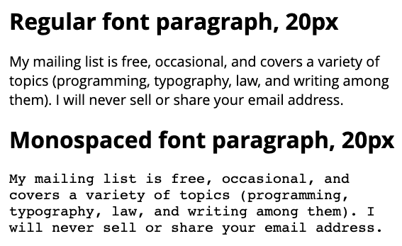
In a normal font, a greater number of characters can fit per line, while in a monospace font, the character width is always the same, generally the width of the lowercase "m", the widest character. This would cause two paragraphs, one with normal typography and the other monospace, to vary considerably in the number of lines per paragraph width.

enter image description here

On the other hand, the "empty areas" between characters resulting in a monospace font make the lines of text perceptually clearer than those of a normal font, so the smaller size does not affect its correct readability (see the word mailing).

6
  • Then, why are most monospaced fonts so wide? There are narrow monospaced fonts like Iosevka and Input Mono Condensed, and they would fit proportional text of the same size in the regard of width. So why aren't most monospaced fonts like that?
    – matj1
    Commented Jan 25 at 10:12
  • 1
    @matj1 Monospace fonts aren't wider than other fonts. By definition, every character in a monospace font has the same character width. That just makes the font appear wider overall, since "slim" characters such as i, l, etc, don't compensate for the widest characters such as W or M.
    – Duroth
    Commented Jan 25 at 15:06
  • @Duroth They are wider in the way that average monospaced text is wider than average proportional text of the same height. If I understand the answer correctly, that is why monospaced fonts are smaller – to be narrower. My idea is to have them narrower but not smaller in height.
    – matj1
    Commented Jan 25 at 17:02
  • A more or less wide font is a design decision, it is not a technical issue to solve. In the same way that there are narrow monospace fonts, there are also wider fonts in their regular version, the designer decides which one to use depending on the design.
    – Danielillo
    Commented Jan 25 at 17:31
  • @Danielillo I mean: Why do designers choose wide fonts and make them narrower by making them smaller? I think that they should choose narrower fonts so they could keep the same vertical size.
    – matj1
    Commented Jan 25 at 20:12

Your Answer

By clicking “Post Your Answer”, you agree to our terms of service and acknowledge you have read our privacy policy.

Not the answer you're looking for? Browse other questions tagged or ask your own question.