0

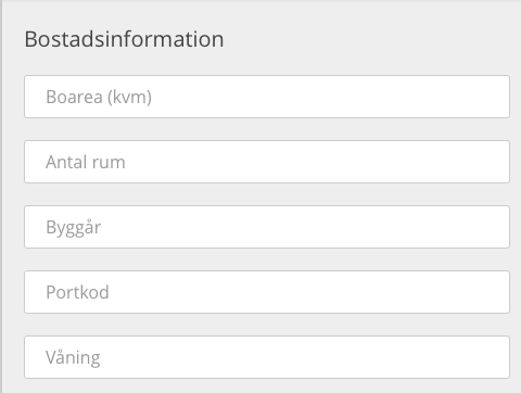
I have a long form with many inputs and I've chosen to not show any labels for the inputs but instead use the input placeholder to show what they should contain:

enter image description here

The problem is, when they fill out the form, it's no longer obvious what the inputs actually are. I really don't want to show a label above each input since it would make the form longer and longer (and there are more inputs to come): enter image description here
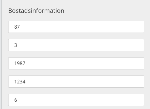
Any ideas how to tackle this?

3
  • It is not recommended that you hide the labels, especially in large forms, the user may feel lost. You could use the title attribute, the user passing the mouse would know what that field is, but it would be an unnecessary action. See: webaim.org/techniques/forms/advanced Commented Apr 26, 2017 at 12:07
  • "I've chosen to not show any labels for the inputs..." The solution is to show labels for the inputs. :) Commented Apr 26, 2017 at 12:27
  • If all of the answers are short, can you put the labels to the left of the text boxes? Those text boxes are pretty wide, and putting labels to the left won't make the form longer. Commented Apr 26, 2017 at 13:53

2 Answers 2

5

Placeholder text within a form field makes it difficult for people to remember what information belongs in a field, and to check for and fix errors. It also poses additional burdens for users with visual and cognitive impairments.

For more information, please read this from Normal Nielsen Group https://www.nngroup.com/articles/form-design-placeholders/

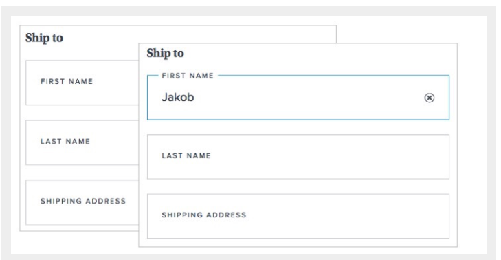
Having read that, it includes the solution that I was going to give you:

caption

Furthermore, I see one more issue in your design: The units The units should be outside of the box so that the user knows always what is the unit that you measure with. You could choose to place it either on the label or on the right of the box, something like the following image.

units

1
  • The example in the image is perfect. It provides the information needed without extending the form. I will probably end up using something similiar. Thanks!
    – Weblurk
    Commented Apr 26, 2017 at 12:20
0

Put labels to the left of the text fields.

You mention that you don't want to put labels above the text fields, because it would make the form longer. If you put labels to the left of each field, the form remains the same length, labels are tied clearly to their fields (which sometimes isn't the case if you put labels above), and you reduce the width of the text fields (since it looks like most of the field values are short, having fields fill the full width of the page seems excessive). I think this would improve the experience.

It would take a bit more work, but to keep all the fields lined up, you could right-align the labels and left-align the fields so that everything is centered around a straight line.

2
  • But what about mobile design? Where would you place the labels then? Also have a look at this study for labels on the left and on top: uxmatters.com/mt/archives/2006/07/label-placement-in-forms.php (same as @NGAFD mentioned) Commented Apr 26, 2017 at 14:16
  • If the window is too narrow to show both the label and the field, you can allow it to wrap so that the fields go below the labels. Mobile is important, but with a little bit of effort you shouldn't have to compromise good desktop design to make it work well on mobile. Just make sure that the label is close enough to the field below, and far enough from the field above, to make it clear which field it's attached to. Commented Apr 26, 2017 at 14:32

Not the answer you're looking for? Browse other questions tagged or ask your own question.