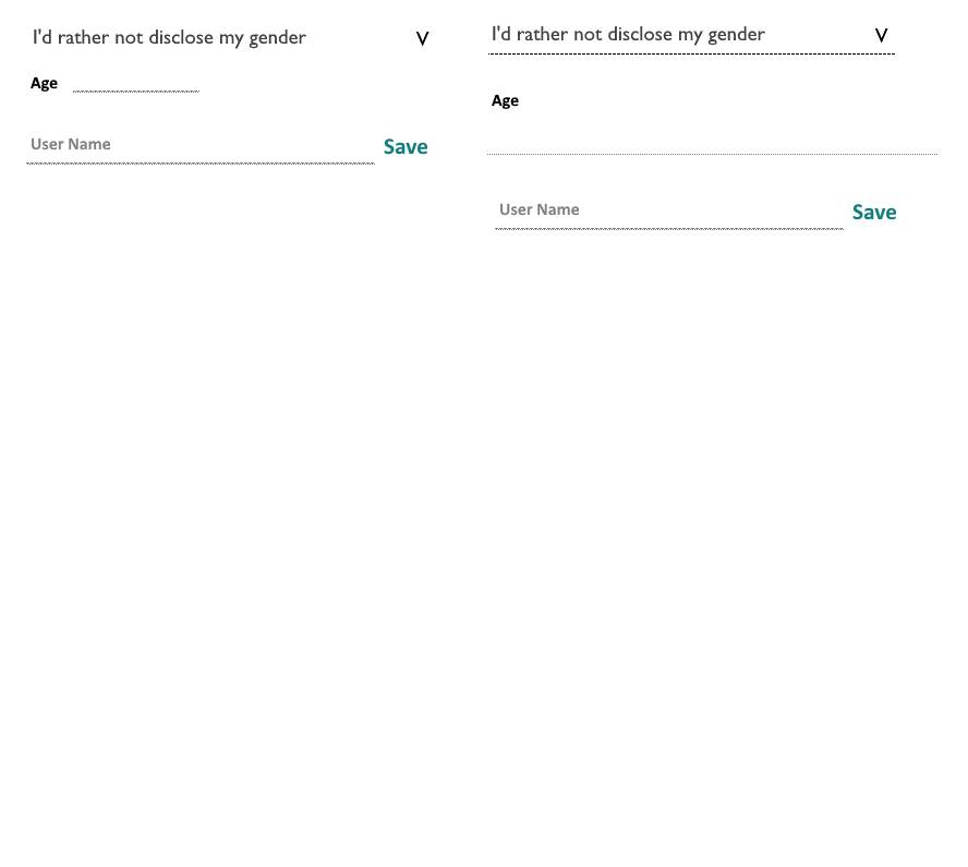
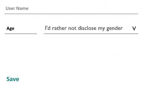
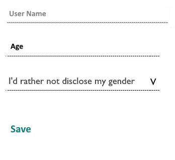
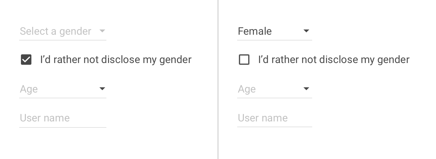
Consider the two form layouts shown below
The context here is an Android app targeting Android v 4.4+. The controls are
- A select box which I have attempted to make flat
- A readonly input which when tapped shows a popup dialog with a circuar selector
- A username
What looks "wrong" to me
- Without at least the bottom border the selectbox on the l.h.s. does not look/feel like a select box
- I feel the Age label + input on the l.h.s. does not scale well to large screens
I hope that someone with more UX experience than I can provide a few insights here.


