5

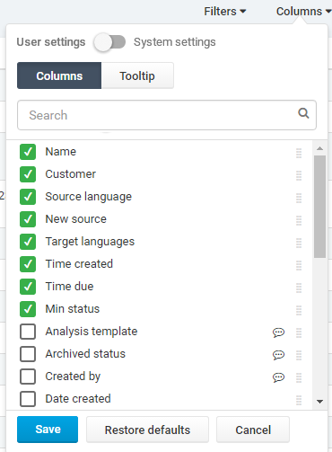
It was quite hard to title this issue - We are giving customers a possibility to customize their table view. They can decide, which fields will be visible as columns in table and which will appear in hover tooltip on each row. User can also change order of those fields, to change columns/fields priority.

What is more, user can also use system default settings, or override them with their own.

I came to this solution, but I'm not sure about it. There is lot of going on here and I'm afraid it might not be clear at a first glance.

Column view editor

Btw, the chat bubble icon indicates that this field is visible in tooltip (there is also adequate "column" icon in Tooltip section).

Is there any way to organise it better? Thank you in advance for any ideas!

EDIT: Important thing - this funcionality should appear inside a dropdown popover

4 Answers 4

1

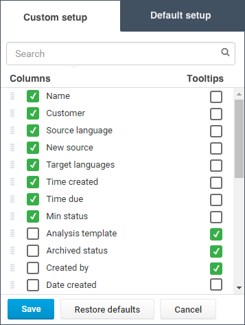
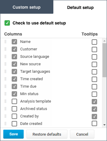
This is just an idea that might need some adjustment. This way you can immediatly see and toggle columns and the corresponding tooltips. Also it is possible to view custom and/or default setup before activating them (in default checkboxes are grayed out/disabled).

enter image description here

enter image description here

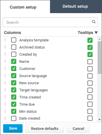
enter image description here

3
  • thank you for your input! The idea is to elevate up the field that has been checked. We have lot of fields - scrolling and looking for checked ones would be difficult and mind absorbing. Greying out is not a bad idea, but there is also a "manager view" that can change default system settings, so she/he cannot have greyed out ones. Commented Nov 10, 2016 at 8:59
  • You could add the possibility to sort on checked columns or tooltips by adding a button on each column. I added an image to show the idea. Clicking again on the sorted column will show the list as normal (sorted alphabetically?)
    – jazZRo
    Commented Nov 10, 2016 at 9:35
  • True, but one thing to consider - it does the trick only if there is a common field order. If user wants to have different order in table view and tooltip, there will be hard to implement it. Commented Nov 10, 2016 at 14:02
0

I recommend a tweak to the labels in that switch. Perhaps consider, Custom & Default as the keywords rather than User & System. This is because most people do not refer to themselves as a User, so this might come across as being impersonal.

However, perhaps you don't really need the switch - a simple Reset feature might be more valuable to the person using this.

The trigger you are using to change the order of columns is too small. Have you heard of Fitts's Law?

This scientific law predicts that the time required to rapidly move to a target area is a function of the ratio between the distance to the target and the width of the target.

Make the Change the Order target wider so that people using a mouse have a much better chance of clicking it.

2
  • I'm familiar with Fitt's Law, but I didn't want to make two action areas next to each other to eliminate accidental clicks. Triggers are changing their color to ~black when user hovers whole row. They have also large padding (about 7-8 px from both sides of graphics), so the area when cursor changes it appearance to drag is bigger than the icon. Commented Nov 7, 2016 at 11:29
  • Irrespective of the padding, one icon is wider than the other, so at least make them the same width. It's not like you are pressed for space.
    – SteveD
    Commented Nov 7, 2016 at 11:32
0

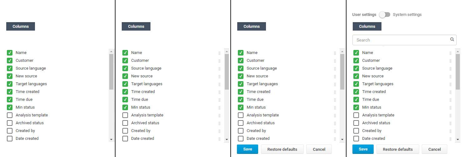
Let me try to analyse the information you are displaying.

enter image description here

In the image from left to right I add the minimum UI necessary for the action and in each step add extra elements. Depending on your application you have to consider which step is the one which shows enough information. To me and without understanding fully the application I would say 2 or 3.

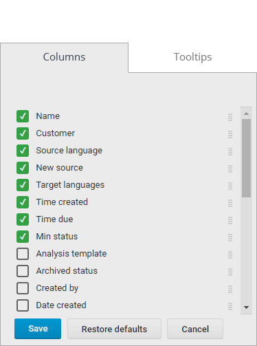
To display the Tooltips I would use the same interface but I would make it obvious which "category" (tooltips/columns) the user is modifying. For example displaying it in the very top as a header.

enter image description here

Are columns and tooltips exclusive? If a field is already selected as column can it also be in Tooltip?

If yes, it is probably a good idea to show which fields are selected in the other category. You are already displaying an icon. but I would rather make it more explicit. For example displaying all the fields in two columns (one for each "category") with active and inactive checkbox.

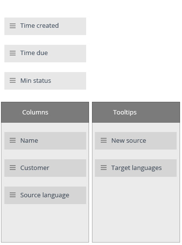
If no, you might want to make options visible and draggable to both categories, in this case the fields would not be repeated. Like in this image:

enter image description here

1
  • unfortunatelly all options that you see on my screen are neccessary. Nevertheless , your solution with draggable fields into separate "windows" might be a good idea. I will try to play with this. I will have to figure out, how to show, which fields are already in use. Thanks! Commented Nov 14, 2016 at 9:07
0

I am not sure if you have already considered this -

Excel Pivot tables, offer this quite nicely. It is a simple drag and drop.

From a list of all fields, you can drag and drop each into the headers of Rows, Columns, Filters, etc. And within each header, you can drag and drop to set the order/sequence of the fields.

A similar approach can be applied here

Your Answer

By clicking “Post Your Answer”, you agree to our terms of service and acknowledge you have read our privacy policy.

Not the answer you're looking for? Browse other questions tagged or ask your own question.