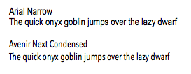
It's important to specify what dimension you're trying to optimize. Are you looking to reduce size horizontally (shorter lines) or also vertically? If you are looking to optimize horizontal width, you should be looking for a condensed typeface. Arial Narrow and Helvetica Condensed are two obvious options, but I don't find them very readable and they come off as looking cheap.
For sans-serifs similar to Arial / Helvetica, but narrower, have a look at:
Myriad Pro, Open Sans, Segoe UI, Tahoma, Frutiger, Bell Gothic, Lato, Antique Olive, and Adobe's new font Source Sans Pro.
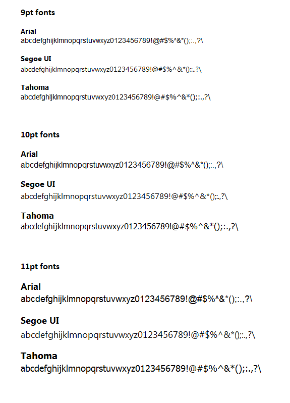
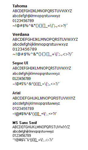
In a comparison that I did with numbers, I found Myriad Pro, Source Sans Pro, Segoe UI, and Tahoma to be the best for readability with minimum width at 9px-11px. Note that these fonts handle sizes very differently, so often a size offset needs to be incorporated to do a fair comparison.
Lato can also work well. Asana uses Proxima Nova, which is very open and readable at small sizes, but doesn't look great in a larger size as they use it.
Here's the comparison I did with everything at 10px. It's best to play around like this yourself, however, as changing font size often has a non-linear effect at these small sizes.

Others have mentioned Verdana. Verdana is very readable at small sizes, but it does not optimize width at all. That said, a wide-typeface that is readable at small sizes optimizes for height rather than width, and perhaps this is what you are looking for, but on the web where scrolling vertically is more natural than scrolling horizontally, this is usually not the case.
My personal preference is for Arial on-screen and if I'm looking for a less neutral look or if I need to optimize for width, I might look at Source Sans Pro or Segoe UI.


