18

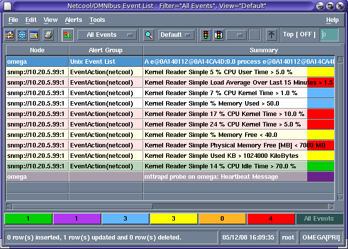
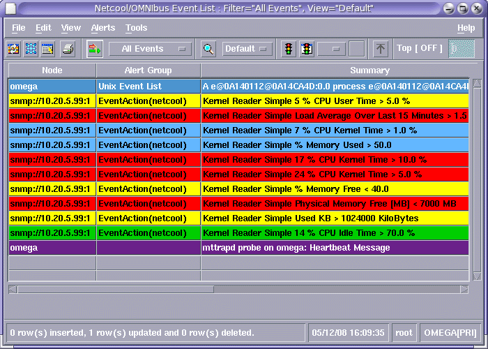
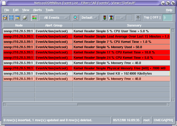
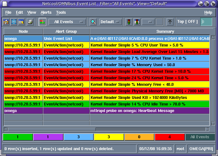
I work on a Network management system (NMS) frontend. Basically this app shows a list of alarms, updated in realtime. Such NMS apps already exist in a large variety, but two things they have in common:

  1. the alarms are presented in a table (1 row = 1 alarm)
  2. each table row background color represents the alarm's severity

Point 1 makes perfect sense to me. But point 2? Is there any evidence that having a rainbow on your screen makes you work better? What is a good approach to solve this problem?

Screenshot of typical NMS frontend

7
  • Related: ux.stackexchange.com/questions/17964/…
    – Zelda
    Commented May 15, 2012 at 14:19
  • 9
    before anyone comments on the fact that maybe you don't need so much of each colour, can you confirm whether this dialog needs to be seen from a distance, as I have found on some projects that that is a requirement for this kind of 'alarm style' dialog. Commented May 15, 2012 at 14:25
  • @RogerAttrill Excellent point.
    – GotDibbs
    Commented May 15, 2012 at 14:27
  • 1
    Great point @RogerAttrill, we've got a similar app here which auto refreshes, anything red needs attention. I made the colors pastel to make them less eye grating (this example is eye grating) but a certain amount of attention grabbing might be warranted.
    – Zelda
    Commented May 15, 2012 at 14:31
  • 1
    @rogerattrill makes a good point. Have you looked at the Few Hues Many Values design pattern? designinginterfaces.com/firstedition/…
    – Wander
    Commented May 15, 2012 at 15:16

10 Answers 10

13

The number of colors seems to be overkill in this situation. To illustrate severity I think it's more useful to stick to a simple, yet well known convention...

mockup

download bmml source – Wireframes created with Balsamiq Mockups

You'll notice that I'm using very light colors above. That's because the original colors are too dark against the black text and it makes the text hard to read. And then, for the sake of red-green color blindness you should probably add an exclamation mark to the high priority items.

Other variations on the above could certainly be used. For example, should low priority items be colored at all? Maybe they should be white to let the higher priority items stand out. But in general I think the number of colors should be kept low enough that people will understand and remember their meaning without having to constantly check a key or legend.


By the way, when it comes to contrast, the black text on a red background is the worst offender in your example with a contrast ratio of 5.25:1. This is just enough to be WCAG 2 AA compliant, but it's not AAA compliant. You can test this yourself here... http://www.snook.ca/technical/colour_contrast/colour.html

3
  • "Ensure that all information conveyed with color is also available without color" From 3.3 of the Fed usability guidelines usability.gov/pdfs/chapter3.pdf
    – David W
    Commented May 15, 2012 at 19:08
  • The use of gradients is actually used here. The gradient between Yellow to Red stands for different severities. But the other colors have to do with other things (blue - informational), (green - alarm has cleared), (purple - information of different kind i think) Commented May 19, 2012 at 3:49
  • @Steve: Thanks for your answer, I am now convinced that yours is the best solution. I've test-driven the original approach "heavy/intense colors": The NOC boss seemed to be more or less neutral, but rather disliked the intense colors. My boss had problems reading the text because of red-green-blindness. Damn, this NOC person on top convinced me so much ;)
    – user694971
    Commented Jun 5, 2012 at 13:32
12

I would say that losing the colors is not an option.

I am a former NOC Engineer, meaning that I sat infront of screens like these for 12 hours shifts. And I used the exact interface you are showing me now. But instead imagine 4 screens filled with 6-8 windows of these, each one focusing on a different network.

Now I'm a UX Architect :)

Talk to to people who use it currently. That will give you the insight you need to understand that these colors are awesome but one of the least problems. You need to understand how people work and use these before you change them. Asking this forum will do little because we don't understand the people who use the software. Except me of course :)

If you would try to remove the colors from my screen I would hit you :) Because having a job that requires you to monitor a screen like this by virtue means that most of the time nothing happens. So I browse the web, watch movies on my private laptop and other distractions. Each color, yes all 5 of them, had different meanings at work. And after working hundreds of hours behind these screen you develop an "intuition" for the amount of certain colors that would pour in and also the pattern in which they would arrive. If you would reduce that to icons or something similar you would handicap me.

Only one idea for improvement (there are more)
To help me, it would have been better if I could monitor a certain node/servers/adress, because each shift hands over a list of "trouble" nodes. I want to be able to keep an eye on them, so it would be awesome if I could create a specific watchlist for certain specific nodes that I know are important.

Trust me the colors are important. And you should go outside and observe real people using them. Spend a 12 hour shift with someone, it will do you more than 12 hours behind your own screen ;)

Hope it helped!
8
  • 3
    Very good advice about talking to the actual users. However you are experienced and habitualised to this system so are used to its layout. Should the system be built as brand-new then the colours and layouts may not be the best route to take. But you make a good point; redesigning existing accepted systems requires a very different approach than when building from scratch.
    – JonW
    Commented May 15, 2012 at 21:50
  • Jon is absolutely right. The fact that you've developed strategies to make the most out of your UI doesn't mean that it has the best possible concept or that it can't be improved greatly. Judging from its looks, it's not a very modern system. It's very possible that by now different approaches have been developed which can make it much more efficient. See "the faster horse" story. Commented May 16, 2012 at 8:30
  • @VitalyMijiritsky: Yesterday, I talked to one of my engineering colleagues: he said, these systems all look the same. (Although this fact actually encourages me to try a different approach)
    – user694971
    Commented May 16, 2012 at 8:32
  • @JeroenEijkhof: thanks for your great answer, this really makes me thinking. And yes, I remember our NOC people telling that during night shifts they watch a movie or something... By the way: in this new NMS, there'll be also audio notifications (and +1 for monitoring troubling note. I heard similar things while checking out requirements, but not as clearly stated)
    – user694971
    Commented May 16, 2012 at 8:36
  • 3
    My comment doesn't necessarily have to do with this particular system, I'm talking more about the general validity of this approach. "Trust me, I'm a user" should be taken with a lot of salt :). In this case, you say you need the colors because you need to know what's going on. In other words, you don't need the colors - you just need to know what's going on. The colors may or may not be the best means to this end. Commented May 16, 2012 at 8:38
3

Talking to the customers is a good suggestion, since they will be using it on daily basis it should be usable to them first and foremost.

Just an idea, perhaps limiting the colors to the right side would make it less "shouting"? Left side could have some transparency so that the colors are still there but subtle.

Again, I agree that any changes to the UI must be cross-checked with engineers who are currently using it.

enter image description here

1
  • I would put the colour at the left instead of the right.
    – sergiol
    Commented Jul 13, 2014 at 13:21
1

For the longest time computer convention is to use color to help give meaning to a message. Traditionally error accompanied with red. Warning with yellow and successful/Good messages with green.

Long term users of any type of system will grow use to seeing items in such a fashion. I would suggest to keep this trend going. The additional color help imply meaning. If you are fixing the UI I would suggest to change the colors a bit to be more ascetically appealing to the eye as users that have to watch these screens for 8 hours a day suffer from eye strain with hard colors like these. I would also suggest accompanying the background color with an icon so those with color blindness can still use the software. Trust me it helps, I know personally!

1

few thoughts

  • too many colors, consider keeping just conventional ones like red for errors, orange/yellow for warnings, green/no color for ok's
  • color coding isn't explained (not clear what each means), consider adding a legend that explains all colors
  • all colors are equally bright, not clear which one should get most attention, consider emphasizing most important and fading less important ones
  • colors are too bright/vivid, there is no such colors in nature, so they hurt human eyes, consider less aggressive ones
  • consider leaving in color only the most crucial alarms (errors/warnings), make no color for everything else
  • consider a switch (tabs or checklist on top of the table) that filters alarms by severity: errors only, errors + warnings, only blue ones, everything
1
  • All good points, however this is more of a critique / review of the screenshot than a specific answer to the OPs question.
    – JonW
    Commented May 16, 2012 at 7:36
1

It very much depends on which information you're trying to get across here. Two examples:

Example 1, some adjustments in case you want to show the types of events taking place. In this case, the current design is't all that bad. Each color could be tied to a type of event. So that for instance a mostly yellow screen would say something about the types of events taking place. I only dimmed the contrasts in the background and dumped the bottom row of colors. Still ugly, but it might work. :-) example 1

Example 2, some adjustments in case you want to show the severity of the events taking place. In this case, the least sever events would be light grey, the most severe would be bright red. Inbetween you'd have a few steps between grey and red. And again, it's not about the background, so those contrasts are dimmed. example 2

1
  • This is an interesting exploration, how would I be able to show only red, yellow, etc. alarms in this UI? In the top one the bottom row show the total amount (important) and if you click them then you can see only the type of alarms that you are interested in. These are primary filters. Commented May 19, 2012 at 3:45
1

Using different colors to differentiate the various notifications can be useful, however, the diversity in background colors seems overwhelming.

Instead consider less background colors and a diversity of foreground colors. Just make sure the contrast between the various foregrounds and their background is high enough and that the various foreground colors are distinguishable (*).

(*) Offer a few themes (and perhaps an option to create custom themes) so that people with eyesight problems can select a color theme that is both comfortable and diverse enough for them (e.g. users with color blindness).

Also try and give default colors that have a correct contextual meaning when possible (e.g. red for error, orange/yellow for warning).

Use diversity in background colors only for limited uses (e.g. selected/active rows).

1

I love the rule of three. The reason behind is when you design a presentation audience are likely to remember only three things from your presentation. Same rule can be applied here.

1
  • Maybe when the audience you are addressing will only see it once. But in this case it is different, people work in the interface for hours. Commented May 19, 2012 at 3:46
1

Not perfectly related, but i wrote a Debug-Viewer to see what's going in some of the applications I write. I decided to drop "warning" all-together and just have 3 output severities: INFO, DEBUG and ERROR. Info and Debug has no color, Error is red.

I use some extra configurable colors like blue and yellow for areas that interest me, for example messages from a certain services (errors from that service are still red).

0

color is useful, up to a point. This example goes beyond that point, however, and is now just a crazy mess of primary colors all competing and conflicting with each other.

2
  • I think the question is looking more for answers for whether the use of colour in apps to communicate information is in general appropriate (and strategies for doing it), than for critique of the specific example.
    – kastark
    Commented May 15, 2012 at 16:20
  • as stated, color is useful up to a point. So, I'd say definitely appropriate.
    – DA01
    Commented May 15, 2012 at 16:43

Your Answer

By clicking “Post Your Answer”, you agree to our terms of service and acknowledge you have read our privacy policy.

Not the answer you're looking for? Browse other questions tagged or ask your own question.