2

We have events in our system which every one of them has its own "severity". There are severities from "deadly important" to "normal" and "success". Our goal is to visualize those severities on a button in fixed navigation. the button itself shows the number of events happened in our system, but not those severities.

We want to show the overall of severities of events logged in the system on that button. button itself is a standard bell with white background (the size is small: 50px x 50px).

We tried some solutions, like changing the color of bell or changing background of bell container. I myself suggest visual changes, since the button is small. Things like resizing or rotating.

Clearly I need some ideas based on limitations I described.

here is a mock up of what I did:

The bell is one that I want to show overall of events severities

2
  • can you provide a mock of what you have so far?
    – Mike M
    Commented Jul 30, 2017 at 5:36
  • Is it possible to surface these as a preference in the settings? Also, is this a mobile app? desktop? You have some real estate ramifications otherwise.
    – Mike M
    Commented Jul 30, 2017 at 16:15

2 Answers 2

1

Reconsider your idea of wanting to show severity in the menu.

Such labeled icons are intended to show if there's an event and how many, not what these events are. A detailed view with more info on events, like severity, should be shown when a user clicks the icon.

Don't try to push everything you want to show in one icon/menu. An extra step in your flow is not a problem when it is a logical step.

You can try things like changing color but it will not work as well. There's no room, no labels indicating what color means and there will be contrast problems. A yellow level severity event will be hard to read for example. What color do you give to your icon when you have two low level events and a very high level one?

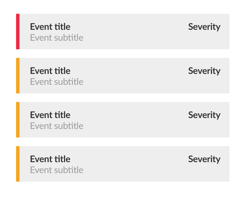
I'd stay with the numbered label above the icon and show a very clear list when the user clicks the icon. See the image below. The list shows events very clear. There's room between them. Every event has a clear indicator of severity (coloured bar and label to the right).

enter image description here

2
  • I agree about yellow level severity that you've mentioned, but I'm searching for a more "readable" solution instead of "clickable". you're right that another click is acceptable, but I want to avoid that. Commented Jul 30, 2017 at 10:51
  • and sorry for no up vote, I'll up that when I got 15 reputation ASAP Commented Jul 30, 2017 at 10:52
1

If you insist on showing the severity using the icon, I think you can try changing the background of the icon based on the severity of the event. But still, you don't have to change the background for all the events. I will go with indicating a deadly important event by a red background for the icon and a successful event with a green. For all other events (based on priority) the user can go on and read it from the list.

4
  • 2
    Don't use colour alone to convey information.
    – JonW
    Commented Sep 28, 2017 at 10:21
  • I thought that changing the color of the icon container would convey the priority as he was consistent of displaying the info using the icon itself. Anyways, thank you for the feedback :) Commented Sep 28, 2017 at 11:13
  • While it might convey that meaning to many people, those who are colourblind, or with any visual impairments would not even realise that it was showing a different state.
    – JonW
    Commented Sep 28, 2017 at 11:26
  • @JonW Agreed. Color itself can be confusing. And that's right about colorblind people Commented Sep 28, 2017 at 11:39

Your Answer

By clicking “Post Your Answer”, you agree to our terms of service and acknowledge you have read our privacy policy.

Not the answer you're looking for? Browse other questions tagged or ask your own question.