59

Trying to design a user interface screen for a part of the system where users will be able to select companies from a drop-down. The drop-down list is potentially very long. However, if the company is not there, they are allowed to add it in free text.

The important thing about this screen is that if the company is in the drop down list, it's critical that the user finds it and selects it. If they add it again, it could cause serious problems with the workflow.

What we've considered:

  1. A searchable (i.e. type in the box to get autocomplete suggestions) drop-down, with an "add new" option at the bottom of the list which they can't get by typing. That way users have to scroll all the way down to add something.

  2. A check-box toggle between a drop-down and a free-text entry, with a possible warning popup when they hit the checkbox.

Are there any other smoother, cleverer or more secure ways to try and ensure a user tries to find and select something already on the list before adding?

4
  • 41
    The "tags" box you used when you asked this question meets very similar needs - how was it for you? Commented Oct 19, 2015 at 21:42
  • 3
    This also sounds like a situation where backend validation is important: if your processing code receives something other than the ID of a company that is already in your database, it should check and see whether it got a name that matches an existing company and, if so, convert it to the corresponding company ID. You could also check for names that are close to known company names at this stage, to protect against misspellings or the like, and prompt the user with "did you mean [name]?" Kind of like how the tag box prompts you when you try to create a new tag.
    – David Z
    Commented Oct 20, 2015 at 13:39
  • 1
    Isn't this exactly what gmail offers if you want add a label to an email? you can type to filter the list of labels you already have. If not, the thing you typed will have (create new) appended so you can create a new label. Commented Oct 21, 2015 at 14:20
  • For cases like this, I've found this (allow additions for a searchable dropdown) to be extremely helpful and straight forward to end users. semantic-ui.com/modules/dropdown.html#/examples
    – Alex Szabo
    Commented Mar 22, 2016 at 18:56

9 Answers 9

51

Worked on a project with this exact problem. We needed a way for the admin staff to add attribute to products. Because attributes are used for search purposes, we need to ensure if that attribute type already exists, it should be selected instead of creating a brand new one.

We ended up using something akin to your first idea.

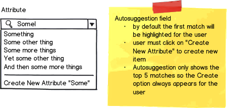
mockup

download bmml source – Wireframes created with Balsamiq Mockups

The "Create New" option does not show up until the user has initiated a search. This ensure the user sees all likely matches before attempting to create a new item.

Note: This solution assumes you have sensible users who understands why it's a bad idea to create duplicates. It provides increase flexibility to your search to still find potential matches, without preventing the user from creating another item if that action is really necessary. e.g. Apple Inc. & Apple Inc. Canada

Update: Because of the way the autosuggestion box works, it will only show the top X (we used 5) matches for the search string. This system is optimized for speed and depends on the user being diligent in typing in the full item name when creating the new item. For tools that gets infrequent usage, consider JeromeR's solution. Context matters! Test your design!

10
  • 1
    We also had a very similar problem, and for our users this solution failed usability testing and long-term field testing. It's too long to explain in a comment, so I posted it as an answer. :)
    – JeromeR
    Commented Oct 19, 2015 at 21:58
  • 1
    @JeromeR I probably should have mentioned that the autosuggestion box is limited to the top 5 items and so "Create New" option is aways visible. The users are also in the system on a daily basis and understand that they should keep typing if they think something is already in the system. I agree, this solution is optimized for speed and has a bit of a learning curve.
    – nightning
    Commented Oct 19, 2015 at 22:11
  • The Devil's in the details, as you know. I just updated my answer with more details, too. And with these extra details, I can upvote your answer. :)
    – JeromeR
    Commented Oct 19, 2015 at 22:16
  • Not all that dissimilar to Stack Exchange tags!
    – corsiKa
    Commented Oct 20, 2015 at 14:51
  • 1
    @DoubleDouble We can also bulk edit the records themselves to change all of these to a single company record, then remove the other 2.
    – nightning
    Commented Oct 20, 2015 at 16:44
28

The first idea failed field testing and variants failed usability testing

It sounds like we had the same idea as your option 1, and we implemented it. We were looking for a way to force users to search first without users realizing that we were forcing the search to occur. A variant of our first design actually tested OK with a small sample in usability-test sessions.

Post-release, it was bad news.

Let me first tell you the details of our earlier design, and then tell you why it failed and what we're planning to do to make it more usable.

Our first attempt

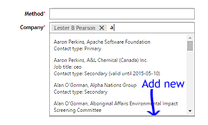
As users type in the box, matching names appear in a drop-down list. The drop-down list scrolls if there are more than four matching. Clicking an item in the list adds a lozenge to the box. To multi-select, users can click in the box again, beside the lozenge, type some more, and select another match from the drop-down list.

The more characters the user types in the box, the more exact the matches become in the drop-down list. As you can imagine, this shortens the list of items. The very last item in the list is always an icon with its Add new command link. But if there are still more than four items in the list, users can't see this command link unless they scroll down.

The version we released first

In this detail the design failed. Users didn't scroll. They didn't discover that the Add new command was at the bottom of the list. It increased support calls. The majority of users of this system are occasional users, so not daily users. They are data-entry clerks. Some of them are unwilling users who enter garbage data so they can "finish" their task and get on with other work. The garbage data must later be cleaned. The users quickly learned—and remember—that they can enter a few character in the box, and see a list of matches. They stop typing as soon as the list of matches appears, so the list is never short enough to reveal the Add new command link. #FAIL

We also considered putting the Add new command at the top, but this path was too easy and caused over-use in usability testing. The desired user behaviour is to select an existing item whenever possible. The Add-new function needs to be the user's last resort, in this context.

Another thing we considered was a non-scrolling block below the scrolling drop-down list, for the Add new command. Our developer couldn't manage it in the available time.

[Edit] One comment asks why we didn't pursue this for the subsequent modifications. The circle-plus icon was present in the legacy version, to the right of the box. We moved it to the bottom of the list for the first release, but there was pressure from various interested parties to put it back. So the solution described next includes a political compromise. (This is UI-design and usability in the real world, folks.)

Our second attempt

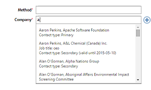
We relocated the command. It's no longer at the bottom of the drop-down list. It's now to the right of the box, but with a few differences.

Our second attempt, showing sample data

  • The command is now a button with only the icon. The command link's text has moved into the tool tip, which appears on hover. The icon is a circle with a + inside, common on the Windows platform. This icon is appropriate for these users.
  • The command never appears unless the box has focus and the user has typed at least one character.
  • The command doesn't appear in one abrupt snap. It fades in, so it won't trigger an involuntary looming-stimulus response. This is because we don't want the user's brain to flush its short-term memory or to release stress-inducing adrenaline.
  • The command fades out when the box loses focus.

We're about to start testing this Saturday.

We really want the user to click in the box and start typing, so we can look for existing matches before they create a new entry.

7
  • 3
    Really looking forward to seeing your test results for the 2nd version. I wonder how having the + at the side affects the number of duplicate entries added to the system. I can definitely see how mileage can vary depending on the user group for the 1st version. We have content curators who are in the system all the time, they know how that search tool works, the fact that the autosuggest box will only show the top 5 results and they should keep typing if they don't see their option they think is already in the system.
    – nightning
    Commented Oct 19, 2015 at 22:08
  • 1
    The "content curators" for this product's users fall into two categories: A) High-Power, so they can send errors back to the clerks to fix. B) Low-Power, so they must fix the errors themselves, and in a hurry, because they are responsible to use the data to generate reports for a regulator or a legal action, always on a very tight timeline. We are trying to make life easier for Low-Power users, because these users have great influence when it comes to renewing the product's annual license fee.
    – JeromeR
    Commented Oct 19, 2015 at 22:19
  • 2
    Can I ask, why you decided to move on to another idea that would presumably also require additional design/dev/QA time, instead of allowing some extra dev time? It would seem that all the faults you mentioned would be fixed by an always visible bottom link.
    – Celos
    Commented Oct 20, 2015 at 13:14
  • 1
    How about having the pop-up just display a few choices, with no scroll bar, but with "More..." and "Add new..." as additional choices. Clicking "More..." would expand the control and add scroll bars if they're still needed, but "Add new..." would be available without scrolling in any event.
    – supercat
    Commented Oct 20, 2015 at 17:48
  • 1
    @Celos I amended the reply so it addresses your point. Initially, I dodged your question, but it deserves a reply. See the section marked [Edit].
    – JeromeR
    Commented Oct 24, 2015 at 14:10
21

My answer shows simularities with others posted here but I want to emphasize how important the right communication is.

For example:

  1. Reconsider the used language to make the intentions clear. For example use create company to add some weight to the action or use the word new to emphasize the difference.

mockup

download bmml source – Wireframes created with Balsamiq Mockups

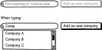
  1. Directly show the create button as it makes users aware of the possibility to add a new company.

  2. Showing the suggestions without delay allows to experiment with the input to find out if a company is possibly in the list (maybe with a slighlty different notation)

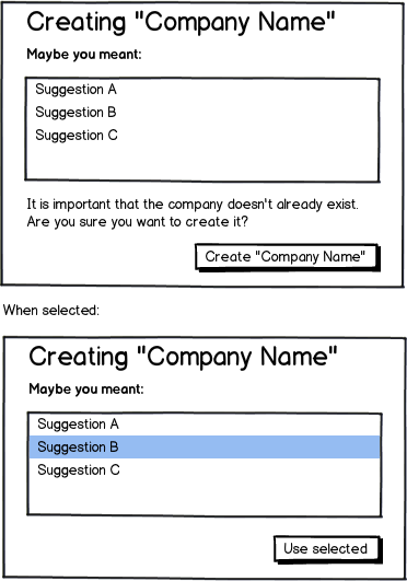
  3. When clicking create/add show all possible duplicates first (eg. in a modal). A small informative text can make clear why this action is needed.

mockup

download bmml source

5
  • This is nice and clean.
    – JonH
    Commented Oct 20, 2015 at 15:31
  • 1
    It's not obvious to me that I could click one of the suggestions in your modal. Until I got to your "When selected" example, I thought you'd forgotten to add a Cancel button.
    – Alex
    Commented Oct 21, 2015 at 12:28
  • 2
    @Alex It’s just a Balsamiq representation of a select box and serves as example only. Sure , when implementing this concept there is much to improve about it, but that goes beyond the purpose of my answer.
    – jazZRo
    Commented Oct 21, 2015 at 13:19
  • 1
    +1 for the check for duplicate when creating new company modal. Although it may make it clearer there are 2 possible actions if you add 2 buttons that explicitly say "Use Selected" vs "Create New Company" instead of changing the button label if an item is selected.
    – nightning
    Commented Oct 21, 2015 at 19:49
  • 1
    For the suggestions box, instead of "Maybe you meant", try "If you meant one of these, please select it:" so the user is prompted to choose the selection if it's in the list. Also, "Create 'Company Name'" should always be in the interface, as well as "Use Selected"; if nothing is selected then "Use Selected" should be greyed out -- this will help reinforce to the user that they can select something. Keeping the create button always visible makes it so even if the user accidentally selects something they can still create a new one without having to figure out how to deselect the erroneous item.
    – Doktor J
    Commented Oct 23, 2015 at 16:25
7

Not commenting on the usability of this design pattern.

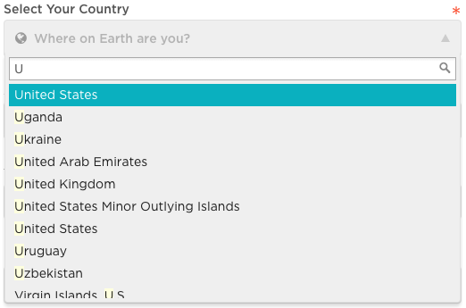
The New Relic sign-up form uses this pattern.

Example: Country drop-down/search field.

enter image description here

2
  • This is interesting. I tried it, at the link you provided. Your screenshot shows that you typed "U" and the list displays matches that start with "U" and matches that contain "U". I wanted to know what the magnifying glass does. It is a diversion to get people to start typing a search string. Clever. The original question has two parts: "search existing" and "add new". Your answer helps by showing another drop-down box possibility for the "search existing" part of the question. I'll vote this up. :)
    – JeromeR
    Commented Oct 21, 2015 at 20:25
  • Thanks for the link. It really helps to play around with something to get a feeling for the interactivity.
    – Nash
    Commented Aug 16, 2018 at 9:43
4

The problem with scrolling is that scrolling to the bottom of the list box can be inconvenient, and takes the user's attention from the text box where the item to add is located. Basically, the content to add is above the list, but the command to add is below the list.

To resolve this, use the first method you described, but have the "Add" button beside the search box. To protect from errant additions, disable it, and only enable it if the search returns no results.

Here's a mockup:

mockup

download bmml source – Wireframes created with Balsamiq Mockups

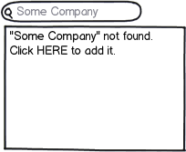
You can also put a link to add the content in the results box itself when nothing is found. I'm a bit leery of this approach since the list box does double duty, which may confuse the user. Still here's an example:

mockup

download bmml source

2

Hmm... This is just an idea and I don't have any actual examples of other sites that do this but what if there was a field where the user would type the full name or part of the company name and then clicks "search". Their entry would generate a list of clickable matches which would appear below the search box, perhaps using a "tag" style. If there's a 100% match, only show that one for the customer to choose from. If there's more than one, include an option for "It's not listed" or something to that effect and clicking on that would allow the user to enter in a custom value.

The great thing about doing a search first and then allowing the user to pick from the results is that it ensures that the full company name is entered first, not just the first few letters, which would provide a high-percentage match of search results. Dev would need to be involved but it may be worth it not expose the user to a myriad of options in a drop-down menu. This would be a much cleaner, more elegant approach.

An example of this could be if the user types in "P&G", they would see "Proctor & Gamble" appear in the list of matches.

4
  • I like this idea of only showing fuzzy matches or partial matches if the user requests them. I'll upvote this. :) Could you add a hyperlink to your P&G example?
    – JeromeR
    Commented Oct 19, 2015 at 22:24
  • 1
    Thanks Jerome! This wasn't something I've seen before. It's just an idea I had. I could put together a quick wireframe if that would help. Commented Oct 19, 2015 at 22:45
  • This sounds like a good option if avoiding duplicates is a priority.
    – user31143
    Commented Oct 20, 2015 at 6:23
  • No need to wireframe. I was thinking "If I go in search of this on the P&G site, I'll end up on some country-specific site that doesn't have the control you mean in the same way." :o By the way, welcome. Julia.
    – JeromeR
    Commented Oct 20, 2015 at 7:23
1

What about a drop-down with a "other" option at the bottom, which, when selected, displayed a text box?

4
  • 2
    This is a pretty decent option if the list is short. However, it is unlikely to work well with a long list that scrolls, because the user will not see the "other" option.
    – user31143
    Commented Oct 20, 2015 at 5:49
  • @dan1111 True. This comment needs to be longer.
    – Gaelan
    Commented Oct 20, 2015 at 5:50
  • @Gaelan Did you know you can easily add to your answer? Click the edit link below your answer, above the comments. Also, welcome to the ux stackexchange list.
    – JeromeR
    Commented Oct 20, 2015 at 23:38
  • 1
    @JeromeR I know. 😀
    – Gaelan
    Commented Oct 21, 2015 at 1:23
1

Or you could simply just authenticate user submissions.

Note: I'm not a developer with this technology but being a developer using other languages, I think front-end editing power to users is generally a bad idea since there's all sorts of people out there.

I would simply just do manual authentication.

1
  • Samuel. Welcome to UX.stackexchange. This response functions more as a comment than as an answer
    – Mayo
    Commented Oct 25, 2015 at 15:13
0

Among the posted solutions I think Julia's one might be the best, but I want to point out an important aspect: with selections so complex as that for a company, of which there are likely many with very similar if not identical names, the thing that could help the most in avoiding both duplicates and erroneous entries is giving the users extended information about the selected (already existing) company: give the users information about the company location, its logo, its field of activity, but actually even just their website, that could be more than enough: it's very easy for a user to click a link and check that that's what he meant (and there are very few companies without a website these days).

Actually you could likely allow and demand the users to enter the information themselves if they want to add a company: this is both increased effort that stimulates searching for an existing match and a quite trivial of an effort if the user really wants to enter the correct information: it's very likely that he already knows the company's website.

To be sure not to frustrate too much the users you could allow them to skip the website information entry, but you should do that rather hard to do; you might activate the option after a minute, maybe still showing it, disabled, but saying to those who click it something along "Please try for a little longer to find the company website. If you can't find it in a minute you'll be allowed to go on without that".

Actually in the end it would likely make sense to allow the entry of either the company name or its website's url, and the entry (paste) of the url will likely be easier for most users.

You should consider only the second-level domain name of the url by default, and maybe tell that to the user for confirmation and allow to instead enter a longer part of it they say it's not correct to cut it (some company might have a site without their own domain name).

Many little companies have just a social network page, you should handle the major ones (facebook...) automatically, recognizing them and probably storing only the relevant part of the url for them.


You could think about e-mails as another option, but that would likely help little and add confusion, as most companies will have more than one, and while you might want to consider only the domain part, those who don't have a website will likely neither have e-mails with their own domain.


You could, and maybe should, go further with this by making yourself internally a web search with what the user enters, displaying the first urls found (of course as clickable links) and making the user select the correct one.


You should sort the informations returned by number of past selections and, if you do the web search, by relevance from the search engine.

===

Consider also if it really makes sense to allow the users themselves to add new companies, if they are not very frequent it might be better to make a less automatized process, with a request for adding a new company or in any case with a second check on your part that the entered company is new and its information is correct.

===

As an aside, if this makes you think of using the url as a database key, not the worst idea but not ideal either, urls change owners and probably not every single company in the world has a website.

===

Edit: Well actually I'm not sure Julia's solution (requiring the entry of the full name) is the best one, if you implement the checks I wrote here you should probably allow partial entries of the name, and of course searching results as the user types

Your Answer

By clicking “Post Your Answer”, you agree to our terms of service and acknowledge you have read our privacy policy.

Not the answer you're looking for? Browse other questions tagged or ask your own question.