2

So I have a menu on web application I am developing. In this menu, there is an option for how many Project vacancies one wishes to create. The user can choose as many as they need (large numbers will prompt a confirmation to ensure the user hasn't made a mistake).

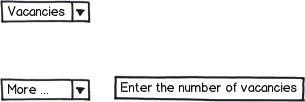
The first way of choosing is a small Drop Down List that looks like this:

Drop Down List, unselected

When you open said list, you are prevented with these options:
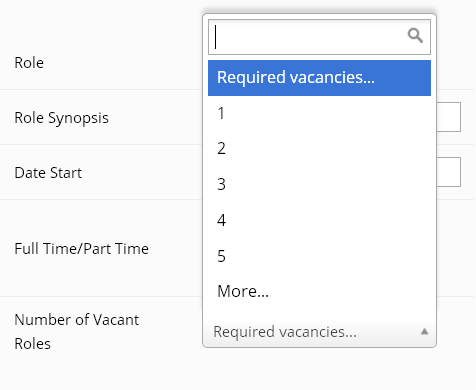
Choices available

If one decides that 5 is not enough, you can select "More..." and the Drop Down List changes to a text box:

Custom entry for the number of Vacancies

When I showed this to my tech lead, his first question was "Can you go back to the List?"

I instantly thought that having such an option was inappropriate, as I felt it would clutter up my nice menu, where I like to keep things minimal for things like this.

My question is - Is this the right choice? Should I give the user the option to go back to the list? Does it matter?

3 Answers 3

6

Spin control suits your requirement.

enter image description here

user can increase or decrease the number by clicking on up-arrow or down-arrow. This can be controlled to be between two numbers

2
  • 1
    +1 for re-evaluating the situation and providing a nice and simple solution Commented Apr 12, 2013 at 12:00
  • Due to a requirements change the Boss doesn't want a "number of roles" option anymore, but this was a good answer, thanks.
    – Felix Weir
    Commented Apr 19, 2013 at 12:26
3

If someone decides that they now want to select 3 instead of 15, they can already go back just by entering 3 instead of 15. Sure, the interaction is slightly different, but I can't imagine anyone being confused by this.

You should limit the inputs of the text box to numbers (and indicate that clearly), so that you don't get answers like "fifteen".

Personally, I would prefer not having the dropdown in the first place, and only having the text field as I can fill it in faster and it is cleaner.

1
  • 1
    +1 for not having a dropdown. Users aren't going to read the dropdown options to help make their decision, and there's no concern for mis-spelling here, so a dropdown is only making the process harder.
    – Mark D
    Commented Apr 12, 2013 at 12:51
3

User should be (always) allowed to undo his action. This is a good UX practice.

If you want to stick to your design of drop down menu + more, then I'd suggest you add an input box beside the drop down list in case of more. This makes it quite easy for the user to re-select a lower number.

mockup

download bmml source – Wireframes created with Balsamiq Mockups

Your Answer

By clicking “Post Your Answer”, you agree to our terms of service and acknowledge you have read our privacy policy.

Not the answer you're looking for? Browse other questions tagged or ask your own question.