186

In case you missed it, over a week ago Steve Harvey incorrectly announced Miss Colombia as winner of the Miss Universe 2015 pageant. He later apologized and corrected himself; Miss Philippines won.

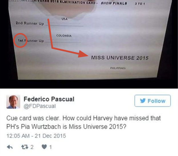
Harvey essentially blamed his cue card for being confusing, and I don't blame him for blaming said cue card:

[http://www.people.com/article/steve-harvey-host-miss-universe-20161]

Assume that it's not a publicity stunt (I don't think it is):

If you're a program director of the pageant, how would you prevent this mistake? [Added Jan 1] In other words, how do you ensure the announces the correct winner and then immediately announces the first runner-up?

I'm assuming most would re-design the cue card (I would), but that doesn't have to be the solution.

Here's some requirements and restrictions, though:

  1. The host may not have a teleprompter or large cue cards held by a stage hand (because the finalists are onstage with the host).
  2. The host must refer to the third-place contestant as "Second Runner-Up" and the second-place contestant as "First Runner-Up" (though they don't necessarily need to be referred to as such on paper).
  3. Once the final three contestants are determined, the host announces the Second Runner-Up who then leaves center-stage. Once the final two contestants are determined, the host announces [edit: the winner, referring to her as as Miss Universe YYYY, and then immediately names the First Runner-Up.]

Assume that

  1. Any printed information that's seen by the host will only be seen by the host until The End of Time.
  2. [Edit again] Over the previous three pageants (2012-2014), there has been no commercial break between the announcement of the Second Runner-Up and the winner. In other words, there's usually not sufficient time to hand a separate cue card to host when only two contestants remain.

I have my solution (I'll post it) but I'm curious to see what others plan.

20
  • 4
    On your third point, from the format of Miss Universe announcements, the host announces the winner directly, and the first runner-up is assumed/announced right after. Commented Dec 30, 2015 at 1:56
  • 68
    I'd have avoided it by cancelling the entire spectacle that is televised pageants.
    – DA01
    Commented Dec 30, 2015 at 18:56
  • 60
    I feel like the problem is that we say 2nd Runner Up ("2nd" == "3rd place"), 1st Runner Up ("1st" == "2nd Place") and then the winner. Why not call a spade a spade and let the numbers and words actually reflect what they are.
    – coblr
    Commented Dec 30, 2015 at 20:01
  • 5
    Actually that cue card in the photo does not look particularly confusing at all. It says "MISS UNIVERSE 2015" with the largest bold letters, followed by "Philippines". Although maybe if all eyes are on the host (or the host perceives it that way) then perhaps the host might feel confused...
    – user74252
    Commented Dec 31, 2015 at 14:31
  • 7
    Here's a modified image showing how Harvey apparently (and understandably) scanned the card. If you watch a clip of the initial announcement of Miss Colombia as the winner, Harvey doesn't mention Miss Philippines as the supposed first runner-up at all. i.sstatic.net/QSvZO.jpg
    – Tim Huynh
    Commented Jan 3, 2016 at 23:13

20 Answers 20

127

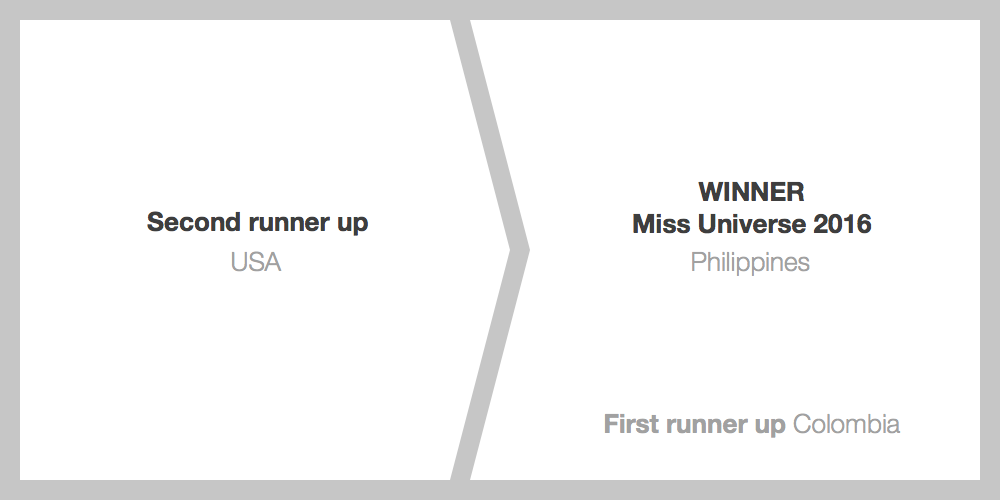
enter image description here

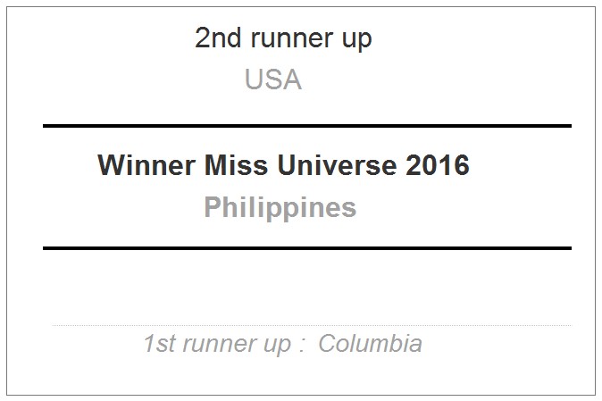
The design should be as simple as possible so that the host doesn’t waste any cognitive load in figuring out who each winner is. If there is any visual element that is not helping convey who those two winners are, then it becomes a distraction that will increase the room for error. Minor distractions, but when not done correctly all the little things like font size and spacing and alignment add up.

As an idea, instead of vertical lists we can separate the winners out side by side, aligning it with the hosts natural reading direction (while this is in English), and giving the text as much space as possible so it becomes impossible to conflate the two categories nor countries.

In the context of this announcement, the first runner up becomes the least important title among the winners, announced after the Miss Universe winner, and is given smaller prominence to reflect that. Some people have mentioned or suggested that the order of the winners should be as they are (so 2nd runner up, then 1st, then the winner) but remember that this card is not supposed to be a representation of the pageant winners, merely a tool for the host to do their job.

Training for events like this is obviously important as plainclothes and others mentioned, but there should also be nothing wrong with coming up with a design so clear that anyone could see it for the first time and not have to think twice.

Edit: I gave the first runner up more prominence as I learned the host does indeed announce that title after the winner, and spelled out the ordinal numbers as Basil suggested to allow for more natural reading for the host.

13
  • 5
    I like this one, but I am not sure why everyone has to put the country name below the text. How about 2nd Runner Up is USA (all on one line). This avoids any ambiguity.
    – JonH
    Commented Dec 30, 2015 at 19:51
  • @JonH Because SE has a tendency toward copy cat answers ... Commented Dec 31, 2015 at 1:22
  • @JonH the 2-column approach works better with shorter multiple lines since you have the vertical space, but generally I agree with you, the country can be to the right or below the title almost interchangeably. Commented Dec 31, 2015 at 4:25
  • I like this treatment, but the First Runner-Up section is too far away from the winner section and too small. I think that a user who's unfamiliar with the design and/or under duress would either a) not see the text or b) see it then dismiss it because its smaller text. A person who's visually focusing on (reading) the Miss Universe section cannot physically see the first runner-up section; our visual focus really is that narrow. You could have an arrow leading from Miss Universe to First Runner-Up.
    – Tim Huynh
    Commented Dec 31, 2015 at 4:38
  • 6
    I would suggest spelling out the ordinals "Second" and "First" rather than use the digits 2nd and 1st in this otherwise excellent design. Seeing the number makes us think of ranks and ordering which do not apply here. The card’s purpose to help the announcer announce, so spelling out the words should help them roll off the tongue. Commented Jan 3, 2016 at 0:01
123

Design matters

One clear problem in this case: No thought was given to the function of layout and typography. In the chaos and excitement of a big event, with all eyes on the host and a few dozen million people watching at home, it's easy to get flustered and read without thinking. Hence the running joke about news casters reading whatever comes up on the prompt. It's critical to design the information for absolute clarity.

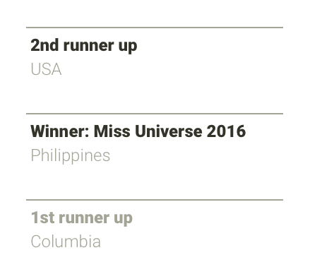
The design part is easy. There's only three key/value pairs, you know the order they'll be accessed in, and the data is relatively short and known to the reader. How about this:

EDIT: apparently they announce 3rd, then winner, and 2nd is implied ... ( ಠ_ಠ )

Proposed redesign of the Miss Universe 2015 results card

The results are listed in the order they should be announced, in the words to be used, with adequate separation from one another, and the secret values are rendered in such a way that they are difficult to "spy".

Don’t forget training

It goes without saying that such a large event comes with a lot of things to prepare for. The climax of the whole thing is announcing the results. Whatever the design is, you need to make sure that anyone involved in that moment can do their task without thinking. Design can make the task more learnable, but you still have to rehearse with a mock-up.

14
  • 30
    That's not the way they're announced, that's the whole problem. Commented Dec 30, 2015 at 6:13
  • 9
    I would consider the training part to be the most important part of this answer. The training should happen using an identical design but with made up country names.
    – kasperd
    Commented Dec 30, 2015 at 11:38
  • 11
    I'd use color for the winner, and add a little crown icon. mixing up the runners up is not such a big deal, but the host should never be able to mistake the winner.
    – Peter
    Commented Dec 30, 2015 at 12:57
  • 2
    That is assuming he knows what is Runner up :P
    – Alex S
    Commented Dec 30, 2015 at 14:37
  • 9
    @VitalyMijiritsky whatever the order, I think you get the idea. I'm glad to say I have no clue how the event goes down. Commented Dec 30, 2015 at 15:40
93

I honestly cannot recall any example that can be used to demonstrate as many cognitive principles.

Red circle and arrow are my additions:

The cue card, with a circle around the text '1st' and an arrow highlighting the visual separation between the runners up and the winner

Priming

Priming is defined by Lidwell (2010)1 as:

The activation of specific concepts in memory for the purposes of influencing subsequent behaviours.

Although he speaks of purpose, spreading activation has it that the term is also used with relation to completely internal processes - like when in search for a tomato other red fruits stand out.

A bowl of fruit and veg

Someone who's about to announce a winner will be primed for something like '1st' or 'first'. So no wonder the 1st runner up was picked by the announcer.

How we read

It is natural to think that when people read things they read every bit of it. But this is far from how the brain works. Although it is a fairly recent theory (you could trace these concepts well back into the 50s), Mayer's multimedia learning model provides a good explanation of the process:

Mayer's diagram of multimedia learning theory

  • When presented with words, our brain converts them from low to high level models. The visual features (lines, low level) and words (medium level model) matter not - it is their eventual semantic (high level) that is important.
  • The brain, as it does, takes every shortcut possible for the sake of cognitive economy.
  • Integration with existing knowledge happens when the stimuli models 'agree' with existing knowledge.
  • Integration is the aim.

So we don't really read everything, we stop once the stimuli model makes enough sense to be integrated with existing knowledge.

Also, as we read, the brain (again due to spreading activation) already forms an idea of what to expect:

If it ain't broken...

You know what's coming next, don't you? Had it been the full sentence, in an appropriate context, your brain might have hardly surveyed the rest of the sentence.

This is why proofreading your own text is challenging - you already know the meaning of it all, so existing knowledge makes the text more integrable and you miss obvious mistakes; unlike a fresh-reader who really needs to make sense of things.

So for someone primed for '1st', the '1st' alone is enough to satisfy the integration requirement.

One way to solve this is by not front-loading the line with '1st'.

Inattentional blindness

Inattentional blindness (see this famous demonstration), asserts that when people are focused on a specific task they could become cognitively blind to what would otherwise be an obvious stimuli.

So once the '1st' was picked, Inattentional blindness may have well kicked in.

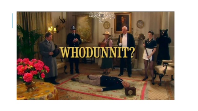
Here's yet another great demonstration:

An image from WHODUNNIT - a video demonstrating how many details can change on a scene without us noticing.

Gestalt principles

Really, the cue card is all about an ordered list. But there's a clear violation of two gestalt principles here:

  • Continuity
  • Proximity

Visual example showing the continuity and proximity gestalt principles of grouping

If you present a list, you must maintain these principles. Does this look like a list to you:

  • Continuity
                       Proximity
    

Note that 'MISS UNIVERSE 2015' can be simply seen as branding. The actual winner is in really small text.

Redesign

To combat all these issues, I suggest:

A image showing 3 rows, font goes from small to big, the first reads 'Runner up (second)', the second 'Runner up (first)', the third 'Winner'

1 Lidwell, W., 2010. Universal Principles of Design, Second Edition, Revised and Updated edition. ed. Rockport Publishers.

11
  • 4
    @lzhaki - I like these parameters and points you made and the sample design.
    – Alex S
    Commented Dec 31, 2015 at 7:47
  • 14
    +1 this is probably the best possible explanation of why the card was misread. Commented Dec 31, 2015 at 13:04
  • 3
    Great psychology background info, but the resulting recommendation is a disaster! The first thing I want to read here is "WINNER!!!" ... but I have to wait ... so I scan back up to the hardest thing to find, which is the first to be announced and I say "Runner up, second" ... wait ... that's not right either ... Harvey fails again! Commented Jan 1, 2016 at 1:01
  • 3
    I like your suggested fix, too. The other answers make sense to a degree but I don't like the idea of presenting the information out of semantic order. You've presented it in semantic order, but in a manner that won't lead to confusion/mistakes when the announcer transforms the information into his lines. I think that's ideal. Commented Jan 2, 2016 at 2:14
  • 1
    Would you consider demoting in some way the "Runner up (first)" - since, even according to some of the principles you've outlined above, the first runner up here is so obvious it doesn't need to be said. It's the last one standing. Put it this way: "if it ain't the winner or 2nd runner up..."
    – PandaWood
    Commented Jan 6, 2016 at 0:49
78

The first problem I see is the 1st Runner up versus just '2nd'. So I also refer to their placing in the title to make it a bit clearer.

How about drawing them on a podium.

It also has the benefit that in reading left to right you would say the names in the required order

                    Winner (1st)
                    Phillipines
                    +-------------------+ 1st Runner up (2nd)
2nd Runner up (3rd) |                   | Colombia
USA                 |                   +-------------------
--------------------+
3
  • 5
    @AlexS Yes, I agree - better to do away with 'Runner up' all together. But the question states that the card has to indicate '1st Runner up'. You could put 3rd (2nd Runner up) to lower the importance of the 'Runner up' even more but it's at the risk of the announcer saying "In 3rd place is..." rather than "The 2nd Runner up is..."
    – icc97
    Commented Dec 30, 2015 at 21:52
  • 1
    Adding a podium on a cue card? I am not sure if that would be a good idea. It would be confusing when you are already on air, live and stressed.
    – Harshal
    Commented Jan 4, 2016 at 9:58
  • 3
    Once again a graphic solution wins over anything that makes the presenter 'have to think'. It would be even clearer without any of the redundant and confusing "2nd Runner up (3rd) text"
    – PhillipW
    Commented Jan 4, 2016 at 9:58
68

Avoid using word/ phrase "Runner Up" as a Modifier coupled with Numeric Ranking

What caused the issue.. the concept or language usage of "Runner up" ..

It was less of an information design issue, and more of a Language/ Verbiage issue. He saw "1st" and the number 1 - First went into his head either he did not know the significance of "Runner Up" or it did not factor in given that he was reading the numeric: 1.

If someone does not know what "Runner Up" means, then they'd confuse that with First place. I've seen it used more in Brit English than US.

Even if they did hear/ know about "Runner Up", in popular usage, language & cultures the numeric 1, habitually points towards Winner; thereby the inherent mental conflict while on stage.

Maybe thats why Harvey's American lingo confused 1st runner up with 1st place.

To prevent future issues and not knowing who might be reading it out, lets assume that the person may not understand language use of "Runner Up".

The "Runner Up" word may not be understood as a "modifier word" by everyone and people may end up seeing the numbers "1st" & "2nd" for what they are.

So it should avoid modifier verbiage and be simple like this:

  • In the 3rd place the Second Runner up : Miss X
  • In the 2nd place the First Runner up: Miss Y

.

  • In the 1st place & our new Miss Universe 2016 is Miss ZZZZ

PS: I'd eliminate the Runner up thing, but if they really want to have those words be SPOKEN in speech, i'd DECOUPLE it from the Index/ Rank numbers. Here's an updated answer with the optional "Italics" runner up section.

Additional: It may be possible to change the order of 2nd and 1st/ winner if the organizers want the 1st place/ winner announced before the 2nd place, if thats what is needed for the Reader/ Host. But, a little bit of demarcation from 2nd & 3rd place holders by SPACE & SIZE will also help.

11
  • 17
    Exactly! "Runner up" has never made much sense to me either.
    – Nav
    Commented Dec 30, 2015 at 16:47
  • 4
    lets assume that the person may not understand language use of "Runner Up" <- But then you've already failed. That's the terminology for this event. The host's experience needs to be crafted to include careful training and adequate cues during the event. If he sees "3rd place" but the title is "runner up", he's more likely to fail. Commented Dec 30, 2015 at 18:23
  • 1
    And they have chosen to get Harvey again :) . If they wish to have Global hosts come to the dias, the terminology might have to be more Global. PS: With specific to his goofup, this is why it happened - And no one here mentioned training him or teaching him but continue to re-insert the same confusing term.
    – Alex S
    Commented Dec 30, 2015 at 18:26
  • 2
    YES! It feels like they're trying to make the girls feel better for losing or something. It's completely useless to do 1st "runner up". The first loser is still a loser.
    – coblr
    Commented Dec 30, 2015 at 20:04
  • 4
    @DanHenderson - UX & Design encompasses everything; font, words, clarity, lack of ambiguity, colors, size, shape, correct association and avoiding wrong disassociation. the numeric '1' even when not READ as language automatically DENOTES 1st place/ WINNER. Design does not allow confusing LABELING.
    – Alex S
    Commented Dec 31, 2015 at 7:45
58

Minimum Information Load

I think on top of some of the good points already mentioned above such as layout & typography, minimizing the information would play a critical role.

Even with the cue card that Steve Harvey was holding, just swapping the place of 1st runner up & Miss Universe would have solved the problem, as the trend is always to announce the 2nd runner up, and then the winner (Miss Universe in this case).

Reducing the information load by showing only the information that is needed in the moment helps in minimizing the chances of error. Of course, the name of the 1st runner up should be mentioned in the cue card but not in the prime spot, as this is just to reconfirm who the winner is for the host (if needed), but he/she doesn't actively need the information.

I would give preference to organizing the information in the order it needs to be retrieved over the conventional hierarchy.

A conceptual layout enter image description here

8
  • 11
    I'd also get rid of the background pattern on the cue card. If the purpose of the pattern is to make it harder for anybody to shine a light through the sealed envelope to read it before the announcement, then that pattern can be printed on the inside of the envelope and the backside of the cue card.
    – kasperd
    Commented Dec 30, 2015 at 11:42
  • 32
    It's Colombia not Columbia :)
    – icc97
    Commented Dec 30, 2015 at 12:48
  • 2
    I wouldn't put "2nd runner up" at the top. The order should be "Winner", "Second prize" and "Third prize". The "Runner up" phrase doesn't really make much sense.
    – Nav
    Commented Dec 30, 2015 at 16:50
  • 14
    @Nav: Given what the presenter is supposed to do with it (announce the 2nd runner up, then the winner), putting 2nd runner up at the top makes perfect sense. Commented Dec 31, 2015 at 9:31
  • 4
    @kasperd I think that pattern is an artifact of how it's a picture of a picture (the fingers at the top also show the pattern) Commented Dec 31, 2015 at 21:11
39

There is a flawed mental model there. We do not need 2nd and 1st runner ups. It needs to be,

  • 3rd Position - Country
  • 2nd Position - Country
  • 1st Position - the winning Country.

1st Runner Up is a confusing concept. You cannot have good UX with bad mental models.

5
  • 4
    I agree. When I first glanced over the card my eyes went straight to "1st," and only after another second or two realized that wasn't the winner.
    – Kevin
    Commented Dec 31, 2015 at 5:30
  • 1
    @Salman - I've already posted and explained why RunnerUp causes confusion. What are you adding with this answer? Nothing.
    – Alex S
    Commented Dec 31, 2015 at 7:55
  • 8
    @AlexS Clarity and conciseness. You can learn a lot UX from this answer. It is short and clear. Commented Jan 2, 2016 at 8:13
  • 2
    Your bullet list suggests a simple ranking which is not the case. From what little I know of beauty contests, the winner is a title, basically a year-long job position, with duties, responsibilities, and benefits. The runners-up are designated to replace the winner if unable to perform the duties. For example, Vanessa Williams as Miss America. So, such contestant winners are more akin to "President" and "Vice-President" than your "Best, Better, Good" ranking. Commented Jan 2, 2016 at 23:54
  • 2
    @EugeneRyabtsev - I wrote that as an initial answer way before this one came in. It was enough as an answer but. - Then people wanted to understand the WHY? The WHY is what helps ground the answer. Additionally, there was this "Runner up" thing and the President/ VP thing, so I added that as "cherry on top"
    – Alex S
    Commented Jan 3, 2016 at 13:33
35

Take a hint from the oscars

Put the runners up on a cue card, with a mad-libs-style script to be read, the names of the contestants filled in at the last minute. The script concludes with "and the winner is...".

At this point the host produces a gold envelope, marked with a little embossed crown. He opens the envelope, and reads out the name inside.

Basically, you make your crutches part of the ceremony, and you highlight that even the host doesn't know until the envelope is opened. This highlights the drama, and makes it impossible to mistake a runner up for the winner.

edit: I guess the actual ceremony is the other way around, but you could open the envelope first, and then read the cue card.

6
  • 1
    Traditionally, the camera rests on the contestants as the runners-up and, eventually, the winner are announced. Using a sealed envelope would be moot unless a change is made and the camera alternates between the host and the five finalists as the winner is announced by the process of elimination. It's possible; just consider what the viewers would want.
    – Tim Huynh
    Commented Dec 30, 2015 at 16:44
  • 2
    @Alex I think if you have a big gold envelope with a crown on it, it's hard to misinterpret. (Assuming they rehearse at least once).
    – Peter
    Commented Dec 30, 2015 at 21:50
  • 3
    Note: The Oscars don't name runners up at all. They only list the nominees and one winner. There's no clue how the ordering went for the rest of them. Commented Dec 30, 2015 at 22:45
  • 1
    Although, if the Oscars switched to the Miss Universe format, for a brief moment, Leo might actually win one...
    – corsiKa
    Commented Jan 4, 2016 at 21:58
  • The Oscars' system doesn't seem to have really helped though now, does it! Commented Feb 27, 2017 at 10:59
23

This is a very straightforward design problem...

...because the information to be presented is short, simple, and hierarchical.

First, lay out design objectives:

  • Clear, unambiguous communication - The reader is likely to be under high stress and the cost of error is large. Fortunately, the information is simple and the reader is speaking the results in a specific order, so layout is quite simple.

  • Communicate narrative sequence clearly - Information should be presented exactly in the linear, narrative order.

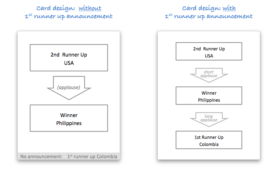
  • Present information hierarchy logically - There are 3 chunks, each containing a place and a country. Each chunk needs to be visually separated because there is applause in between the announcements:

    • Chunk 1 (2nd runner up and country)
    • Chunk 2 (Winner)
    • Chunk 3 (1st runner up...this may or may not be announced)
  • Minimize distraction - The use of different font sizes or weights distracts the reader. The title is as important as the country, so render them with equal size and weight.

  • Use a clear, linear, natural reading layout - The announcement is made in English, so the most natural narrative layout is top-to-bottom. Asking the reader to process information left-to-right or, worse, in a non-linear fashion (as in the original cue card) is totally unnecessary congnitive load for such a simple information payload.


Resulting designs

Since it's unclear from this thread whether the 1st runner up is or is not announced, I've included designs for both scenarios:

two card designs

The designs use simple UX principles: island grouping to organize and visually relate the chunks, top entry point with natural, top-to-bottom information flow, arrows to aid flow orientation and transitions, clear step-by-step / flowchart-style instructions in case presenter gets stage fright, and consistent presentation of hierarchical chunked information (same font, same alignment, line breaks between related information).

The first design includes a subtle but visually separated footnote for the implied 1st runner up position. Although that should be completely clear after the winner is announced, the presenter may be under considerable stress so it doesn't hurt to provide the information for her/his reference.

4
  • 2
    Like Steve Harvey, you've missed important information that's been written down: my requirements and restrictions explicitly state that the host announces the first runner-up immediately after announcing the winner. To be fair, they could be more concise, but for anybody in doubt, see how easy to forget or miss text?
    – Tim Huynh
    Commented Jan 1, 2016 at 15:16
  • 3
    Plainclothes points out that the first runner up is implied and not announced. So the problem statement is incorrect in the sense that you'd like to avoid a screw up but announcing the 1st runner up would be a screw up. If you want, I'm happy to adjust this answer to incorporate the 1st runner up after the winner.... That actually makes the design problem even simpler!
    – tohster
    Commented Jan 1, 2016 at 17:26
  • Well if you're making the case for not announcing the first runner-up at all, the listed requirements, that's up to you. Plainclothes was the first user to answer, and again to be fair, s/he probably answered after I realized that the first-runner up is named immediately after the winner is announced. My previous comment is mostly directed at people who say 'There's nothing wrong with the original card!'
    – Tim Huynh
    Commented Jan 1, 2016 at 18:32
  • 2
    Got it. I think there is actually good logic in the way that it's done (with the first runner up implied rather than announced). After announcing the winner, doing another announcement for the obvious first runner up would be redundant and a let down after the peak TV moment of the winner's celebration. The reason I included the runner up at the bottom with low visual presence is really just for reference for the announcer.
    – tohster
    Commented Jan 1, 2016 at 18:36
11

It was the Budget


I've watched miss Universe a few times across the years and previously noticed the MC used to hold 2-3 separate envelops with each contestants name inside and the place (1st runner up, 2nd runner up) written on the cover of the envelope. This is really a better way that guarantees no mix up like this. Not sure why they ditched this practice they had been doing for a long time and it worked well every time.

My guess is, it was the budget!! why? because this is a more behind the scenes aspect and would have been neglected, and the organizers may have been trying to cut corners on things they perceived as not major.

1
  • This response is late, but that's a good practice. No real 'design' needed.
    – Tim Huynh
    Commented Nov 19 at 13:40
10

There are much better designs for the card, some are mentioned in answers given already, but I believe the error would have been avoided if they simply used different labels.

The label "1st Runner Up", can easily be confused as 1st, especially under circumstances of stress. If labels "3rd", "2nd" and "Winner" have been used the error would not occur.

This type of error is called description error, and it is defined as :

A description error or selection error is an error, or more specifically a human error, that occurs when a person performs the correct action on the wrong object due to insufficient specification of an action which would have led to a desired result.

0
10

Most existing answers rightfully criticize the choice of words, because we’re used to 1st through 3rd place elsewhere, not “title-bearer” and “runner-ups”. I assume that this is established pageant practice, though, and hence cannot be changed at the same level as the card design. (I didn’t know these shows were actually shown on TV, but am not surprised either.)

All answers that show or describe better layouts for the card, treat it as a single two-dimensional surface. It doesn’t have to be. You can fold the sheet of paper like a brochure. I would suggest a C-fold (1), but a Z-fold (4) might also work, even a simple bi-fold (not pictured) would be better than none. The C-fold is the only one that is intuitively opened always the same way, so no turning of upside-down or backside-up text.

1: letter/C tri-fold, 2: gate tri-fold, 3: roll/double gate fold, 4: accordion z-fold, 5: double (parallel) fold, 6: double right-angle / French fold brochures

The obvious trick is to make only the second runner-up visible in folded state or first opening step, and reveal the title-bearer on the next step. The first runner-up would be displayed less prominently way below the winner. There have been enough suggestion how exactly to do that typographically.

4
  • I think this is the best answer because the folds hide the names/details until the moment they're needed. Plus the announcer can easily back-fold the names/panels that were already read back so they are out of view. This consistently gives the announcer one name to read/view while preventing snooping. Bravo!
    – Erik
    Commented Jan 5, 2016 at 23:12
  • 2
    From the standpoint of solving the problem of presenting only the information necessary in a particular moment while providing a clear path to the next stage of information, I like this solution; however, from an aesthetic standpoint, (unless the host is already habituated to the technique) the "unfolding" of the card could easily devolve into a spectacle of "unfolding a map on stage." Commented Jan 6, 2016 at 15:06
  • 1
    I love this answer! I think that the folding matters less, it's the idea of not presenting them all at once. Admittedly, myself, like many of the other responders, were blind to this line of solution and focusing too much on trying to rearrange the lines on a single card. You could easily adapt this idea to 3 separate cards @K.AlanBates.
    – Izhaki
    Commented Jan 6, 2016 at 17:14
  • Can you please take a look at this question: ux.stackexchange.com/questions/92329/… Commented Apr 5, 2016 at 9:41
7
  1. Instruct the person delivering to:

    • read the exact words on the card
    • in the order they are listed on the card
  2. Make the card say

In Third place is Z

The Winner is X

In Second place is Y

No need to make any connections, use different font or the like, just read the sentences.

0
6

Looking at Smitri's and plainclothes's answers, this appears to be (at least somewhat) a matter of personal preference.

Some people would rather they were listed in order of placing (e.g. 2nd runner-up, 1st runner-up, winner) and then be expected to call them out in the correct order.

Yet other people would like them to be listed in the order they need to be called out.

However, As plainclothes has already stated, the importance here is on training. The announcer should've familiarised himself with the card (or had the opportunity) before the announcing.

From a UX perspective, I would suggest a reasonable solution here would be to provide multiple cards in envelopes. One the front of each envelope would be only the placing of the name held within.

In doing this, the announcer only needs to know the order in which to open the envelopes (not an unreasonable requirement).

5
  • Could someone more versed in UX help me formulate what I'm trying to say here. By increasing the work between announcements (i.e. by having to identify and open an envelope) you're reducing the chance of a mistake occurring.
    – Prinsig
    Commented Dec 30, 2015 at 10:49
  • 2
    By increasing the work, it also becomes a negative, because you must also consider that the announcement is done within one speech, and given the magnitude of the event, and the length of the show, the announcement should be done as fast as possible, only allowing pauses for suspense, rather than opening envelopes. I suppose you could do one envelope, with multiple cards though, so that way the host just has to sift through them. Commented Dec 30, 2015 at 12:53
  • An intriguing alternative. Arguably though, the time for suspense could be that of opening the envelope. What if it was a tear-open envelope?
    – Prinsig
    Commented Dec 30, 2015 at 12:55
  • Fair enough, but I would go back to the size of the event, the host is usually preoccupied watching the contestants take their appropriate places, and any other preliminary steps needed before the (next) reveal. I'm not sure on the specifics of the behind the scenes actions, but I'm just assuming that the host usually has a lot of tasks going through their mind at that time, so it would be better for them to have time for preparation, rather than rushing to get the next cue. Commented Dec 30, 2015 at 13:01
  • Or put three cards in one envelope Commented Dec 30, 2015 at 21:26
4

I see three major issues in the described situation; two are related to the card as shown, and one is inherent to the situation.


The first issue related to the card as shown is that the information being presented is a list of three items, but the card makes it look more like a list of two items plus some unrelated, extra information.

To treat this issue, the items should be formatted in a comparable way. That does not mean the same way; the items can use different font sizes, for instance, to highlight the winner. The important part is that the items have something in common - the same kind of bullet point, the same kind of frame, the same kind of layout ... none of this is the case in the card as shown, which is why the first two items on the card seem to form a pattern there, and the third item completely breaks out of this pattern. As this is contrary to expectations of the reader, it can easily lead to mistakes.


The second issue is that each of the items in the list has a specific meaning (1st, 2nd and 3rd winner), but while technically, all labels are provided, they are ambiguous (MISS UNIVERSE 2015 is indeed the label for the bottommost item, but could just as well be the title of the whole card - and the formatting and positioning do not help).

This could be fixed by making each label clearly indicate that it is indeed a label - e.g. by something simple as putting a colon behind it, and possibly always placing it left of the value it denotes. On top of that, choosing less ambiguous texts (e.g. winner instead of Miss Universe 2015) is adviseable.


The third issue, which is inherent to the situation, is that in the aforementioned list of three items, the speaker has to consider two conflicting orderings of items, both of which can intuitively be mapped to the order of items:

  • the ranking of the winners (winner - 1st runner-up - 2nd runner-up)
  • the order of reading out the winners (2nd runner-up - winner - 1st runner-up)

Now, one could argue to drop one of these orderings. However, I think that is not reasonable:

  • The reading order cannot be dropped. If one leaves that bit of information away, the host is essentially invited to mix things up compared to the original plan in the heat of the moment.
  • The ranking of the winners cannot really be dropped, either. Unless the host is just reciting a pre-fabricated text (which is somewhat unlikely, given that the cue card only contains some keywords rather than complete text), they probably choose their concrete words as they go. For that to work, it seems important that the host have a mental model of what they are talking about, i.e. the ranking of the chosen winners.

Hence, both orders have to be incorporated into the card. It can be achieved by using positions for one of the aspects, and arrows for the other one.

As a result, I would choose to indicate the ranking by means of the position. This seems more logical to me as readers see at one glance which one of the three items they are reading. Assigning different positions than the numbers 1st, 2nd, and 3rd winner, or top, middle, and bottom winner, or whatever terms the host might be thinking of, is confusing, comparably to the well-known read out colour names coloured differently than what they say pictures.

Conversely, for the reading order, the host just has to know where they are and what is next. There does not need to be a clear sense of a numerical position in the list, while the sequence aspect, transitioning from one item to the next, is much more prevalent. Therefore, this aspect lends itself to being expressed with arrows.

So, my final recommendation looks like this:

suggested layout for cue card

This card indicates the reading order with arrows that the host can easily follow, while at the same time, the mental model of the subject matter at hand, the ranking of the contestants, is represented by the positions of the list items (and further supported by font sizes).

A few additional points to note:

  • The initial arrow is the only one that starts out of nowhere, the others are directly connected to the frames of preceding items for a clear visual contrast.
  • Moreover, the initial arrow starts in the top left corner, the presumed start of the page in the reading direction of the host, so it is hard to miss that point of entrance1.
  • The placement of the arrows alternates between left and right, so even if the host somehow loses track of which box they were at, they might still know on which side the next arrow was supposed to be (similar to when you are reading a book, and you don't remember the exact page you are on, but you are always somehow aware whether you're on a left or a right page).

1: Given that the original cue card contains only superficial information, I am assuming that there is some minimal briefing for the host. If the card is supposed to be entirely self-explaining, I would consider adding the text read along these arrows or something like that to the beginning of the initial arrow.

2

I would have put "PHILIPPINES" in caps and bold, in the same lettering as "MISS UNIVERSE," to establish a clear association between the two, and a clear "separation" from First Runner Up and Colombia.

1
  • That was the first idea that occurred to me as well.
    – Jason
    Commented Jan 7, 2016 at 20:47
2

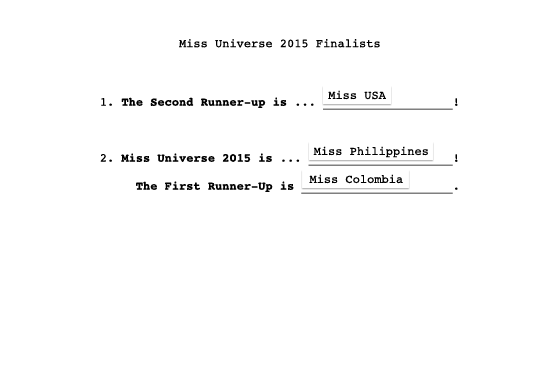
Here's my cue card. It's written in prose like an actual cue card and the three finalists are grouped into two statements. Whitespace all around the text prevents the card-holder from blocking the text with a thumb.

enter image description here

1
  • makes the most sense of all the answers here
    – gnicko
    Commented Oct 21, 2021 at 17:47
0

One thing I've seen used in some events (and I recently haven't watched much TV, especially awards shows, which I can't stand) is to have three envelopes for all the finalists that place. The remaining finalists could be on a cue card which also indicates which envelope to open when given the rather unusual sequence discussed here. Inside the envlopes could be just the winners identity, but a cue card emphasising the identity would be better. They're clearly labelled on the outside (could even be gold/silver/bronze) and the names are inside. Rather than being sealed they should be easy to open. Opening the envelope is part of the show, so the extra UX step (for the host) isn't very relevant -- the extra viewer experience element could be regarded as a feature.

In addition, an assistant (probably a co-host) can hand each envlope to the host in turn, providing a double-check. That doesn't work for a single cue-card.

2
  • 1
    What exactly does this add over the existing answer that makes the same suggestion? In particular, how does your answer deal with the objection raised several days ago in the comments? Commented Jan 4, 2016 at 10:06
  • 1
    @O.R.Mapper I missed that answer -- I was looking for one that said this sort of thing as it's a rather obvious idea. However my answer is slightly different (3 envelopes for all that place, not one for the winner). So I won't delete (but will upvote the other, and edit a couple of things in). I find the objection in the comments rather weak: In many finals the finalists and the host can all be seen in the same shot anyway.
    – Chris H
    Commented Jan 4, 2016 at 10:27
0

I would like to direct fellow designers to look at the Information flow. I am afraid a card design will suffice.

It starts off with Identifying the winners and ends with Announcing winners. There are high chances of information breaking up in this chain.

From the information we have, these are the facts:

  • Yes, the card is badly designed. Information Hierarchy has taken a hit.
  • The nomenclature conflicts with mental models (1st runners up vs 1st place)
  • The card is pre-printed with the winners typed and printed later. i.e The Card template is designed by someone else. While the content is filled in by someone else.
  • Human nature to glance through information in a heated situation.

This is a beautiful design process lesson learnt! Thanks to everyone for pitching in and thanks to Tim for posting.

-2

After thinking about this a bit, I've determined that I might make the cue card look something like this:

identical image

Based on the ideas I am about to present, here is my clear answer about what I would have done to make the cue card look different: nothing. (That is why I'm showing the identical image.) I will now state my strategy very clearly: The cue card is not how I would have achieved different results.

After using that cue card, I could then make sure there are rehearsals. Rather than plucking off some Joe Schmo off the street, I may pick a relatively well-known celebrity which has a track record of providing some quality content.

Oh, those strategies were already something that the program director already did? Hmm...

In the end, I conclude that I may be burned, no matter what I try to do (especially with the "cue card"). I suppose I could do some other things, like specifying in the contract that the announcer is required to read things word-for-word, and providing this person with a detailed script that contains paragraphs of prepared sentences, so that the announcer has far less words to need to make up on the fly.

However, in the end, I am putting my trust in another person, who could betray that trust (through incompetence, or perhaps maliciousness). No matter what controls I place, in the end, some of this is really out of my hands. So, even if I apply some of the techniques provided by some of the other answers, I may still be burned.

The one biggest thing I may be able to do, which really could help quite a bit, is to NOT broadcast live. Place in at least a half-hour delay, and if some catastrophe happens where a certain announcer proves to be unable to say the right words, then re-broadcast with a replacement announcer. Unless there was a conspiracy between the performers on stage, along with the technicians who could lock me out of the broadcasting room, then a single person's error would likely only lead to a rather limited embarrassment, like "six thousand people crammed into a theater saw an embarrassing incident live, before a corrected run was performed and then broadcast". That would be way better than "millions of people saw this embarrassing incident, and it was broadcast so surely there are tons of widely available recordings of this embarrassing incident".

This option is something I expect I would have been aware of, ahead of time. Having a multi-minute time loop (delaying the "live" broadcast) could have been very helpful. The way that things actually happened, a delay of 3 minutes would have been sufficient. I know that doesn't mention the cue cards which much of the question seemed to focus on, but it is my strongest answer to the real core question:

if you're a program director of the pageant, how would you prevent this mistake?

In six simple words, what I would have done is: Broadcast the event, but not live. (In other words, not in "real time".)

This doesn't completely prevent "this mistake" of the wrong name being announced. (As I said before, strategies can be done to reduce the likelihood of that problem, but not to negate the risk entirely.) However, if you define "this mistake" as also including some of the resulting negative consequences of the wrong name being mentioned, there are some things that could be done.

Another thing I could do is to have the winner's name automatically show up, possibly on a large computer screen which automatically shows the name the moment a large amount of volume is given to the microphone (after the finale pause that comes after the announcer said "and the final winner is..."). That would have improved things by immediately showing a mismatch, even before the "winner" walked down and picked up a crown. The resulting confusion could have immediately led to more people wondering what was happening, possibly helping to prevent the initiation of ceremonies that temporarily decorated an incorrect winner.

(That being said, this last paragraph is based on an idea that was much easier to provide in hindsight.)

2
  • This only prevents the TV audience from finding out about the disaster immediately. Sure they could stop the broadcast by inserting an unscheduled commercial break. But you to come back from the break eventually and somehow carry on with shocked contestants and live audience. You are right that these things happen despite the best laid plans. But that does not change the fact that the cue card is a horribly confusing way to convey information to someone who is on stage.
    – David42
    Commented Jan 7, 2016 at 19:31
  • @DavidC: "shocked contestants" ... we're still only dealing with the first and second winner of a beauty pageant being switched. Commented Jan 7, 2016 at 19:44

Not the answer you're looking for? Browse other questions tagged or ask your own question.