Tweeted twitter.com/StackUX/status/1343572436885893120
added 434 characters in body
Source Link
PirateApp
  • 995
  • 1
  • 9
  • 20

I am building a login page and I spent over 5-6 hours reading a tonne of posts in this group. I saw the following discussions

  1. Login and Register as separate pages
  2. Login Modals
  3. Login Register vs Sign in Sign up
  4. Social logins

I have tried hard to wrap my head around what would work best. I plan to run a site where people can code in a playground that has a free account and a PRO account and built a page as follows enter image description here
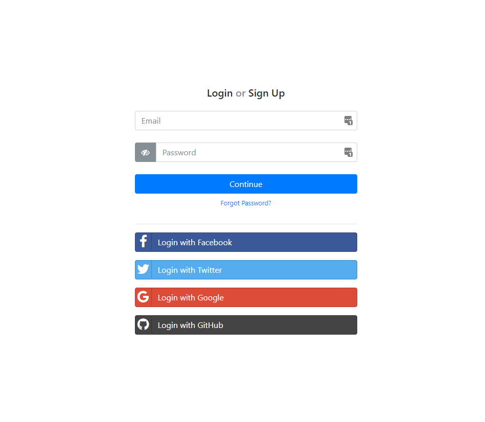
You can see it in action HERE

I have a few questions where your suggestions are super appreciated

  1. Should I do a login or sign up as shown below? I never came across this on ux stackexchange posts
  2. How many social login options should be displayed. I have atleast 6 options to show. To reduce the clutter perhaps have buttons in rows and columns?
  3. If I were to separate login and register, would they be separated using tabs or plain links at the top (or pills in Bootstrap)
  4. if I had to stick to x social login options on the screen, how do I reveal the rest?
  5. Should I add a small label below the email box saying "We wont spam or share your email with anyone"

Thank you for taking your time to read this question. Would love to hear your thoughts

UPDATE 1 Thank you so much everyone, based on your recommendations and reading all the links posted below, I have redesigned the screen and hopefully this one's better. Feel free to use it for your projects as well HERE

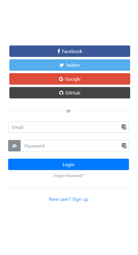
Mobile enter image description here

Desktop enter image description here

I am building a login page and I spent over 5-6 hours reading a tonne of posts in this group. I saw the following discussions

  1. Login and Register as separate pages
  2. Login Modals
  3. Login Register vs Sign in Sign up
  4. Social logins

I have tried hard to wrap my head around what would work best. I plan to run a site where people can code in a playground that has a free account and a PRO account and built a page as follows enter image description here

You can see it in action HERE

I have a few questions where your suggestions are super appreciated

  1. Should I do a login or sign up as shown below? I never came across this on ux stackexchange posts
  2. How many social login options should be displayed. I have atleast 6 options to show. To reduce the clutter perhaps have buttons in rows and columns?
  3. If I were to separate login and register, would they be separated using tabs or plain links at the top (or pills in Bootstrap)
  4. if I had to stick to x social login options on the screen, how do I reveal the rest?
  5. Should I add a small label below the email box saying "We wont spam or share your email with anyone"

Thank you for taking your time to read this question. Would love to hear your thoughts

UPDATE 1 Thank you so much everyone, based on your recommendations and reading all the links posted below, I have redesigned the screen and hopefully this one's better. Feel free to use it for your projects as well HERE
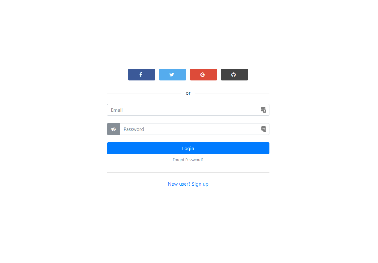
Mobile enter image description here

Desktop enter image description here

Source Link
PirateApp
  • 995
  • 1
  • 9
  • 20

Can I combine login and signup with a single button?

I am building a login page and I spent over 5-6 hours reading a tonne of posts in this group. I saw the following discussions

  1. Login and Register as separate pages
  2. Login Modals
  3. Login Register vs Sign in Sign up
  4. Social logins

I have tried hard to wrap my head around what would work best. I plan to run a site where people can code in a playground that has a free account and a PRO account and built a page as follows enter image description here

You can see it in action HERE

I have a few questions where your suggestions are super appreciated

  1. Should I do a login or sign up as shown below? I never came across this on ux stackexchange posts
  2. How many social login options should be displayed. I have atleast 6 options to show. To reduce the clutter perhaps have buttons in rows and columns?
  3. If I were to separate login and register, would they be separated using tabs or plain links at the top (or pills in Bootstrap)
  4. if I had to stick to x social login options on the screen, how do I reveal the rest?
  5. Should I add a small label below the email box saying "We wont spam or share your email with anyone"

Thank you for taking your time to read this question. Would love to hear your thoughts