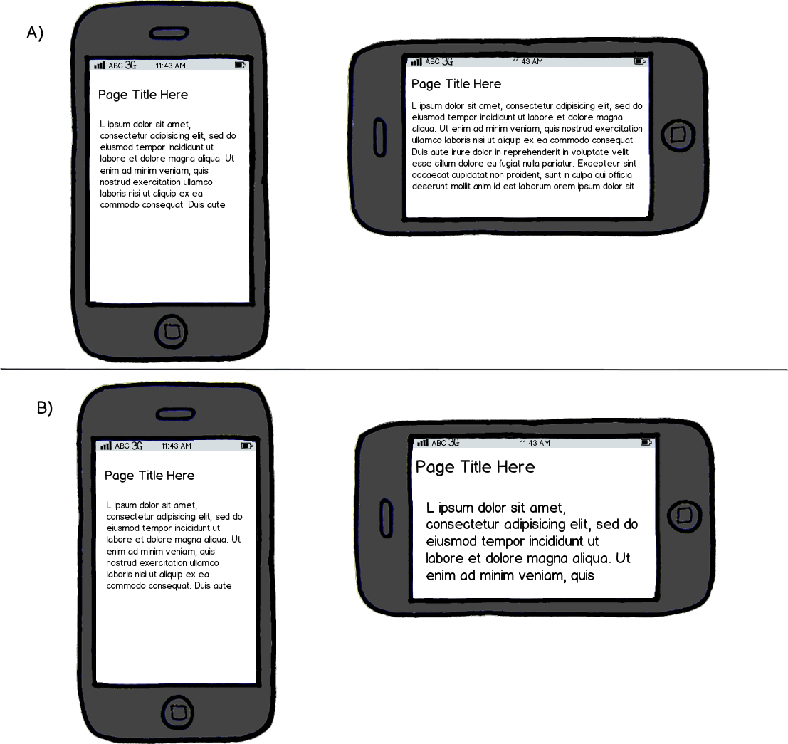
Currently, the standard behaviour for viewing web pages on a mobile is that:
- If viewed in portrait the text is smaller because the width of the device is small and the whole page width needs to fit into view.
- If viewed in landscape the view 'zooms in' as the width is now wider so that the text is larger and more readable, but with less content on screen as a result.
So, this brings a dilemma. When creating a responsive website what should happen on device rotation? (Not on initial page load, I am referring to what should happen once the site is loaded and you decide to then rotate the screen)
When rotated from portrait to landscape should you:
a) Re-detect the device widths and map the contents according to the new dimensions (thereby retaining the same font / images sizes as when viewing portrait).
b) Keep the same dimensions and on rotation just bring the content to fit the window (thereby zooming in the content to make it more readable for viewers if the portrait orientation text is too small).

download bmml source – Wireframes created with Balsamiq Mockups
Bear in mind that with a traditional web-page viewed in the mobile you have the option of pinch-to-zoom the text, so if it's too small you can zoom in. With a responsive site this isn't an option because the site will fit the dimensions so there is nothing to zoom into.
(I guess there is a third option too - use responsive fonts so that the font sizes change according to the screen width. But that's probably a different question altogether).
