5

I am working on a product that shows how much time the user has consumed .

To represent this visually I have used a reversed progress bar but it still feels like a progress bar , increasing.

Are there any ideas you have for me to show that its decreasing ?

8
  • Get inspired by iPhone battery or your laptop's battery?
    – Dipak
    Commented Apr 19, 2016 at 11:59
  • yes i checked that of course , but on large scale it loses its meaning as a battery , it turns into progress bar .
    – Basem
    Commented Apr 19, 2016 at 12:04
  • 3
    Could you clarify the dynamic you're trying to communicate? Is there an "end" to the meter, or does it just count up indefinitely? Is reaching the end desirable or undesirable?
    – Nate Green
    Commented Apr 19, 2016 at 12:41
  • it has an end , its like you have specific time to finish a task , so reaching the end is undesirable
    – Basem
    Commented Apr 19, 2016 at 13:10
  • I don't have time right now to write up a full answer, but it sounds like what you actually need to show users is how much time they have left, not how much time has elapsed. A countdown, like @franchesca suggested below, would do that. You could search for countdown visualizations for inspiration—my favorite is a "pie" shape that starts full and gets more and more slices taken out of it as the end approaches.
    – Nate Green
    Commented Apr 19, 2016 at 14:50

4 Answers 4

5

Why not try an hour glass? Almost everyone understands how an hour glass works, even small children, and it seems to fit your situation unique. The user has an particular amount of time which is represented by the amount of sand in the top half of the hour glass, and as the user consumes that time, the sand moves from the top half to the bottom half, with the top half representing how much time they have left and the bottom half representing how much time they've used. If you don't want to animate complicated sand dynamics, you could represent the sand moving to the bottom with repeating circular drops.

1
  • Nice way to show time used vs time left! This can even work as a very minimalist graphic that leaves out the sand animation altogether.
    – Franchesca
    Commented Apr 20, 2016 at 7:34
3

Animation

Have stripes on the progress bar that are animating to right (presuming your reversed-bar is right aligned). This will give the perception that the bar is moving in that direction, or decreasing.

Here is an example:

enter image description here http://cssdeck.com/labs/vdl9fd3x

1
  • NOTE: If you use the code in the link I forked it from somewhere else and altered it so a lot of the code is likely unused/unneeded
    – DasBeasto
    Commented Apr 19, 2016 at 13:25
3

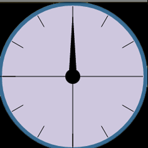
What about a clock? Most people should associate this with the concept of "time consumed".

enter image description here

enter image description here

4
  • 1
    He is asking for - product that shows how much time the user consumed
    – Dipak
    Commented Apr 19, 2016 at 12:36
  • 1
    @Dipak Perhaps "Countdown" is the wrong word to use (I was thinking of the TV show). I will remove that word from my answer.
    – Franchesca
    Commented Apr 19, 2016 at 13:11
  • @Franchesca its nice to show the actual time left . but the circles dont show which direction its moving , so it will confuse the user when he see it , is it completing the circle or decreasing ..
    – Basem
    Commented Apr 19, 2016 at 13:16
  • @Basem Time consumption can only move in [one direction] (en.wikipedia.org/wiki/Arrow_of_time), unless your users have access to a blue police box. I think you need to clarify what exactly you are trying to achieve. Your question does not mention a reference point for time either, and direction must always be in reference to something else.
    – Franchesca
    Commented Apr 19, 2016 at 14:53
0

Progress indicator helps to answer the following questions - what part of the whole task done? how far am I from my goal? how fast am I going to my goal?

'Consumption' indicator should help to answer the following: how things are going relatively to highest possible mark? should I do better or can I go slower?

If above is what you mean about showing 'consumption', so the most appropriate indicator seemed to be gauge. You can google for example 'high low icon' and select one with coloured scale as well as labels like 'very low- low - moderate - hight - very high' or 'so so - good - excellent'.

Your Answer

By clicking “Post Your Answer”, you agree to our terms of service and acknowledge you have read our privacy policy.

Not the answer you're looking for? Browse other questions tagged or ask your own question.